Assignment 5: Frontend Design & Implementation
Assignment Instructions
These are the 6.1040 assignment instructions for this assignment. It goes into greater depth about the expectations, requirements, and deliverables for this assignment. It also includes a rubric detailing how this assignment will be graded.
Community Carpool
A communal carpool coordination social network connecting users that are traveling to the same activity, using location data to help plan the most efficient and convenient routes.
Frontend Deployment
GitHub Repository for Community Carpool's Frontend
Vercel Deployment for Community Carpool's Frontend
Some Brief Notes
This is way harder than I thought it would be.
Going into this assignment, I was very ambitious to implement much of the functionality I had layed out in Assignments 2-4. Frontend development, however, absolutely kicked my a**. I spent a lot of time debugging and struggling to implement functionality that we take for granted, so the capabilities of my social media application are far more limited than I had envisioned and hoped.
This all being said, I cannot stress the tremendous amount of learning and development I went through while completing this assignment. I spent tens of hours working on my frontend implementation, and I am very proud of the results given that I had zero front-end experience until three weeks ago.
What I Spent Time Implementing
I spent the greatest amount of time implementing a number of different functionalities on my front-end website. The biggest things were:
- Profile Photo and Uploading Images
- Activity Groups
- Handling Members and Managers in Activities
- Search
- Password Validation
Profile Photos and Uploading Images
I wanted Users to be able to upload pictures to this app. I thought this would be a good challenge to implement, and would also make the app more personal for users as they would be required to upload a profile photo.
It took me a tremendous amount of time to implement this functionality, mainly because I had never done anything like this. HTML coding is completely new to me, and I've never worked with other company's APIs. I had zero prior experience to Firebase as well as all of the other services we used.
To handle image uploads, I adjusted my API to handle a new concept I referred to as Media (this concept is defined in media.ts). Since I am not limited to only allowing image uploads, and people could upload other forms of media, I made this Media concept broad so it can handle multiple different types of uploads. This Concept has Media.creator, Media.media_url, and Media.target attributes so that the rest of my application can refer to it, know its scope, and load the Media into the website.
Needless to say, this also required adding a number of API actions to my routes.ts file. I added synchronizations so that the database can be easily queried by Media a single User uploaded, and enforced restrictions on who/how Media can be deleted.
This was difficult, but I had a lot of fun implementing this, and I think the end-result is quite great!
Activity Groups
Put simply, Activities were very difficult to implement, mainly due to my infamiliarity with Vue and the interconnectedness of different components. In the process of implementing these data objects, I needed to adjust my backend Concept implementation slightly, modify my API, and validate actions relating to Activities.
Handling Members and Managers in Activities
A key functionality I implemented is the restrictive nature of Activities. Only members of activities are supposed to be able to interact with and view the more sensitive data within the Activity. Therefore, I wrote multiple API functions to handle these verifications, ensuring that users are only able to view data that they are approved to view.
While I was only able to implement these "gates" for showing/hiding the members of an Activity, a lot more complex functionality is already implemented in my backend, and I just didn't have time to implement it in my frontend. This includes promoting and demoting members from an Activity, establishing sub-groups within the Activity, as well as all of the synchronizations and validations that occur during this process.
Search
Though subtle, I had a lot of fun working on the search capabilities of this application. I wanted to implement a "Live Search Bar" that didn't require the user to click "Submit" to generate the results, but would instead update the results with every keystoke. Additionally, and this is the part I struggled to implement, I wanted the search results to work with "imperfect" or "related" searches in addition to "exact" searches. I implemented a few additional API functions that are able to return results that are relevant to what the User is typing and what they wish to find. This is very similar to how most search bars that we encounter work, but I now have a newfound appreciation for this functionality and its associated challenges in implementing.
Password Validation
Albeit this is admittedly unrelated to the core Concepts and structure of this application, I thought that implementing a password setting utility similar to those that we encounter throughout the internet would be both useful and a good learning experience. This expands on the concept of providing Users with feedback on the frontend for functionality that isn't supported (or is restricted in this case) in the backend.
Rather than telling the user that the password they are trying to set is invalid after they have written it and it is submitted to the server, my application directly notifies the User that their password does or does not satisfy certain requirements, and what they must do to adhere to these requirements. It is very clear when the User is not in compliance with the restrictions on the types of passwords that can be set, and positive feedback is also given to indicate that the User is now in compliance with these restrictions.
Heuristic Evaluation
Intuitiveness (Learnability)
As users of websites have gotten more used to how content is structured and certain UI consistencies that exist across multiple different platforms, it is important to use these UI queues correctly throughout different applications. As a result, I intend to make buttons clearly different from standard text, and include notifications when a user attempts to do something that is not allowed.
When a user creates a post, they will be directly presented with a "celebration signal" (confetti) to indicate that they have submitted a post. This type of user feedback is a great indicator of their actions, and they their post was properly recorded.
Efficiency
I wanted the most relevant and pertinent content Users are likely to interact with to be the first thing they see, as well as easily accessible.
Though subtle, I think the way I implemented the Search functionality is extremely useful, helpful, and user-friendly. Unlike requiring a "Submit" button that relies on the user knowing exactly what they want to search, I implemented a generic and general Search capability that shows Users relevant/related content that is usually what they are looking for.
Adherence to Fitts's Law
It's important that frequently used buttons and actions that the user performs are easily accessible, intuitively placed, and are properly sized so that users can easily interact with the application. As a result, many of the buttons, navigation menus, and icons I use are sized to induce human interaction that is convenient and natural.
Adherence to Gestalt Principles
- Similarity
- Continuation
- Closure
- Proximity
- Figure/Ground
- Symmetry and Order
Iconography
Consistent icon use throughout the application will ensure that users are familiar with the design language of the application and are aware of the functionality each icon is associated with. The main icons/elements my application uses are the idea that a profile photo in the top right corner of an application is where a User should click to adjust their personal settings, as well as standardized buttons.
Consistency
As mentioned above, consistency is key, and I spent a lot of time ensuring that buttons are visually similar and distinguishable from other elements on the website and that there is a clear separation between functions/capabilities.
Visual Design Study
Original Figma Wireframe
This is my Figma Wireframe from Assigment 3. I go into greater depth regarding the intended layout and design of the website on this page.
My wireframe can be viewed on Figma.
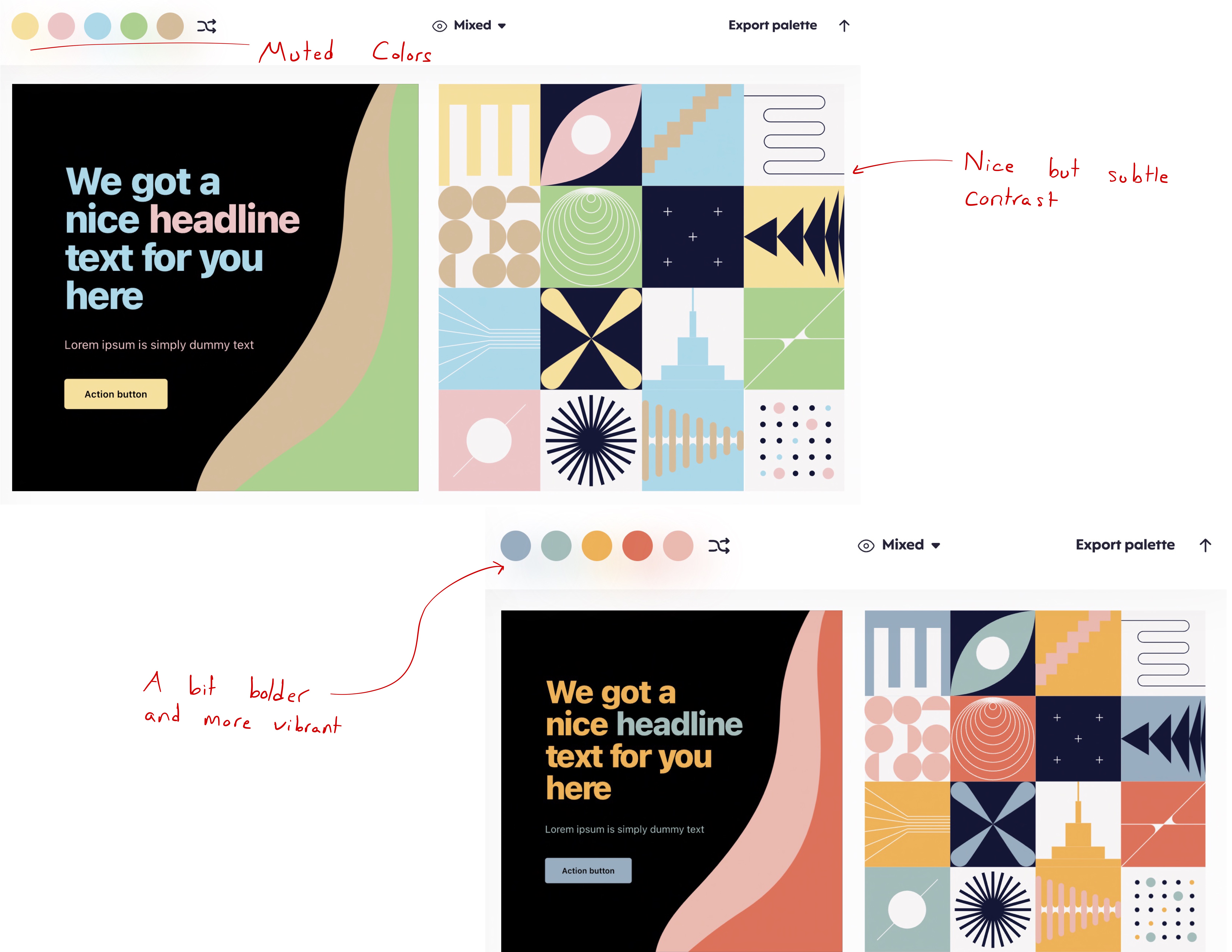
After reading a lot about Material Design and appropriate/pleasing color pallettes, I ended up going with a relatively subtle and muted color system. With more time, I think I would be a little more bold in some of my choices, picking darker more saturated colors that would be a little more "fun" to experiment with.
I love the color pallette of my website, and put in a lot of effort to implement a similar UI to the one I designed during Assignment 3. I think I did a good job accomplishing this.
UI Details I Spent Time Developing
| UI Detail | Explanation |
|---|---|
| Rounded Corners | I think rounded corners are far more pleasing to look at than sharp, abrupt corners. Especially in objects that box/enclose other information, the rounded corner marks a gentle and comforting transition between the two objects. Based on Google's Material Design Documentation, this is the case, so I made a conscious effort to include this in my website. |
| Colors | I spent a lot of time refining my color choices and making sure that I used colors that are both easy to read, visually pleasing, and comforting on the eyes. I used a combination of online testing tools as well as personal fine-tuning to finally land on this combination of colors. |
| Gradients | I know, I know; this is a little controversial. I did this mainly because my Figma Wireframe included these details and because I wanted to learn how to do it. In places where I could and it wouldn't be too obtrusive, I used gradients to add a little color to otherwise plain/flat text to emphasize certain elements of my UI. |
| Fonts | I spent a lot of time testing out different fonts and seeing what worked/didn't work in my website. In the end, I decided to go with a Sans Serif font because this is a little more modern, less formal, gentler, and fit the mood of my website better. I ended up using Nunito as my font of choice. |
Visual Design Study - Research
Colors and Color Pallettes

Websites and the Presentation of Information
