Assignment 5: Frontend Design & Implementation
Overview. In this assignment, you will turn the wireframes you produced in earlier assignments into a fully fledged and styled reactive user interface. You will also integrate the interface with the backend service you developed in the previous assignment, to produce a complete full-stack application.
Purpose. This assignment will help you: (1) gain more experience with HTML and the DOM; (2) practice the idioms of reactive programming and Vue.js, a widely-used client-side framework (note: we will be using Vue v3); (3) develop skills in the visual and interaction design of user interfaces.
Deadlines. Like the previous assignment, you will have two weeks to work on this assignment. Your final submission will be due 11:59pm on Tue Oct 24. However, you will be expected to submit an intermediate milestone half way through (i.e., 11:59pm on Tue Oct 17) containing deliverables specified below. This milestone will only be graded for completion (i.e., whether you have submitted the required materials), and the assignment will be graded as a whole after the conclusion of the final deadline. As before, you may only use slack days to extend the final deadline; you must turn your milestone in by the associated deadline.
Your Tasks
-
Starter Code. Fork this GitHub repository by clicking the green “Use this template” button and selecting your personal GitHub account (we cannot use the
61040-fa23GitHub organization due to limitations with the free tier of the deployment platform, Vercel). This repository contains starter code for the assignment, and theREADME.mdfile describes its structure. Read through this file, and follow the initial steps to install the required packages vianpm install. Verify that you’re able to get the frontend running locally. Familiarize yourself with what this starter code provides, and how it is structured and written as it can helpfully guide you as you implement your frontend. -
Heuristic Evaluation. Conduct a heuristic self-evaluation to assess the usability, linguistic, and physical aspects of your wireframes. Pick two heuristics from each of the three categories found at the bottom of this page, and use them to generate a bulleted list of observations about how they apply to your wireframes. For example, what design decisions do your wireframes make that support the heuristics? Or, do your wireframes violate them in particular ways? In either case, do the heuristics suggest improvements you might make? Finally, what tradeoffs exist between optimizing for some of these heuristics (e.g., have you had to make some sacrifices to learnability to boost efficiency)? Make sure to clearly identify the heuristics you are responding to, and keep your observations grounded by ensuring that you cite a specific aspect of your wireframes with every observation.
In total, you should aim to generate about half a page of observations. Your final frontend implementation should reflect design improvements that emerged from your heuristic evaluation.
-
Reactive Components. Implement your wireframe designs as a series of individual Vue.js components. These components should cleanly separate concerns — each component should be responsible for managing its own state/data and other behavior. Note: there may not be an exact one-to-one correspondence between your concepts and Vue components as some components may combine data from multiple concepts, or vice versa. Components may be nested within one another, and will need to pass data back and forth accordingly (i.e., via props when passing data from a parent component to a child, or by emitting custom events to pass data vice-versa). You will likely also have some shared frontend state in a Pinia store. The resultant user interface should be reactive: the web page should not need to be refreshed or reloaded to see the effect of the user’s action.
When implementing your components, consider how you might ensure your frontend interface is also robust to erroneous input and remains accessible to a broad range of users. For instance, can you validate the values of form widgets before submitting them to the backend service? Instead of generic
<div>tags, can you use more specific tags that convey the semantics of their content?For this task, we recommend focusing exclusively on the functionality of your components. Aesthetic concerns will come next.
-
Visual Design Study. The wireframes you constructed in A3 focused on identifying the user interface elements your app would use, how they would be laid out, and how users would flow between different screens of your app. In contrast, a visual design study will help you establish the “look and feel” of your app—namely, what fonts and colors will you use, and what do they communicate about your app’s purpose.
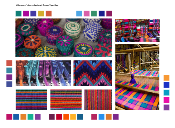
Look through a diverse range of visual media (including photographs, screenshots, magazines, newsprint, graphic novels, etc.) and assemble two slides of inspiration focusing on typography and color respectively. On each slide, collage together examples that you find particularly inspiring, and then use the margins to extract or annotate particular design choices you might be interested in exploring (e.g., specific color palettes and font families, or characteristics that you find interesting such as serifs, tall/short x-heights, etc.). We provide an example of a slide focusing on color in the advice section at the bottom of this page.
-
Styling and Layout. Once you have your component tree implemented, turn to the aesthetic aspects of your user interface design. Make choices for the layout of your components, as well as the colors and typography they use, to provide a usable, accessible, and pleasant experience for your users. Think about how you can use these different aspects of style to convey importance (e.g., using colors to indicate successes or errors) or an order of operations (e.g., left or right sidebars, or heading levels to suggest an outline). Your visual design study should provide you several sources of inspiration, but you are welcome to change your mind and make different choices.
-
Deployment. Deploy your code so that your frontend communicates with your backend. See the deployment guide in the
README.mdfile for more instructions.
Deliverables
You have two weeks to work on this assignment. After two weeks (i.e., by 11:59pm on Tue Oct 24), you should have a fully implemented and deployed frontend that is accessible at a public URL.
However, one week in (i.e., by 11:59pm on Tue Oct 17), we would like you to make a milestone submission to signal you are making adequate progress. This milestone will only be graded for completion (i.e., only to determine that you have submitted the required materials). Your milestone materials should include the following:
- Completed heuristic evaluation and writeup.
- A fully working set of components corresponding to one concept in your design. For the milestone, you do not need to worry about styling (i.e., your components may remain entirely unstyled or using the default styles).
- An attempt at deploying your frontend.
To help make all parts of this assignment accessible, your portfolio should provide prominent links to your frontend code repository and deployed frontend.
Note: Slack days may only be used to extend the final deadline; you must turn your milestone in by the associated deadline.
Submission
For the milestone submission, follow the two-step process from previous assignments (i.e., post necessary material to your portfolio, and submit the Google form to confirm your Git commit hash).
For the final submission, update or add new material to your portfolio. Then, submit the Google form twice: once with your portfolio URL and its Git commit hash, and second with your deployed frontend URL and the corresponding Git commit hash for your frontend repo.
Rubric
| Component | Excellent | Satisfactory | Poor |
|---|---|---|---|
| Heuristic Evaluation | Application of heuristics suggests refinements to the frontend design that improves the user experience, and exposes tradeoffs. | The observations largely focus on how wireframes adhere to heuristics. Only relatively minor improvements are identified. Tradeoffs are shallow or missing. | Heuristics did not expose many substantive opportunities to improve the frontend design. Tradeoffs are missing. |
| Visual Design Study | The design study explores a diverse range of visual media. Typographic and color inspiration are well-extracted and communicated. | The design study offers some nice inspiration, but could have drawn from a more diverse range of sources. | Design study is missing or incomplete (e.g., only focuses on color or typography). Specific inspiration is not identified or is poorly communicated. |
| Functionality | The frontend supports all the functionality described by the operational principles and actions of the concept designs. Entire app is reactive, requiring no page refeshes. | The frontend supports most of the functionality described by the operational principles of the concept designs, but some actions or other parts are missing. App is largely reactive, but occasionally requires a page refresh. | Even the operational principles are not fully implemented in the frontend. App is hardly reactive, requiring several page refreshes. |
| Robustness | Where appropriate, client-side validation and error checking is performed; informative error messages are shown | Client-side validation is performed to detect errors, but some missed opportunities to improve robustness or user-friendliness with regards to error messages. | Several parts of the frontend fail to perform client-side validation to catch errors. Error messages are missing or opaque. |
| Usability | Visual and interaction design help users learn novel concepts, and provide an efficient and intuitive flow through the app. | Visual and interaction design largely provides an intuitive user experience, but some issues present occasional usability frictions. | Minimal visual or interaction design yields an app that is difficult or frustrating to use. |
| Styling & Layout | Layout and styling give the app an attractive, cohesive, and distinctive feel. | Attention has been paid to styling and layout, but occasional rough edges undermine cohesion or attractiveness. | Layout and styling are minimal and fail to provide a cohesive feel. |
In this assignment, we’re offering an additional optional category for Creativity and Polish. You may earn up to +0.5 points by demonstrating an attention to detail or particularly creative use of styling and layout to enable an intuitive, usable, and pleasant frontend experience. Note, this work is not required, but we offer this category because we know some of you will enjoy doing this work. These additional points will not take you over the maximum score of 10/10 — so there is no pressure to do this. Rather, these points can help make up for those lost elsewhere.
As in previous assignments, while rubric cells may not map to specific point scores, qualitative judgments correspond roughly to grades of A (9/10), B (8/10), C (7/10).
Advice
-
Review 6.1020 (6.031) material. This assignment builds on ideas covered in 6.1020 (6.031) including callbacks and graphical user interfaces and asynchrony and Promises. While we will briefly cover these ideas in lecture and recitation, we recommend working through the materials from 6.1020 (6.031) if these ideas are new to you, or you haven’t seen them in a while.
-
Attend recitation. We have devoted three recitations (Thu Oct 5, Thu Oct 12, and Thu Oct 19) to discussing ideas pertinent to this assignment. If you missed recitation, be sure to look through the relevant material on the class website (including slides and exercise code and solutions).
-
Collaboration and ChatGPT. As a reminder, our class guide encourages you to collaborate with other students as long as you actually write up your work by yourself and note the set of people you collaborated with. Moreover, you’re welcome to use ChatGPT (or other generative AIs) to help with this assignment; if you do so, however, you should include a brief note in your portfolio describing how you used it.
-
Third-party code. Similarly, as per our class guide, you are free to use any third-party code (including code snippets, software libraries, or design systems) provided that it is publicly available and appropriately cited (see the section on code in the MIT handbook on academic integrity for more details).
-
Color palettes. Finding colors that work together can be tricky business. We recommend using a color palette generator like Coolors or Adobe Color.
-
Typography. You are not restricted to the basic fonts available in the browser. Instead, feel free to browse the large libraries of free fonts available via Google and Adobe — follow the instructions for how to include such fonts in your Vue app. If you Google around, you’ll find lots of recommendations for which fonts are popular currently, and how you might mix fonts together (e.g., a serif font for body text, and a sans serif font for headings, etc).
-
Consult documentation. Vue.js is a widely used package, with extensive documentation that provides useful references. Note, if you use third-party packages, or follow StackOverflow answers, be sure to double check compatibility: we are using Vue v3 instead of v2 in this assignment.
-
Code quality. While we will not be grading your code, we expect you to organize your code thoughtfully, with appropriate structure, names, comments, etc. If you write sloppy code, you will likely find it harder to achieve reliable functionality (which we will be grading).
Heuristics for Evaluation
The heuristics for task #2 are as follows (pick two from each category):
- Usability criteria: capture the broad overall goals that your visual and interactive designs might be trying to satisfy
- Learnability: how rapidly and easily can users understand how to operate the interface?
- Efficiency: once you know how to use an interface, can you use it to quickly and efficiently accomplish your goals?
- Safety: how does the interface guard against people making mistakes?
- Error tolerance: how easily can a user recover from making mistakes?
- Security: how does the interface ensure a user’s privacy and integrity?
- Pleasantness: how aesthetically pleasing or calming is the interface?
- Accessibility: is the interface usable by people with disabilities (e.g., visual, auditory, and motor disabilities)?
- Physical heuristics: describe characteristics about the user interface that affect how users might operate it
- Fitt’s Law: how quickly and easily can users reach for (or point to with their cursor) interface elements?
- Perceptual fusion: how does the interface account for time delays?
- Gestalt principles: does the layout of the interface elements convey conceptual structure?
- Mapping: does the layout of the interface elements match their function?
- Situational context: how does the interface convey to a user their context (where they are, the app’s state, etc.), and how does it adapt to their context?
- Accelerators: what shortcuts does the interface provide to speed up expert users?
- Linguistic level: describe cultural conventions and norms about the interface
- Speak a user’s language: does the interface use simple, helpful informative messages? are there instances where messages might only be understandable by developers?
- Consistency: does the interface reuse the same names, symbols, and icons for the same concepts or actions? how consistent is the interface with others across the same application domain or platform?
- Information scent: how does the interface provide hints for navigation to aid a user in “foraging” for information?
- Recognition vs. recall: does the interface force a user to remember operations?
Example Color Study