Chapter 6 User Testing & Analysis
Task List
- Register a new user: test if there are any obstacles for new users joining the platform.
- Try out the Abstract map : test the introductory map and its navigation functionalities
- See the animation. What do you think about the look and the animation pace?
- Did you find the relationship between the number and the size/color of the hexagons
- Tell how you understand the abstract map. Tell the function of it
- Try panning the map, zooming in and out by fingers/mouse
- Try clicking at a region and see how it goes. Does it reflect what you expect?
- Try out the Map page : test the core map functions and find its potential improvement
- Zoom in and out
- Switch the maps layer and tell which map style is your favorite. Is this map style useful?
- Navigate to Massachusetts regions
- Find where the existing users are
- Click on one of the users to see how it goes. Does it meet your expectations?
- Click the marker of another user, read their profile
- Swipe through their post list
- Follow the user
- Try out the Blog page : Observing user interaction and determine ease of content creation and consumption.
- Filter the posts by their types
- What changes did you notice between different kinds of posts?
- Did you notice the icon differences?
- Write a comment
- Like a post or comment
- Favorite a post
- Create a new post and see if it changes the
- Try out the Relationship page : test relationship implementation
- Try searching for a user and sending a follow-up request
- What do you think about how we can expand the relationship page?
- If there are multiple relationship options available, do you think it would be too complicated? What do you expect for the difference between "friend" and "partner"
- Try out the Plaza page : revisit the initial page to find out returning users’ experiences
- Scroll down to view the posts
- navigate to the profile page
- Try out the user profile page
- How do you think about the layout of the profile? What information other than what was provided do you expect?
- Try to change one profile parameter
- Log out
- Open the same website on the phone : test out responsive user interface
- quickly test out main pages using the bottom navbar: plaza, map, blog,
- Feedback and Discussions
- Tell me your worst experiences in this test.
- What do you think about the color scheme?
- What do you think about the font size?
- Is it easy to read on your PC screen?
- Is it easy to read on your phone?
- Tell me what left the most impression on you.
- Any suggestions on refining the app?
Study Reports
Amator User 1: Cutey Meng Huang

"I can't find where I am"
Identity Card:
Cutey
- Professional internet and map product manager
- 5+ years of product experience, worked at Tencent Alibaba, now a senior PM at Unity China, a keen instinct to find the key needs and pain point
- Heavy user of social media networks, with a wide range of hobbies and many friends from a social platform
Test Report:
The overall test was successful. Before the test, Cutey herself registered a new user without the tutorial. We then start the test with her logged in.
The test went mostly smoothly. One of the difficult points is when Cutey wants to find herself on the map, she couldn't. That's reflects a design flow that I didn't provide another color for the current layer. She was also confused by the abstract map, becuase where the app navigated to has no users. This reflects an issue that there is no international user currently in the platform.
We imagined and discussed the differences in experiences. We noted that there are different usage scenarios and recommendations tailored for various types of users, including professionals or users who are interested in beekeeping. We discussed how amateurs can interact with advanced users and view trending topics, and at the same time, tweak the interface to adopt such a user journey. Cutey tried the platform on both PC and phone; she noticed the responsive UI and could easily navigate between pages. Then, we delved into how the social platform can be optimized to adapt to user habits across different devices and how to offer enhanced interaction experiences with different input methods.
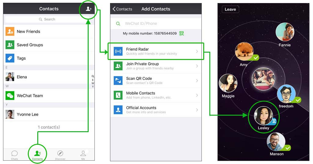
WeChat Friend Radar: https://help.wechat.com/cgi-bin/micromsg-bin/oshelpcenter?t=help_center/topic_detail&opcode=2&plat=android&lang=en&id=160526viEJBv16052626BRFv&Channel=
We discussed a lot about refining the design and interactive of Map pages. As an experienced product manager, Cutey provided examples of how other location-based apps realized prospective functions I introduced. For example, the "nearby user" function in WeChat provides an entrance point for users to add their friends. Once added as a friend, it becomes a permanent connection. For feature-level design, such as locating nearby contacts and geographical location, we discussed how vague location can help protect user privacy and its way to be displayed on the map, such as drawing a large circle to represent a "range" rather than a specific point.
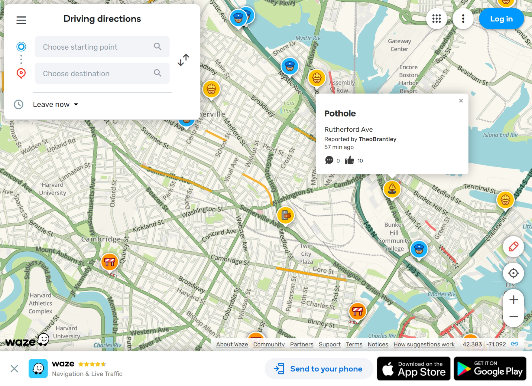
Waze User Interface: https://www.waze.com/live-map
After the user test, we discussed the trending map app, Waze, highlighting its cartoon-style interface design, its extensive social features, and its capability to meet user requirements. We discussed how Waze can guide me further to enhance the user interface. Suggestions include unifying the style and refining the way elements are represented. For Waze, they design every element in cartoon style, including a map, user icons, navigation icons, tool tips, and so on. Currently, many visual elements in the WeeHive app have different styles. It is better to polish the interface by defining one core style,
Appreciation
- Easy registration and login experiences
- Continuous experiences
- Animated elements that guide easy navigation
- Big font, easy to read
- Each function are clearly distinguishable and understandable
Suggestions
- Chat rooms: enable local users to be gathered and chat with each other
- Regional ranking: Provide a rank for nearby users to trigger user participation
- Commercial Functions: Integrating products suggestions with Q&A/blog platforms.
- Landmarks and POIs: Add key locations to the map so that users can find the desired location more easily.
- Wisely use geographic information: to establish closer connections to improve the experience of using products.
- Identity-related functions: distinguish the functionalities according to the users' identities and provide dedicated services to consumers, such as recommending beekeeping introduction and providing related products.
- Add rich text and images to posts: The current post-writing interface is limited to plain text and limited lengths. It is better to add a rich text editor and allow users to upload media, like images or videos, to the platform.
- Add rich user information to the posts: Display users' icons, nicknames, and identities next to blogs' contents to make the blog page more lively
Issues:
- Can't find the current user's location.
- Can't return to home location
- Layer switch control is too small
- Lacks direct message functions
Design Consultant
Identity Card: Xiaoyu Yang

- Xiaoyu Yang is a lecturer teaching design innovation at the University of Technology, Shanghai.
- 15+ years of cross-scale design experience.
- experience working with beekeepers
"Your app needs personalization"
Test Report
Xiaoyu was one of the advisors that helped a lot during the initial development of the WeeHive platform. So, she knows a lot about the platform's values and visions. In this section, we discussed the community platform development process and experience of using the software.
Xiaoyu quickly tested out the software, and pffer mostly positive feedbacks when trying out the app. The major concern she found is the user group. She was confused about her identity, whether the functions are designed for beekeepers or ordinary users. There should be different design and contents for different usergroups.
We then discussed the features of this software, such as its map capabilities, comprehensive interface, and blog interface. She suggests improvements in color matching to provide a more vibrant user experience. Now, the color schemes are all based on one color, and compared with competitive products, the overall color scheme is singular. She suggests adding accent color and secondary color, making the title bar white to accommodate additional colors. We also discussed methods to distinguish between different social groups by implementing varied color schemes to display different types of information.
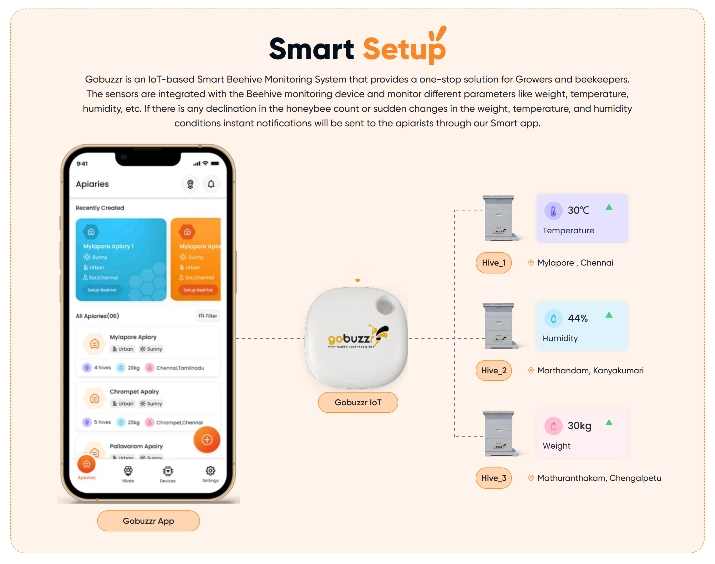
Gobuzzr's color design: https://www.gobuzzr.com/
Then, we discussed the functional design. We elaborated on functions like displaying bee colonies with beekeepers, tracking user behavior to make suggestions based on their daily usage, and offering personalized suggestions on the plaza page. She points out the color matching issue and suggests that an option can be added to allow personal color preferences. Our discussion also covered optimizing UI design for various demographics. For instance, more comprehensive content and fewer visual effects could be provided for professional beekeepers, and more intriguing visual elements to attract amateur users. Lastly, she tested out the mobile interface and found it easy to use.
She suggested that details such as the user's present location and recent activities can be annotated on the map. The user details on the map are folded, so it takes her a while to find out how to interact with the markers. Then, she points out a potential privacy concern with the marker function, given that a precise location may make the user uncomfortable.
Appreciation
- The overall design matches WeeHive's inclusive value
- The interface is easy to understand, and each functions is clearly defined
- Uniform color matching and interface elements
- Fast and responsive experience
Suggestions:
- Try removing the color of the title bar and adding secondary color and accent color to the app.
- Try using color to distinguish between user and post types.
- Make the Plaza page more lively by adding activity and post suggestion widgets.
- Adding customizable theme color options.
- Providing two versions of the user interface targeting different user groups.
- Take care of user privacy when displaying locations and track activities.
Issues:
- Lacks personalization functionalities
- User location sharing and activity tracking privacy issues
Design Flaws
🔴 (high priority) 🟠 (medium priority) 🟡 (low priority)
Map page
- 🔴 There is no distinct marker to distinguish the self from other users
- 🟡 Limited information showing the users' states
- 🔴 Collapsed markers for every user at initial states
- 🟠 The color scheme of the map markers does not match
Plaza page
- 🟠 The abstract map needs improvement on the information shown
- 🟠 The blog underneath the plaza page should not be a duplicate of the blog page. We may think of a better way of showing a limited number of blogs by recommending trends.
- 🟠 The plaza page has limited information about the users themselves. We may design a better interface to show the user's profile and design the plaza page as a comprehensive landing page for recent posts, user profiles, the abstract map, and user relationships.
Connection between the abstracted map and the actual map
- 🟠 Confusing logic from the abstracted regional map to the actual map, if the user is directed to another region, there should be a return home button to locate their current location
- 🟠 Doesn't need to show the animation every time; may record the user state for the initial visit or coming back to the same page
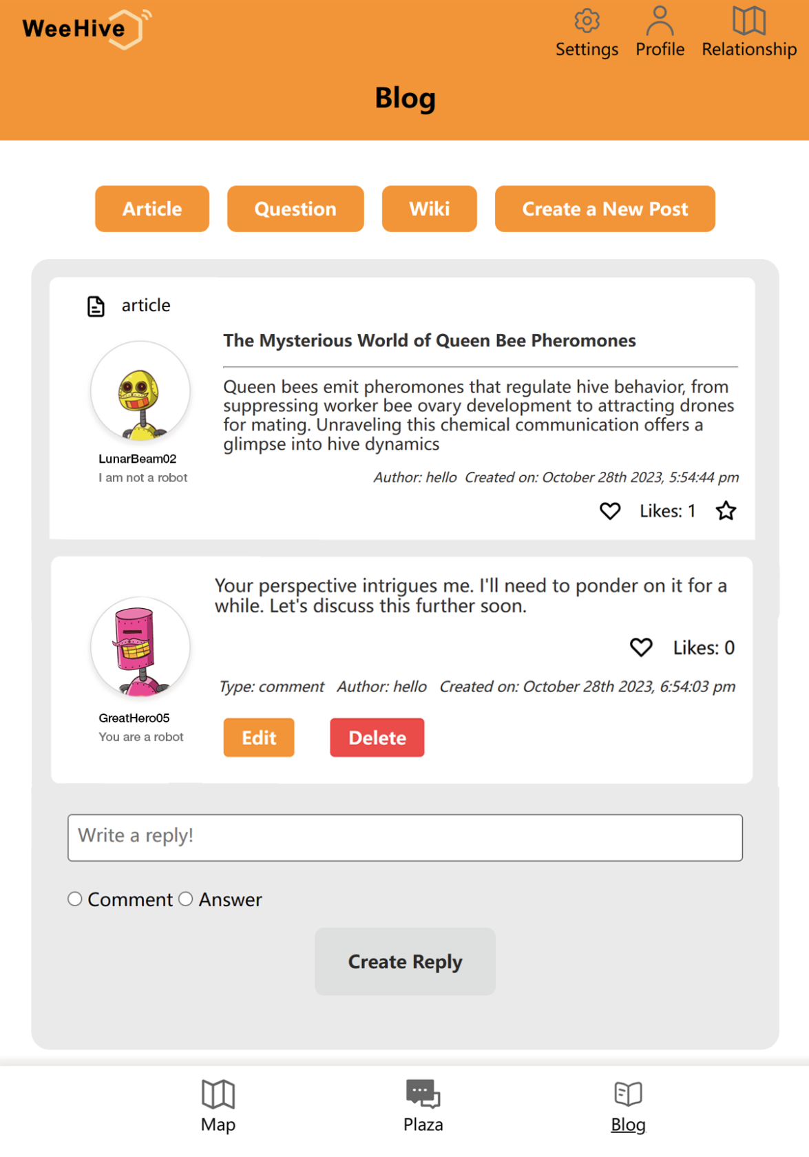 Refined blog page after user test
Blog Page
- 🔴 The formatting of replies doesn't fit with the posts' formatting
- 🔴 No paging for blogs
- 🟠 No user icon or detailed information next to the post contents
Details
- 🔴 On the initial page (logout stage), the "Login" text doesn't reflect the "Registration" action, which may confuse the new user.
Features to be implemented and bugs
- 🟠 Post directly from the map page
- 🟠 Hierarchical relationships, including friends and partners
- 🔴 The replies don't automatically refresh after the posted
- 🟡 Dynamic diagram of the plaza page showing the current users' distribution
Opportunities
🟠 User Customization & Personalization:
- Develop user preferences and tailor the app experience to each user's unique needs. This can range from theme colors to content preferences, providing a more engaging and user-centric experience.
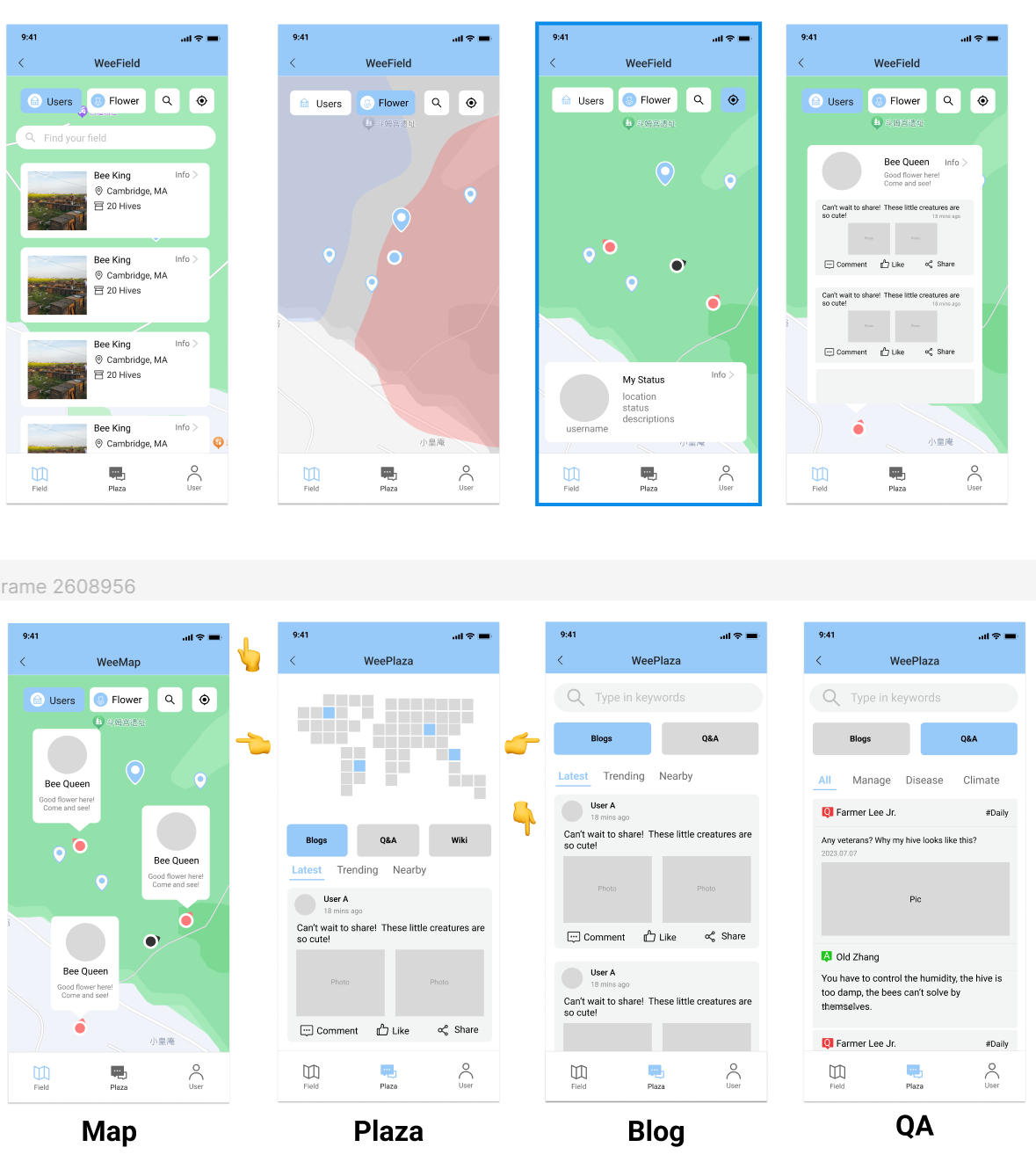
🟠 Social Features Enhancements, Gamification & Challenges:
- Develop features like group chat rooms or local community forums where users can discuss specific topics, share experiences, or collaborate on projects.
- Introduce gamified features with the map where users can participate in challenges, earn badges, or unlock achievements to provide opportunities for users to interact
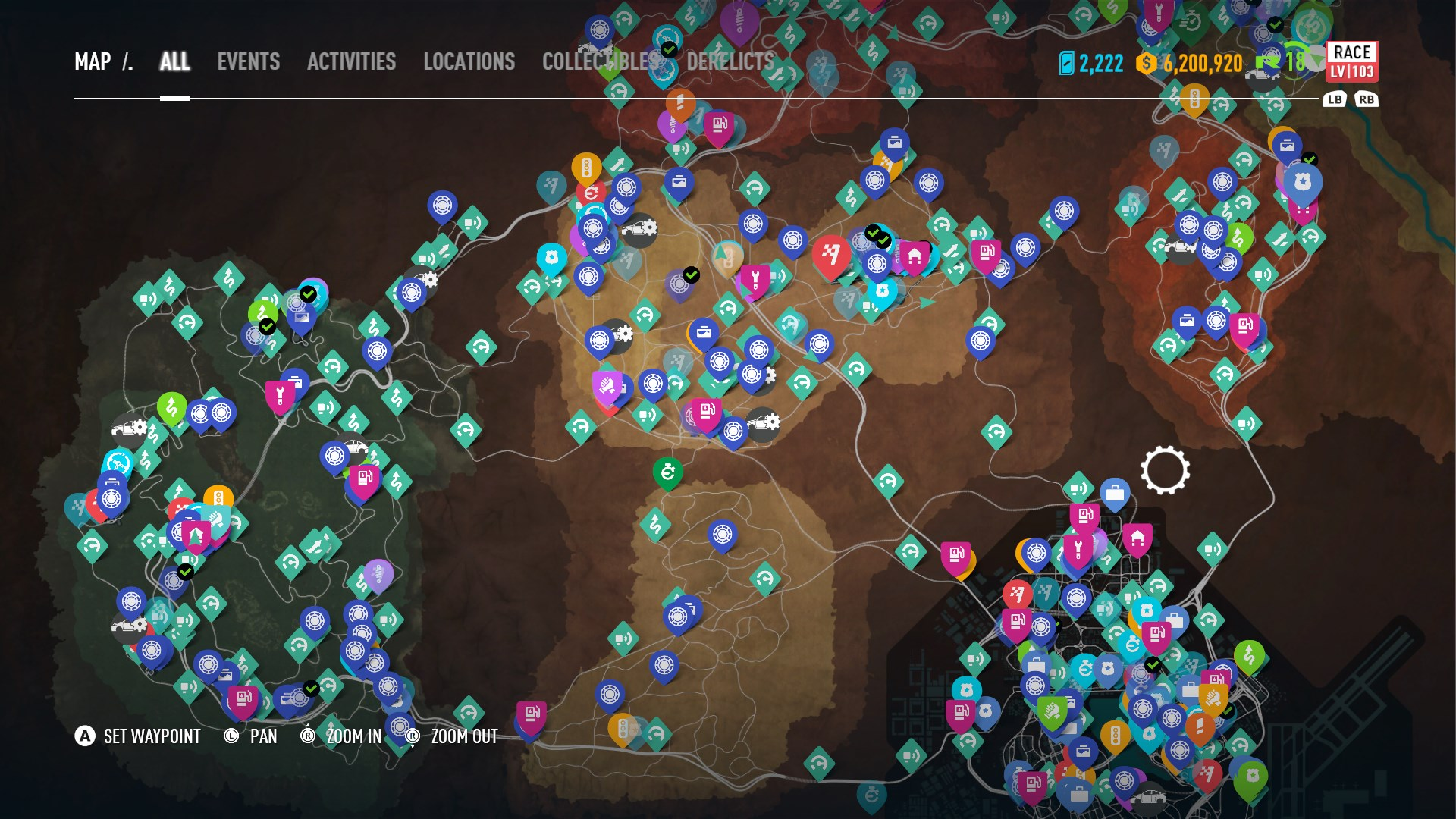
Event map of Need For Speed Game: https://nfsmods.xyz/mod/1162
🟡 Learning & Skill Development Contents for Amateur users
- Incorporate learning modules or tutorials for amateur beekeepers, providing expert content, videos, and interactive learning opportunities. This can turn the platform into an educational hub for both beginners and professionals.
🟡 Provide Entrances to existing eCommerce platforms
- Introduce entrances for linking online shops for products. Users may not purchase directly from the platform, but they can be directed to external websites
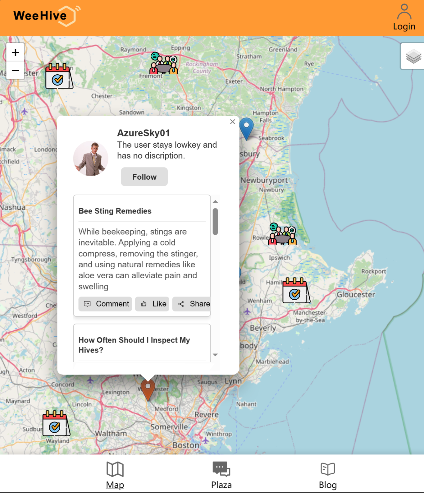 Refined map page after user test
🔴 Privacy Enhancements:
- Offer privacy options and protect users' precise location and activities.
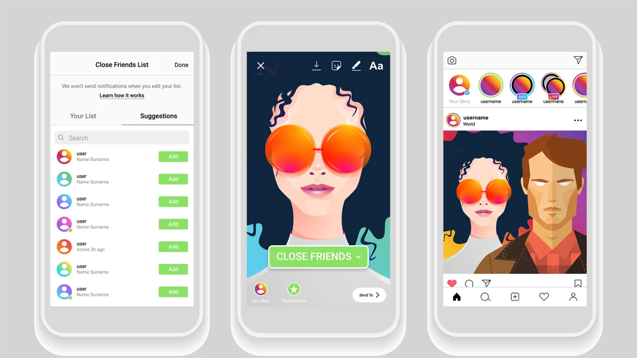
Instagram's close friends concept: https://mashable.com/article/how-to-create-and-post-close-friends-story-instagram
🔴 Collaborations & Partnerships:
- Partner with beekeeping organizations, experts, and influencers to bring exclusive content, such as webinar information, to the platform. This can enhance the platform's credibility and provide valuable resources for users.