Chapter 5: Frontend Design Document - Alpha

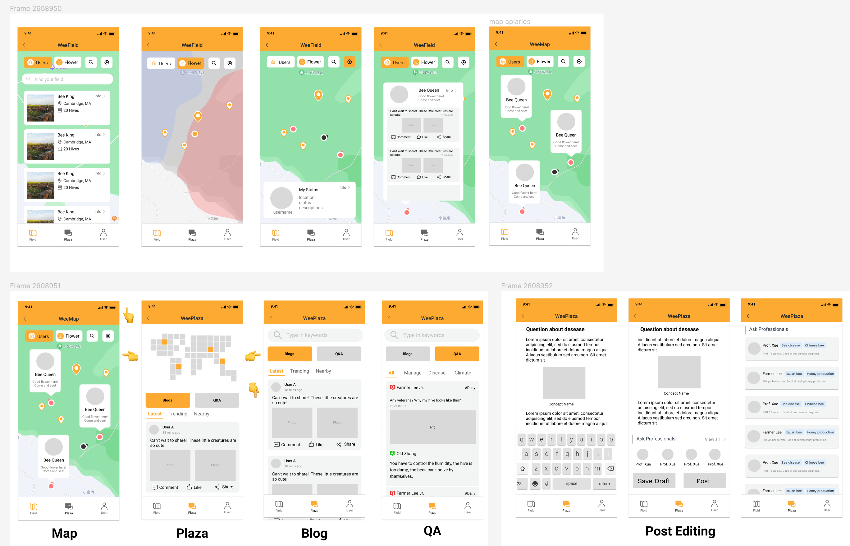
Fig.1 Current Wireframe
Heuristic Evaluation
Learnability:
Positive:
- Clarity: The app's main page contains entries for the main functions for the user, helping users understand the core functionalities at a glance.
- Universal Symbols: Most features have an understandable name depicting their underlying logic.
- Similarity: The post-user journey is close to the blog and chat system. It reduces the users’ learning time by migrating their existing experiences to edit or react to commands.
- Consistency: The app uses icons and colors uniformly, facilitating easy and quick recognition.
- Contextual Understanding: A user’s icon always appears when the username appears, which maintains consistency and familiarity. Also, it facilitates the user to identify themselves and other users.
- Recognizability: Each screen only focuses on one core function and has distinct layouts. Make it easier to recognize and remember.
Improvement Suggestion:
- Guidance: It may be difficult for newcomers to understand the swipe navigation. We may provide visual advice and offer an onboarding tutorial.
- Intuitive Symbols: The markers on the map are general; using intuitive icons such as a flower or bee would be easier to understand.
- Optimized Layout: Some entries with detailed info are hard to notice. We may guide such entries.
- Feedback: We may provide visual feedback for each operation
Accessibility:
Positive:
- Visibility: Large buttons and high-contrast, bright colors ensure the app is usable by those with visual impairments.
- Spacing and integrating: Adequate space around buttons and merging the icons and texts as a big button reduces unintentional clicks and improves usability.
- Readability: The font size and style chosen for comments and posts are more significant than regular apps, which are friendly to senior users.
Improvement Suggestion:
- Customization: As mentioned in the functional design, we should offer options like big font, big button, night mode, and high contrast mode for users who need further accessibility.
- Screen Reader Support and Alt Text: Use the HTML 5 accessibility features, incorporating descriptions for visual elements and alternative text for images and button labels.
- Voice input and messages: Integrating voice command capabilities can be
- Greyscale Contract: Check the contrast without color to ensure a balanced difference.
Physical Heuristics:
Fitt’s Law:
Positive:
- Reduced index of difficulty: Important actions, like "Post" and "Save Draft," are showcased through large, easily clickable buttons, which are more accessible for the user to identify.
- Aggregated Layout: Common functions, like sub-functions for post-editing or map layer control, each function’s icons are placed next to each other, reducing the time to complete a movement.
- Hot corner: Frequently accessed buttons, such as "Back" and "Next,” are placed at the corner of the screen, allowing imprecise movement and reducing the chance of user error.
Improvement Suggestion:
- Multi-platform optimization: consider the finger, digital pen, and mouse and how to make design decisions that improve usability under Fitt’s law under different input methods.
- Reduced Error: Increasing space between closely placed buttons can reduce accidental clicks.
- Customization: (Optional but an excellent idea) Draggable or customizable elements could enable users to rearrange interface elements per their preferences, reducing the time for the users for their frequently used functions.
Situational context:
Positive:
- Self and Peer User Awareness: Using a Map, users know their and other users’ positions.
- Seamless Transitions: Movement between sections is fluid, ensuring users are not disoriented.
- Highlighted Selected Navigation Icons: When navigated to each section, the navigation icons for that section change color to show the user what page they are on.
Improvement Suggestion:
- Provide Visual Feedback for operations: Giving real-time feedback like animations or color shifts to confirm user interactions,
- Visual Cues: Design more visual elements corresponding to states, such as icon selected/not selected, post reaction, and map display modes
- Progress Indicators: Showing a progress bar or step indicator when the app is loading, retrieving data, or processing data
Linguistic Level:
Positive:
- Clarity: The app tried to use simple, concise language for all features and elements, making it easy for users of all language proficiencies to understand.
- Consistency: Terminologies and phrases used throughout the app remain consistent, minimizing confusion.
Improvement Suggestion:
- Multi-Language Support: Enabling users to change the app's language
- Cultural considerations: Certain regions may have different writing habits, such as Hebrew and Arabic read from right to left. Everything from text alignment to UI layout must be mirrored for these languages.
- Error and Feedback: Provide clear, accessible error messages that allow non-technical users to recognize what is not properly functioning
Deployment:
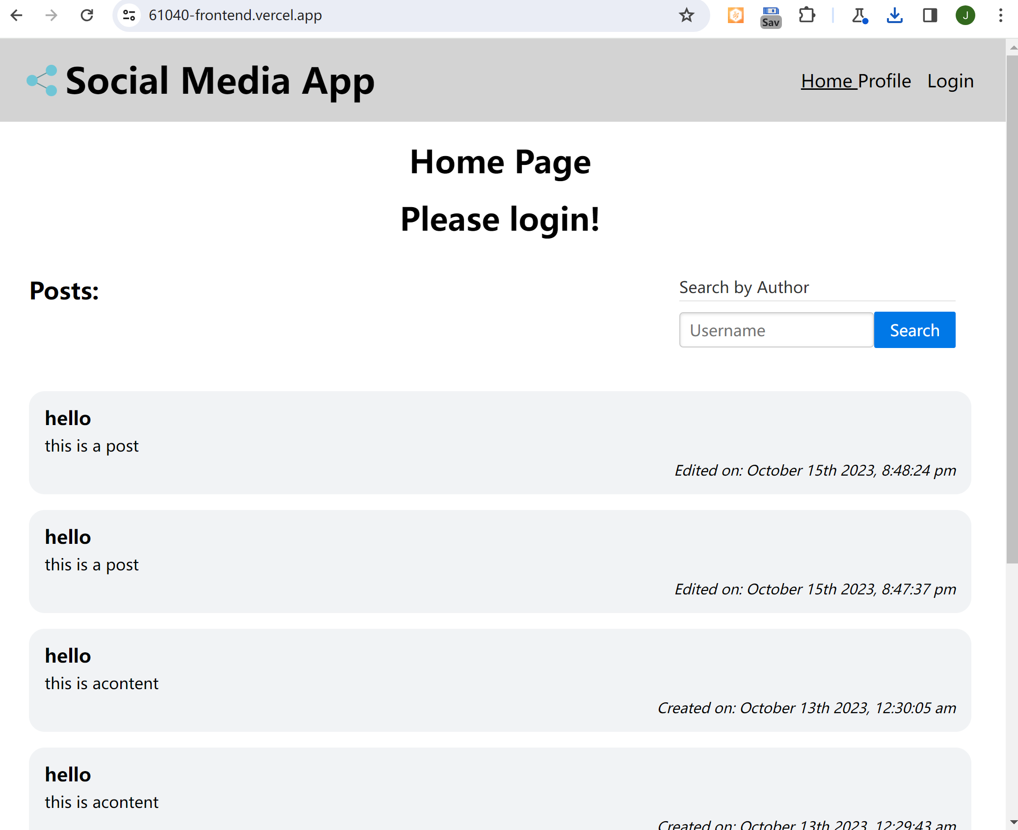
Deployed URL: 61040-frontend.vercel.app
GitHub Repo: https://github.com/srcJin/61040-frontend


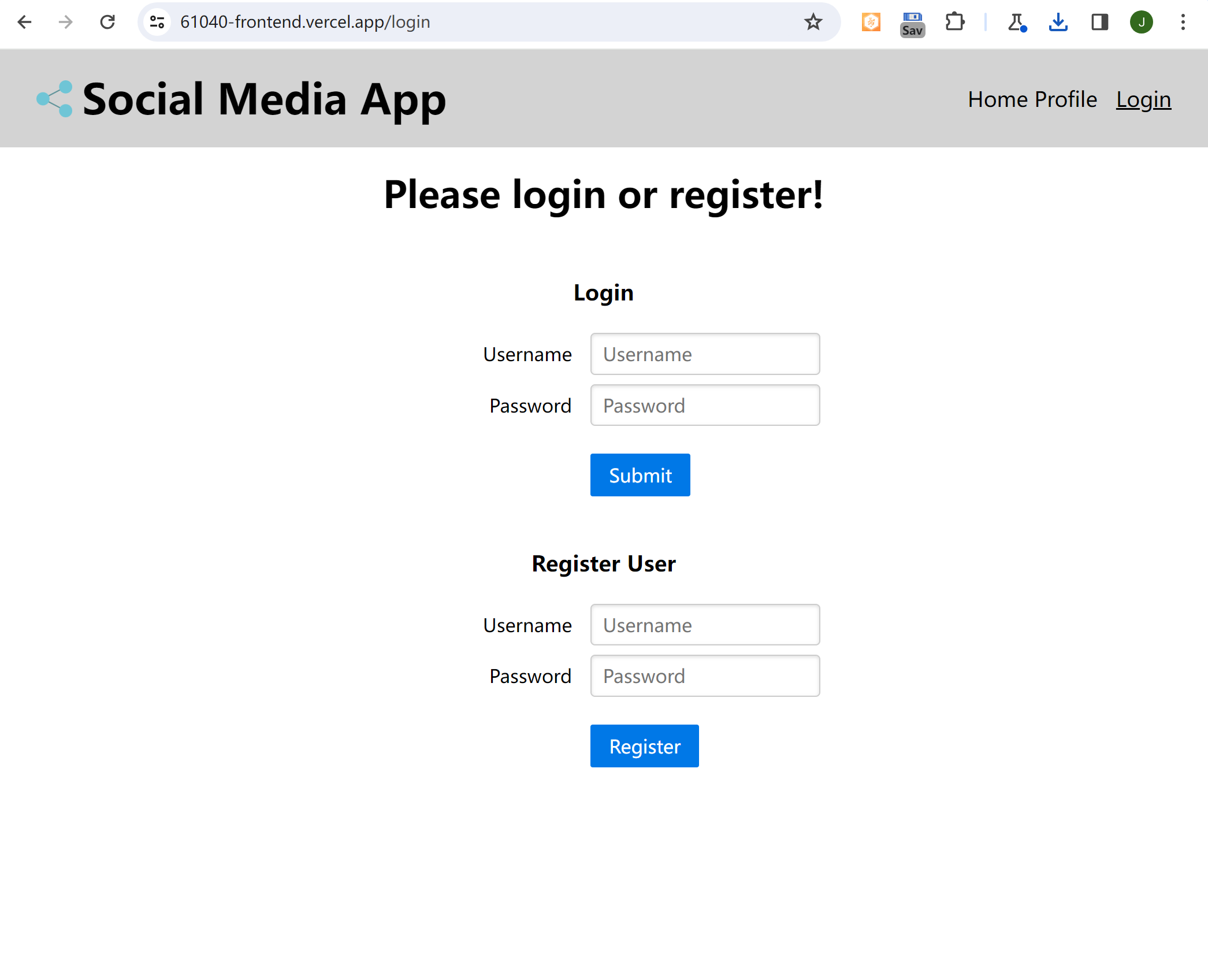
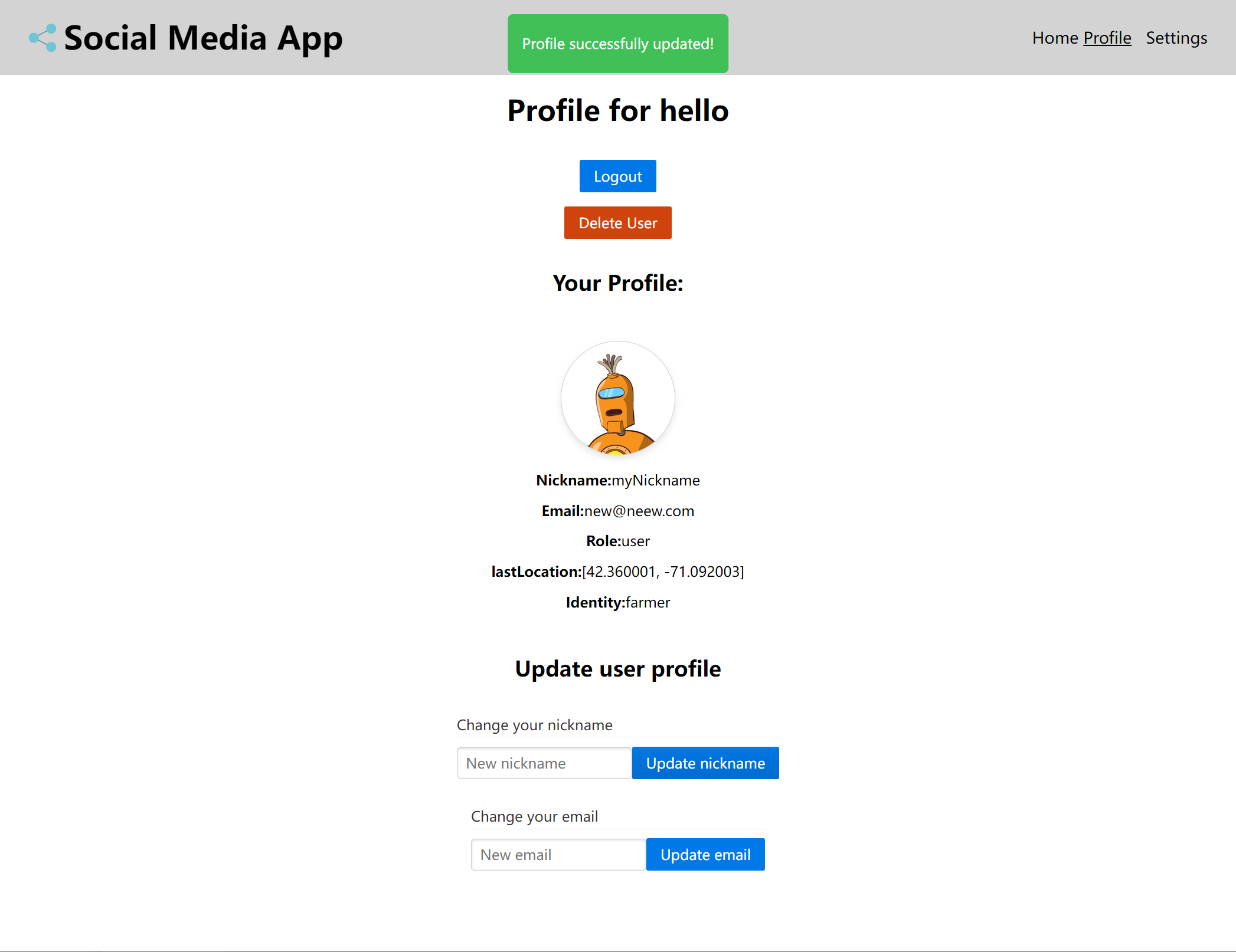
To test out the frontend profile function, you can use the username and password below:
jsx
username: hello
password: worldusername: hello
password: worldjsx
username: hello2
password: worldusername: hello2
password: world