Chapter 3: Convergent Design Document
Pitch

WeeHive presents an innovative vision for a decentralized, data-driven agricultural platform that aims to bring stability and sweetness to our uncertain climate future. At its core, WeeHive creates a supportive network for beekeepers who generate, collaborate, and learn new knowledge to tackle the serious challenges of harsh climate conditions together.
For its social media component, WeeHive provides a location-based world map for all the beekeepers to share their experiences, photos, and best practices. Both novices and experts from different parts of the world can connect, share, and learn from one another. To foster deeper discussions, the platform also provides an interactive forum where beekeepers can discuss specific topics, ask questions, or seek advice by posting texts, voices, data, photos, and videos.
Eventually, we aim to go beyond the bee industry to trigger a broader, smarter agriculture community with a new generation of farmer groups backed by technologies and survival wisdom in a new climate era. This small change will bring new life into a timeless and essential industry.
Functional Design
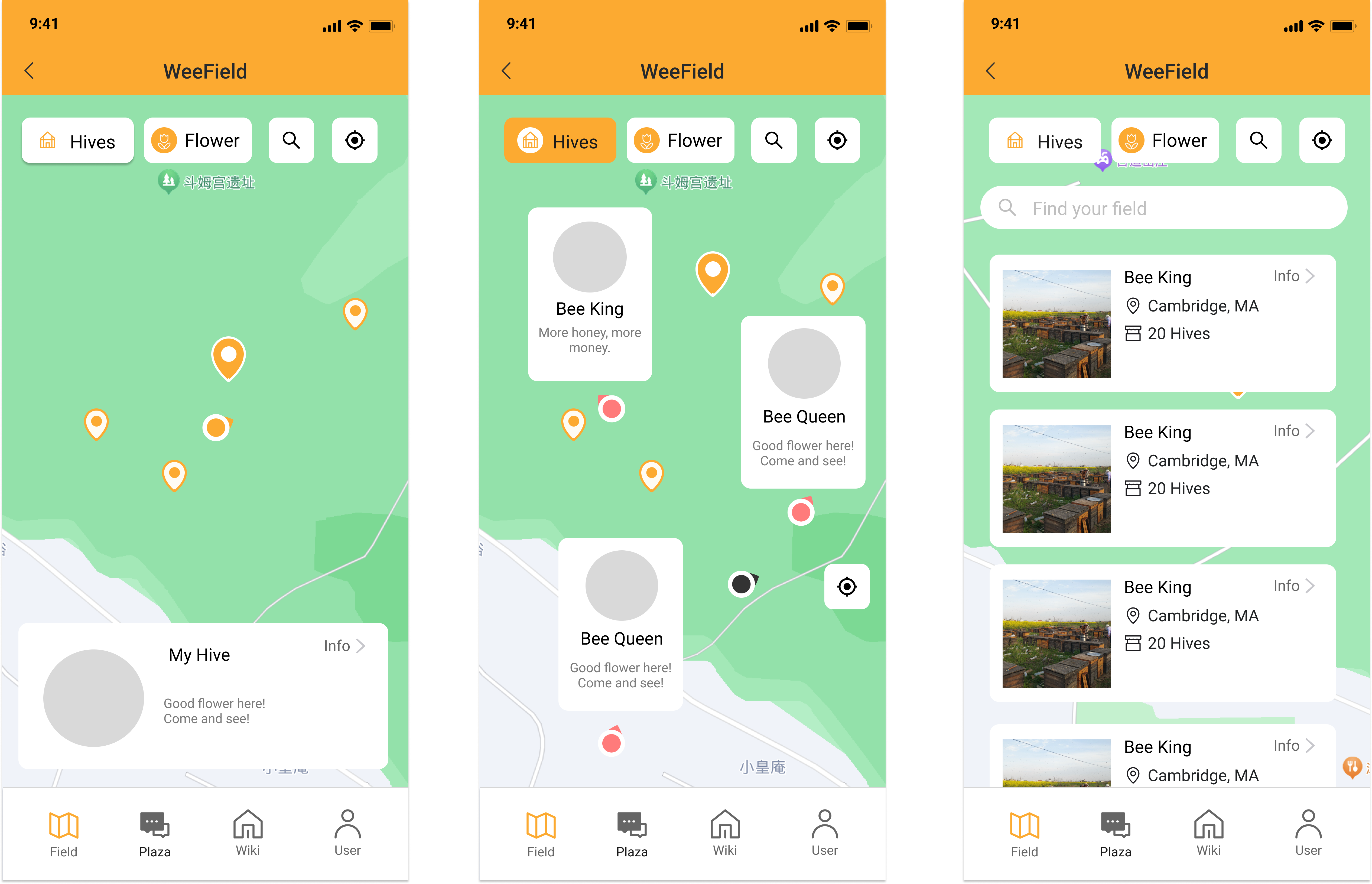
The WeeField: Location-Driven Interactive Map (Core Function)
- Priority 0 Functions
- Navigation: Users can navigate the map using gestures to zoom in/out and pan.
- Surrounding: Nearby users can identify each other, but not precise position if not partner relationship
- User Markers: Display markers represent beekeepers and their hives' location.
- User Card: When clicking the user marker, pop up a user card with their info and recent posts
- Announcement Card: user can post their message to let all the surrounding users see their announcement
- Follow, Comment, and Like Users can use the user card or the announcement card as an entry point to follow the user, like or common beneath the post
- Priority 1 Functions
- Flower Zone: Users can see the distribution of the flower spots, like a heat map
- Flower Calendar: Select a location, display the flower calendar of the month, and zoom out for the year
- Notifications and Alerts: Display notifications and alerts for two cases: flower zone identified or extreme weather condition
- Yield Estimation: Based on related (pseudo for this project) data
- Check-in: Once they arrive at a new place, the users will be able to create a checkpoint post to show off their achievement
- Route Calculation: Using Mapbox Navigation API, users can get a route from their current location towards the dedicated zone
- Interactive Layering: Users can toggle flower zones on or off the map, filtering by flower type, bloom period, or yield estimation.
- Priority 0 Functions
The WeePlaza: Data-Driven Online Forum
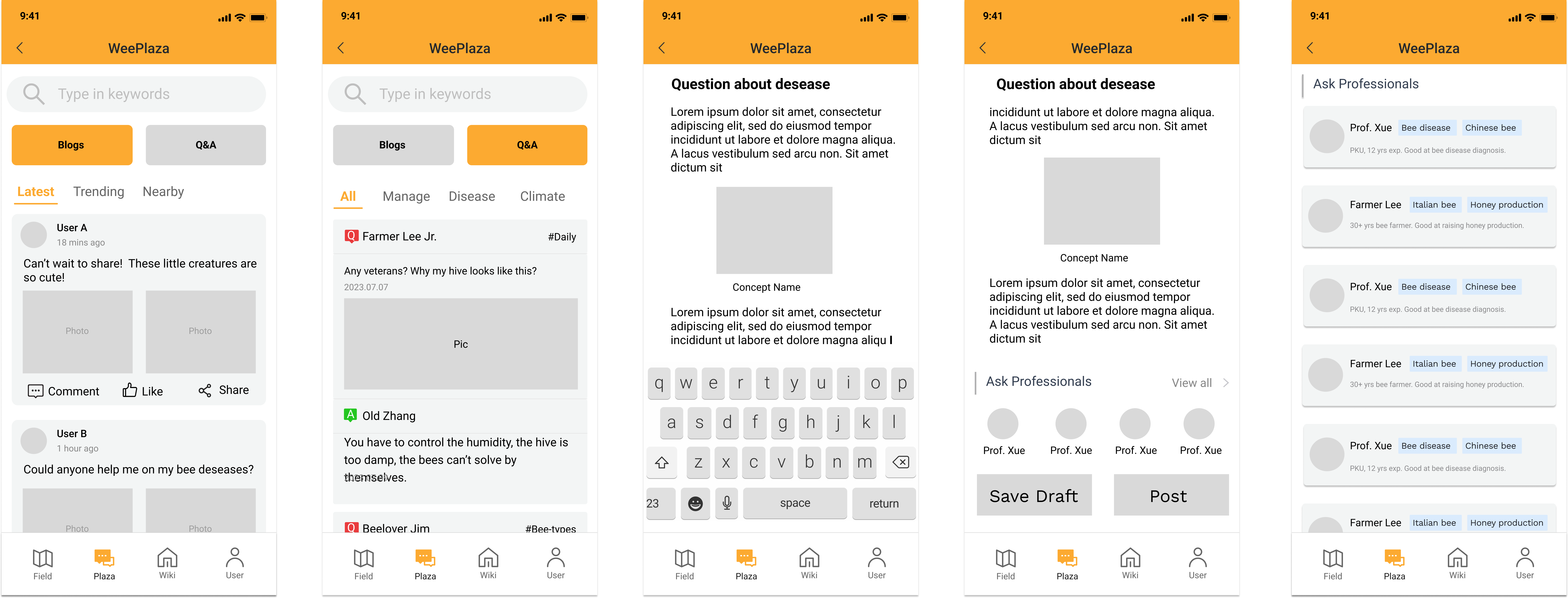
- Blog: Post informative articles to the platform
- Q & A: ask and answer question
- Expert Inquiry(Optional) : ask questions to “expert” identity users
- Hive Analytics (Optional): Post the question with the hive data
User page
- Register, login, logout, edit profile, delete account
- Semi-anonymous identity: New users can join the platform with a nickname of their choice without revealing their real name.
- Honor and Rewards: Active users will be awarded prices that can show with others
- (Optional) Hive management: register, update or delete hives under one's account
- (Optional) Identity verification: Normal users can submit necessary documents or undergo a process to verify their identity; once approved, they unlock corresponding identities, such as "beekeeper" or "expert," to distinguish them from normal users.
Accessibility Features
- Fieldwork Mode: Optimized for the fieldwork environment, big font and icons, big buttons, simplified layout, and high contrast color theme
- Senior mode: Similar to fieldwork mode, but without high contrast theme
- (Optional) Dark mode
Optional Feature List:
Here are some optional features that may exceed the time constrain. But want to share it here for the initegrity of the app design.
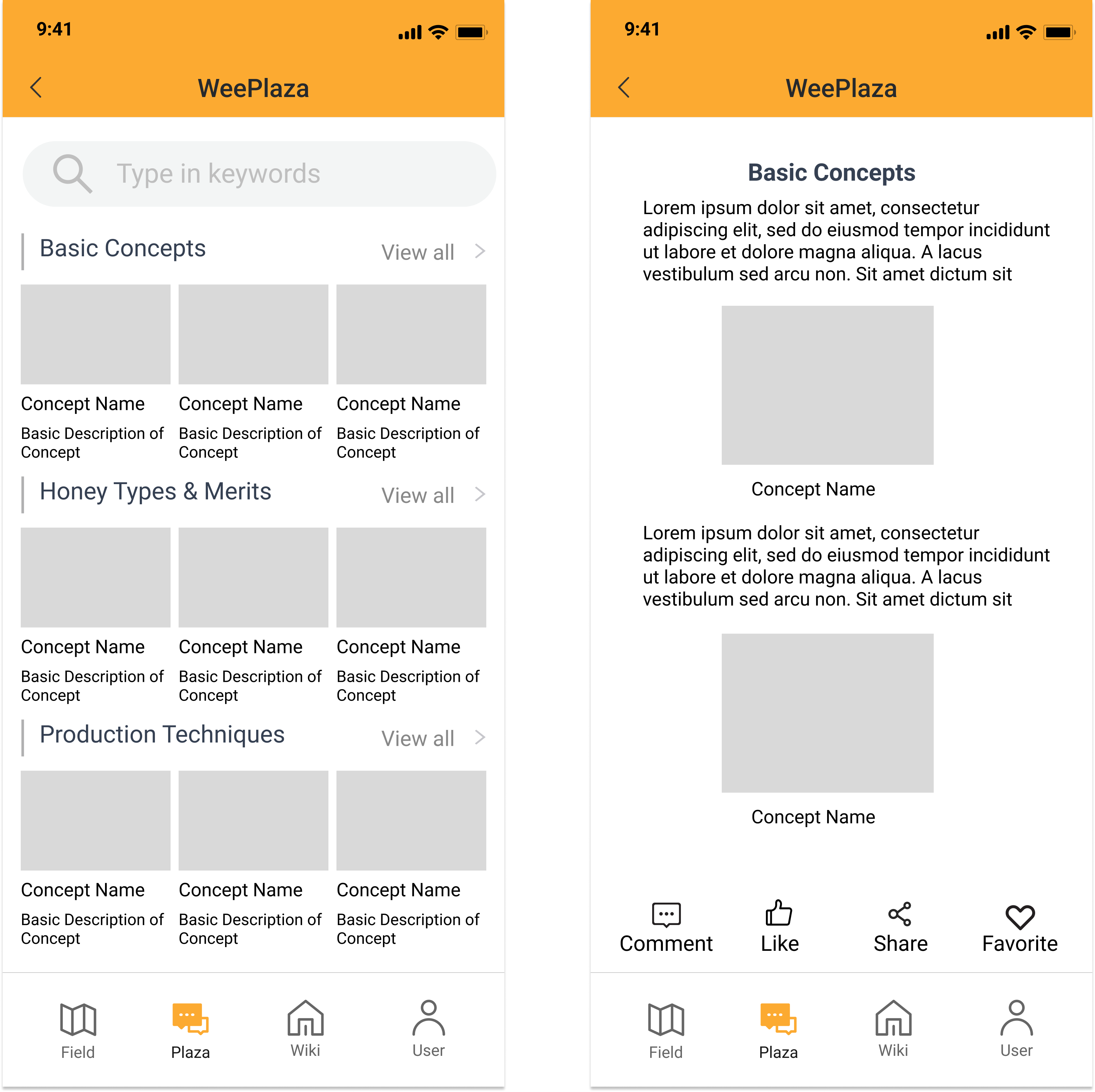
The WeeWiki: Interactive Beekeeping Knowledge Base
- Interactive contents: Display text, 3D animation and videos to show beekeeping techniques
- Bookmark, Comment, Share: User can mark a page as their needed page, comment below a page to discuss the content, and share the page with other social media
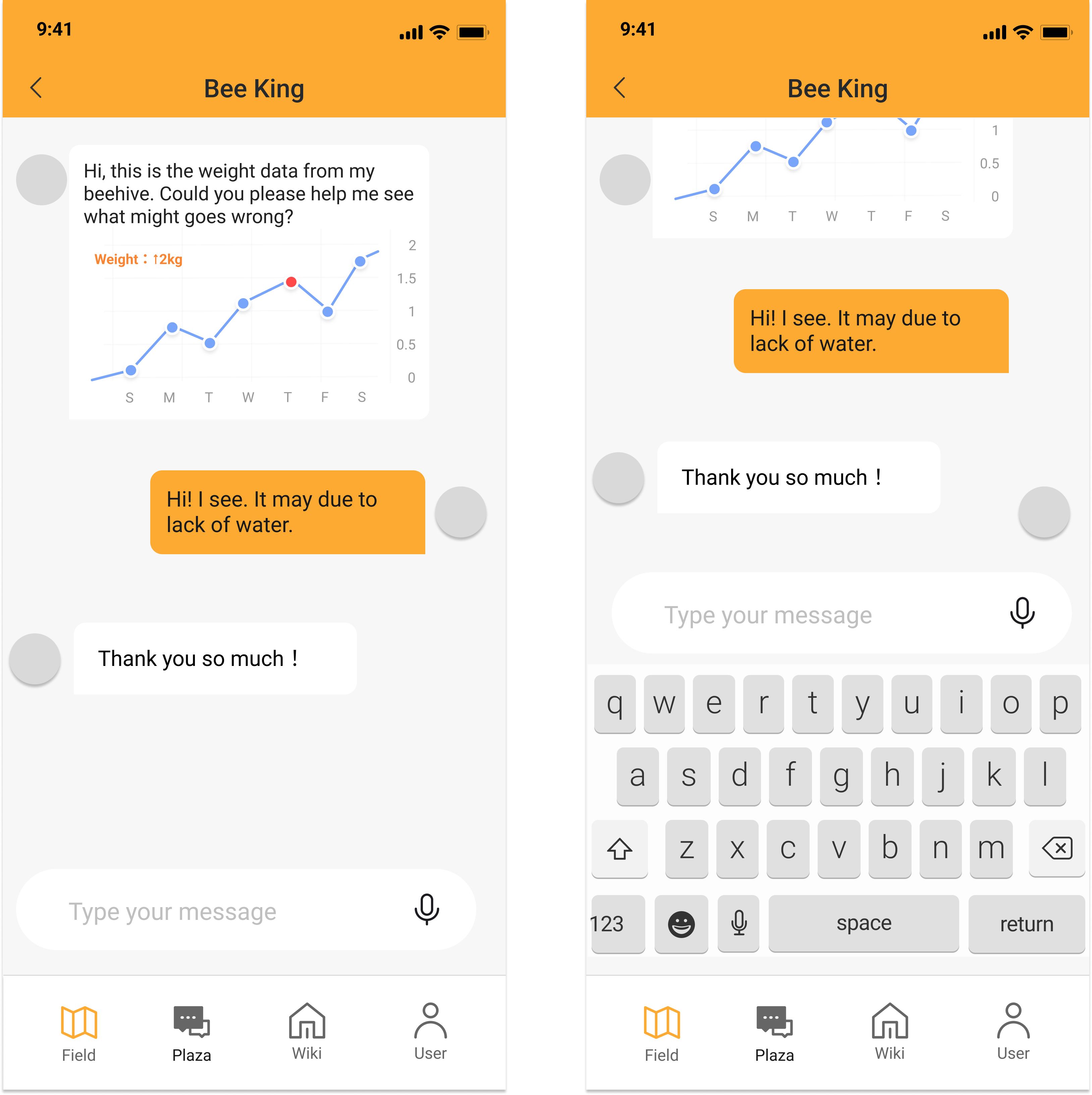
WeeChat: Direct Messaging Page
- Two registered users can send direct messages on a separate page
- Send rich text messages, including sound, video, and images, and have sensor data
Theme: Users can define a theme color for their UI
Voice Commands: Users can control the app via voice commands. Considering the limitations of web apps, may be difficult to achieve
Concepts
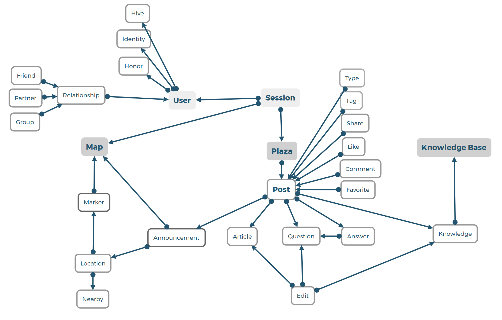
This time, I have re-framed the concept dependency map. First, I removed the unnecessary concepts like market and peer-review. And I reconstructed the "post" concept to make it a reusable concept that is suitable for contents across different functions. All the posts are rich text content with images and videos. However, I added a "Type" concept to identify the content types. For example, the informative article is a post with "article" type, that identifies it as not answerable content, while the "question" has "question" Type, making it can be displayed as a question that requires answers.
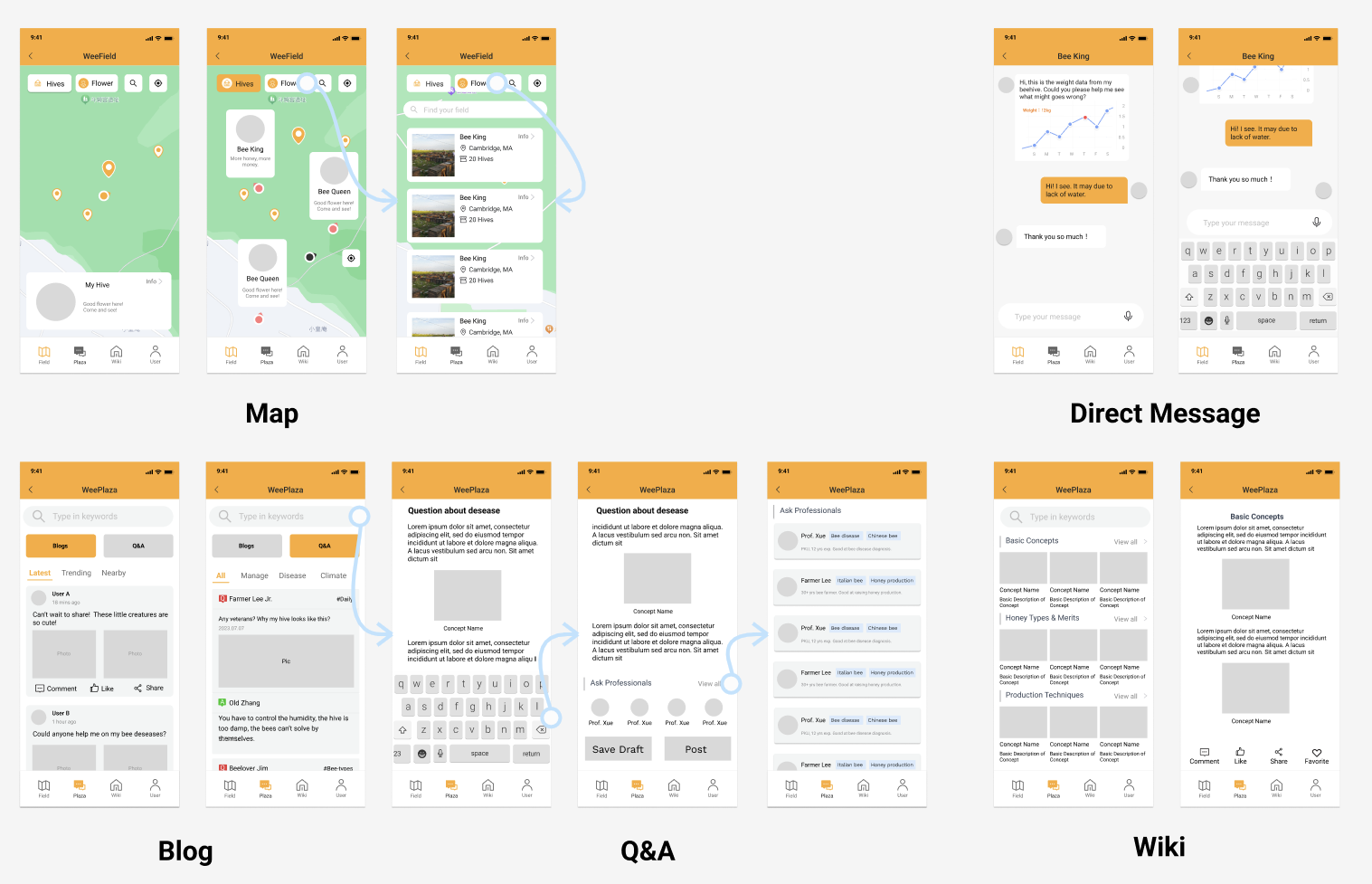
Wireframes Overview (also integrated with function design)
Design Tradeoffs
1. The Choice of Adding the Market Function
Concerns:
- Time limit: Complex workflow that not feasible in time constraints
- Security and trust issue: a function involves financial transactions requires a high level of security.
Alternative solutions
- Consider market expansion in the future when designing concepts
- Redirect the user to a professional trading provider
- Serve as a bridge, not a merchant
Decision outcome
Eventually, I decided to drop the market function for this prototype. Because I prefer to focus on the location-based community functions, which are unique among competitive products.
2. Customizability
Concerns:
There will be numerous parameters that can be customized in this app, what will be the ones to be customized by the user?
Under what design principle that we select the customization parameters
Alternative solution:
- Automatically decide based on time, age, and scenario
- Offering limited control for the user, let the developer decide which is the best, to keep it simple
- Make the default interface suitable for most people and give the number a series of customizable options.
Decision outcome:
- Using themes and display modes to pack parameter changes
- The first three modes are relatively easier and can be achieved with the same method of dark mode and high contrast mode.
- dark/light mode
- high contrast mode
- Visibility mode
- This mode requires more work because it is a whole set of design decisions. We need to hide complex features and tweak the layouts due to font/text size changes.
- The first three modes are relatively easier and can be achieved with the same method of dark mode and high contrast mode.
3. The level of user anonymity and security
Concerns:
The app should establish a line between online relationships and potential offline relationships.
How to prevent misuse and trolling by designing a proper user identity structure.
How to make the user feel free to speak and express their true feeling.
Alternative Options:
Complete anonymity
Pros: Users can share and communicate without fear of personal identification, which can encourage open discussions.
Cons: Complete anonymity can lead to misuse, including trolling, harassment, or the spread of misinformation. Besides, it may be difficult for users to establish long-term trust.
Complete Real Name
Pros: Users might trust the platform more when they know they're interacting with real people, thus will facilitate offline interactions, which could be useful in farming scenarios.
Cons: Users might be uncomfortable sharing their real names due to privacy concerns. There can be identity theft or malicious uses. Users might self-censor from sharing their genuine opinions.
Decision outcome:
Eventually, I came up with a 3-tier structure for peer relationships, the relationship will affect the content visibility.
"Stranger"
- Nicknames
- Vague location (city or region level)
- Sending 3 direct messages before the other respond
- First 10 posts visible by others by default (configurable)
- Comment or like public posts
- Visibility to public profile details
"Friend"
- Nicknames
- Vague location
- Sending unlimited direct messages between friends
- Follow one's posts, comment, or like public posts
- Visibility to more profile details (configurable)
"Partner"
- Real names (forceful, but not visible until request)
- Precise location (with user's consent)
- Unlimited direct messages with priority notification
- Follow one's posts
- Exclusive access to posts with "partner" level visibility (like "close friends" on Instagram)
- Collaborative features (e.g., shared calendars, to-do lists, or projects)
- Option to share personal contact details (like phone number or email, based on user's discretion)
- Special badges indicating the 'Partner' status for easier identification
4. Redesign of the "post" concept
Concerns: The "post" is the core concept that connects with nearly all the functions. When I first designed the post concept, I had a concern that I made it too complex. I made it a preliminary concept that relates to its child concept for each function. For example, an "article" is a separate concept derived from "post". Then I talked with TA and realized that "post" can be a generalized concept for rich texts that can be applied to all the scenarios when the user publishes something. It doesn't need to be split into multiple concepts. Instead, we can specify a "type" parameter to each "post" in order to classify them.
Alternative Options:
- Split the post concept into multiple concepts: article, comment, knowledge...
- Make two kinds of content concepts: "post" and "comment". Because comment relies on posts to exist.
Decision outcome: I'll try to generalize all the user-published content as "post", and classify them using inner parameters including "type", "tag" and "dependencies". By improving the Genericity of the "post" concept, the new "post" concept is more Scalable. If the app adds more functions, it can be achieved by assigning another "type" to the "post", without having to rewrite a new concept. I do feel it increases the independence and scalability of the concept design.