Assignment 5: Frontend Design & Implementation
Heuristic Evaluation:
Usability Criteria:
Learnability:
- Overall the app displays good learnability in its functionality due to its familiarity to other social media apps like Instagram and Twitter (posts) or Reddit (comments).
- One aspect that might pose a learnability challenge may be the concept of the SpotLite, since that is new and not seen in any other social media apps. A possible occurrence that may happen due to this unfamiliarity may be that a user may want to make a post even if they have not been selected to be in the SpotLite. A solution to this could be informative error messages to help the learnability if users try to do something not allowed. Also the UI can be dynamic and change based on whether they are a SpotLiter or not. For example, the post page can be disabled when they are not a SpotLiter, with a message informing them why they can't post at the moment.
Efficiency:
- The app has good efficiency in that comments are structured by tiers, and users can click on a comment to close that comment tree to quickly read through various comment threads.
- The efficiency could be improved as in the wireframes, the comments only display after clicking into a post, which is an extra step for people just scrolling on the feed and wanting to see some comments. This however is a tradeoff between pleasantness and efficiency; where the feed can stay clean and uncluttered if the comments are on a separate page, but it introduces an extra step to view the comments. Thus, a possible solution could be to have highlighted or newest comments show up on the home feed under the post, which keeps the feed clean and allows users to have a quick preview of what others are saying without needing to click into viewing another comment page. Under this, there can be a 'see more' button for viewers to see more comments if they are interested.
Physical Heuristics:
Situational context:
- The app could improve on the situational context by changing the app’s appearance if the user is selected as a SpotLiter. This way the user is reminded of their special status and is more encouraged to participate.
- The app could also improve on situational context by changing the appearance of the app when the user is in anonymous mode or not, to remind the user of their state.
Perceptual fusion:
- The app can have a loader message to account for loading delays
- The app could also have an animation screen at the beginning/end of each week when the SpotLiters are being selected. This can both account for any possible delays and also act as a transition to get users excited for the new SpotLite round.
Linguistic level:
Information Scent:
- The app displays good information scent by having recognizable icons in the upper right hand corner that users can click on to create a post or view their profile
- The app could use better information scent on the home page feed where users may not know that they can to view more comments. This might be remedied by having the top comment previews as mentioned above, and also having a ‘view more’ option below.
Consistency:
- The app demonstrates good consistency where the app shows familiar concepts like comment trees from Reddit and familiar icons like arrows and profile icons, as well as language like “SpotLite” and “SpotLiter”.
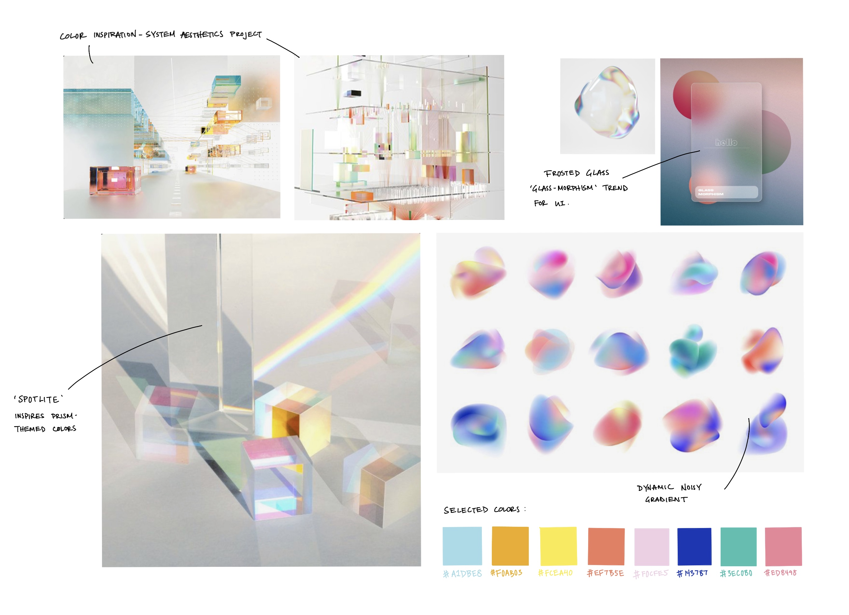
- The app could further improve its consistency by having a strong visual language and colors that correspond to the theme of 'spotlights'. For example, the color scheme can be based on colorful lights similar to theatre spot lights or prism refractions.
Visual Design Study:
Color:

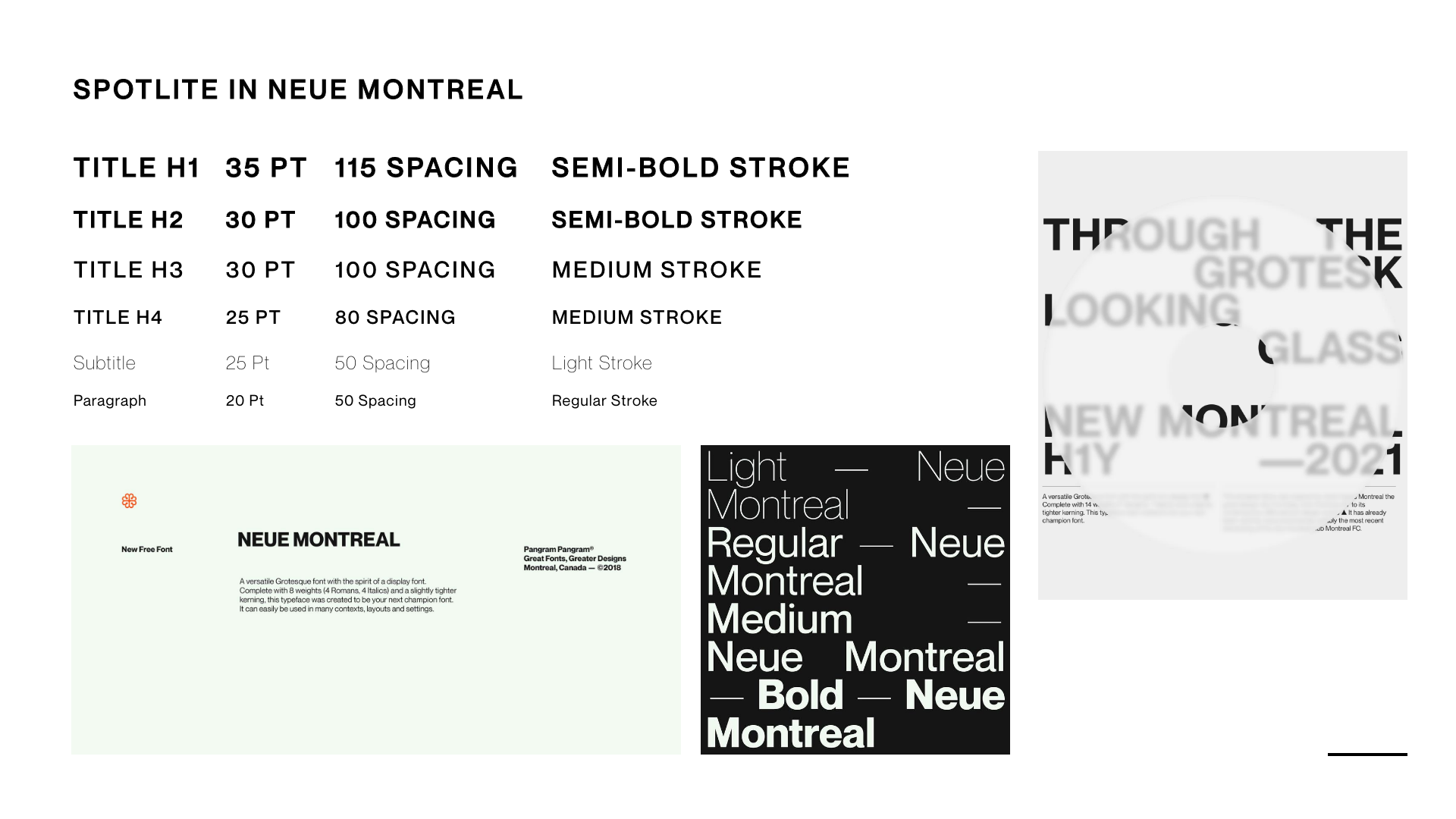
Font:

Link to Deployed Site:
https://spotlite-frontend.vercel.app/