Design Innovation: Corner
One of the coolest apps that I've come across recently is Corner. It recently launched a few months ago, and I think it has the potential to become successful.
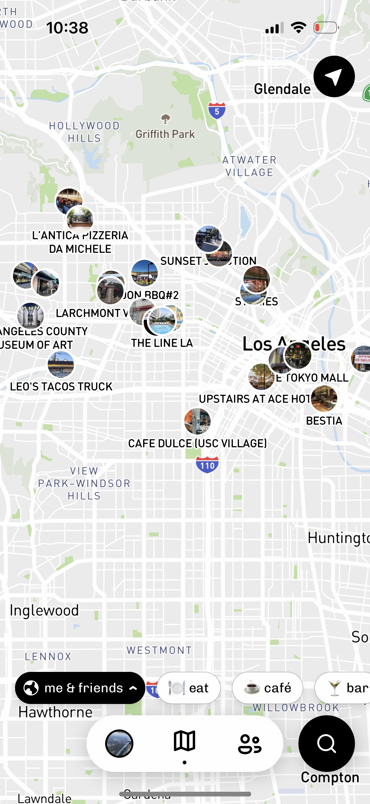
Upon first glance, Corner may seem like a Yelp or Google Maps wannabe. However, Corner's strengths lie in its innovative combinations of simple existing concepts. At its most basic level, Corner enables users to create lists of places that they've enjoyed in a city and share them with their friends. Thus, the main crux of Corner is that it presents you with places (restaurants, shops, museums, parks, etc.) that your friends have enjoyed; rather than show you recommendations based on strangers' reviews, Corner uses your friends' trusted opinions. One of Corner's most interesting features, for instance, is a map view where you can see all the places in a city that your friends would recommend going to. By performing a simple sync of map, list, and friend concepts, Corner provides users with truly personalized sets of recommendations. (Puzzlingly, this feature was present in Corner's beta versions but seems to have been taken out in a recent update—I hope they bring it back!)

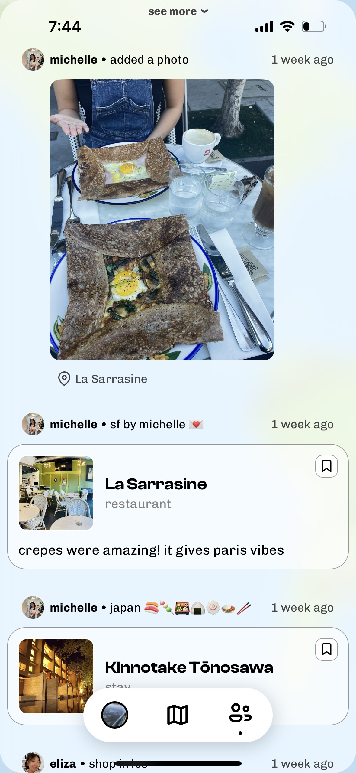
Furthermore, Corner synced the concepts of list, friend, and feed by filling users' feeds with automatically generated posts of their friends' latest updates to their lists, in chronological order: this enables users to keep track of what places their friends have been going to and enjoying recently. This seemingly simple combination results in a recommendation app that is fundamentally a social media app at its core, making discovering and going to new places a fun social experience.
