UI Visual Design Analysis: MIT DUSP's Website Redesign
In lecture on Monday, we discussed several components of good visual design. As an 11-6 major, I often visit the Department of Urban Studies and Planning (DUSP) website. In 2022, it finally got a much-needed redesign – let's take a look at the before and after.
Old Design
Below is a screenshot of the landing page of the old website, which existed until 2022. In my opinion, it does a poor job of achieving the objective of guiding users: its structure doesn't clearly indicate the importance of different parts, and it's difficult to easily locate actions on the page.
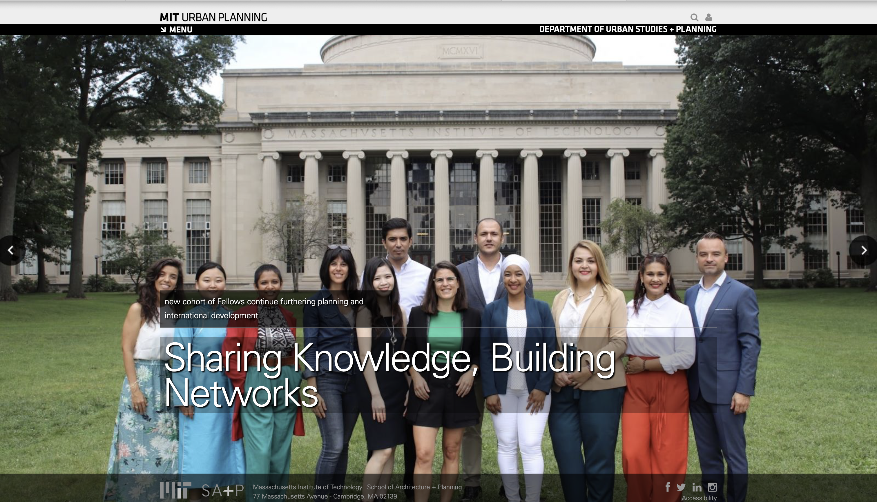
Regarding the layout of the page, it's unclear how to navigate it or go to another part of the website. Additionally, there are some strange choices regarding the text: the department name at the top is just so small, and I also thought it was strange that the description of the article featured was above its main title.
The color choices also have a lot of room for improvement: the black menu at the top blends in with the photo — it's hard to distinguish it as the foreground or an important element. Additionally, the text in the footer menu is hard to read (and only becomes harder to read when you hover over it, because it turns an even darker gray).
Below is the page with the main menu expanded:
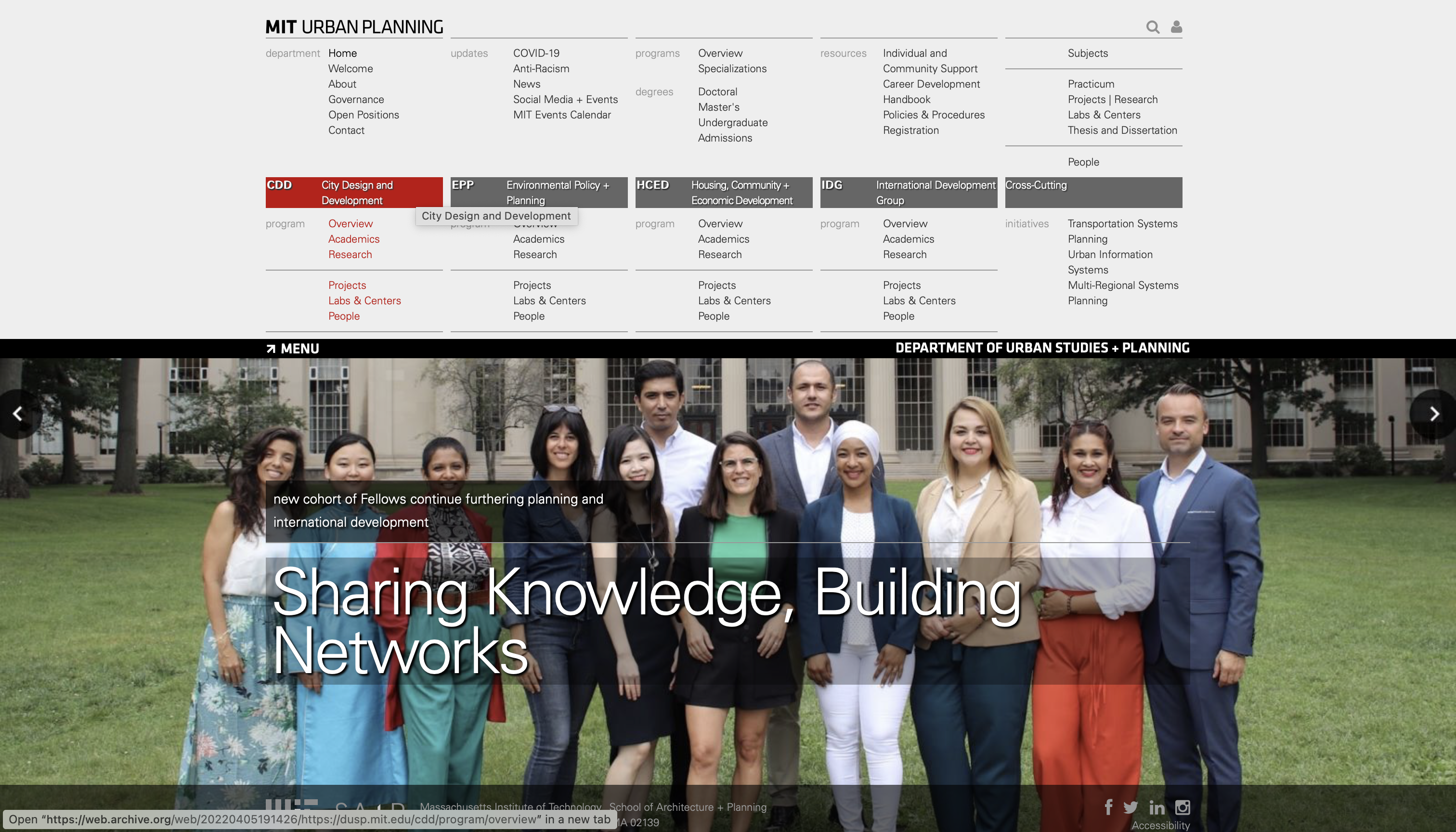
The layout of this menu is overwhelming (just too much content!) and the font size is way too small. Also, the menu button moves down as well after being clicked on, which is confusing!
New Design
Here's the newly redesigned website:
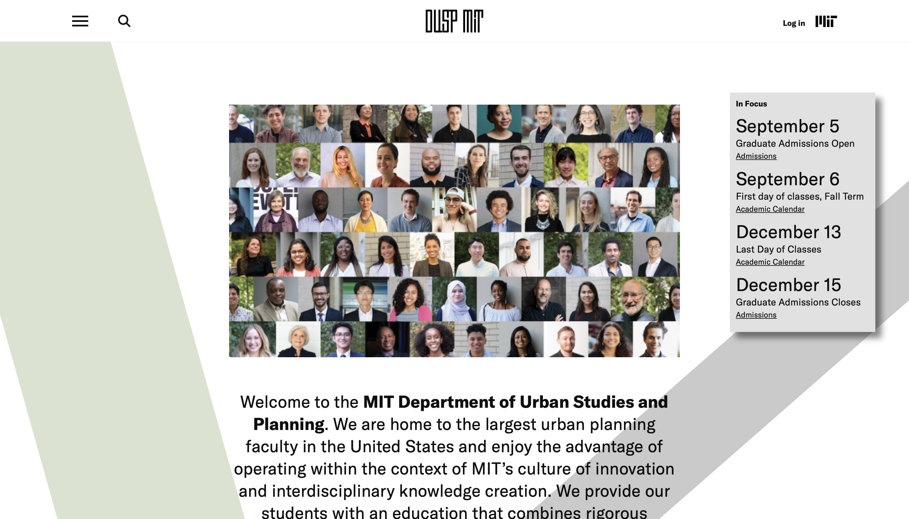
Overall, this website feels a lot more welcoming and calming. The white background is pleasant to look at, and the splash of green adds some interesting contrast. We're greeted by a collage of student and faculty photos, and between the department logo at the top and name bolded in the main paragraph, it's finally clear whose website it is.
Additionally, the content grouped together in the gray box on the right is now actually relevant to students (both prospective and current) visiting the page.
The news articles are also now grouped together in a much less overwhelming layout:
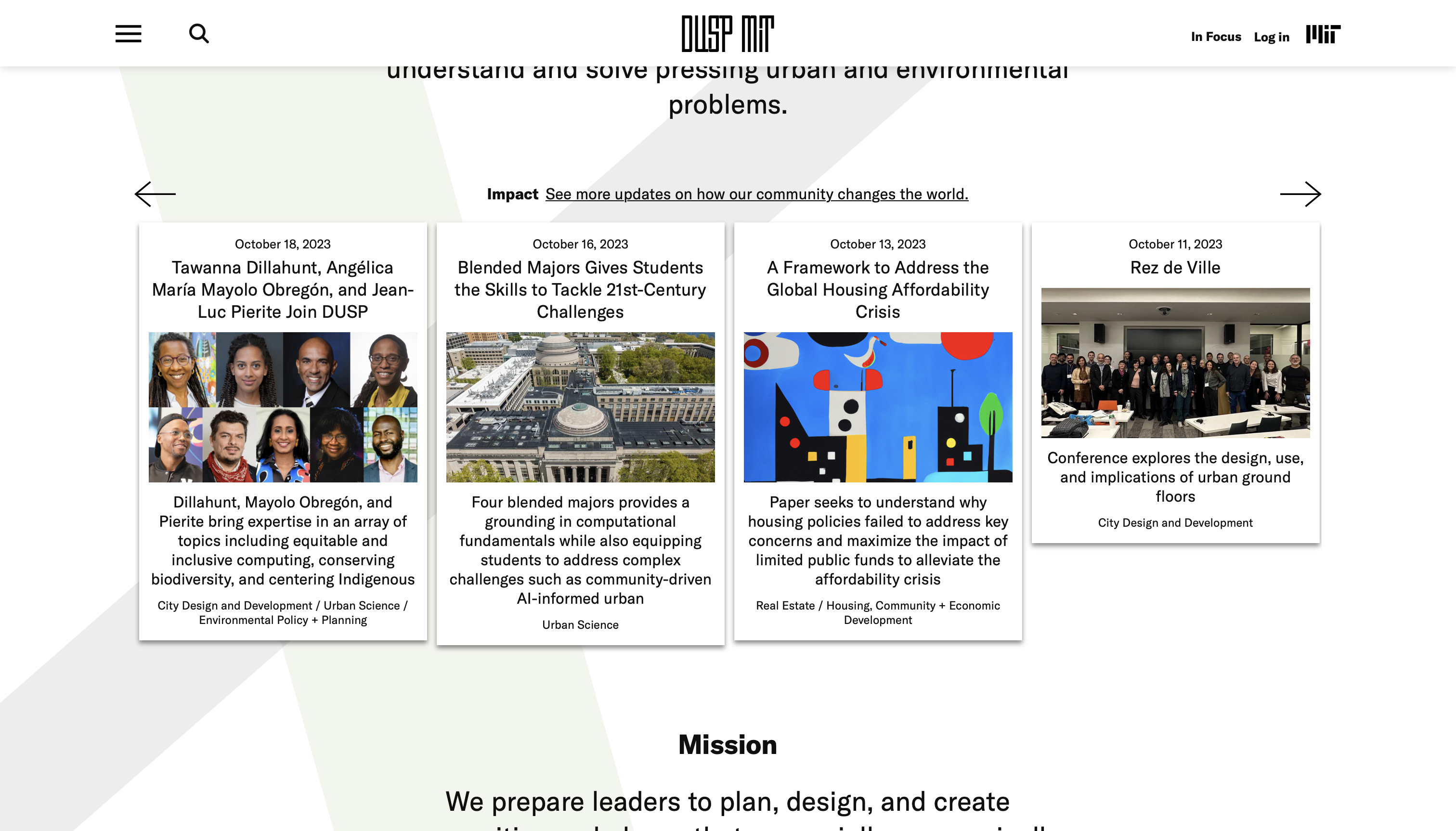
Finally, the menu's layout has also been redesigned to include larger text with content grouped into dropdowns, so users aren't presented with every single option all at once.
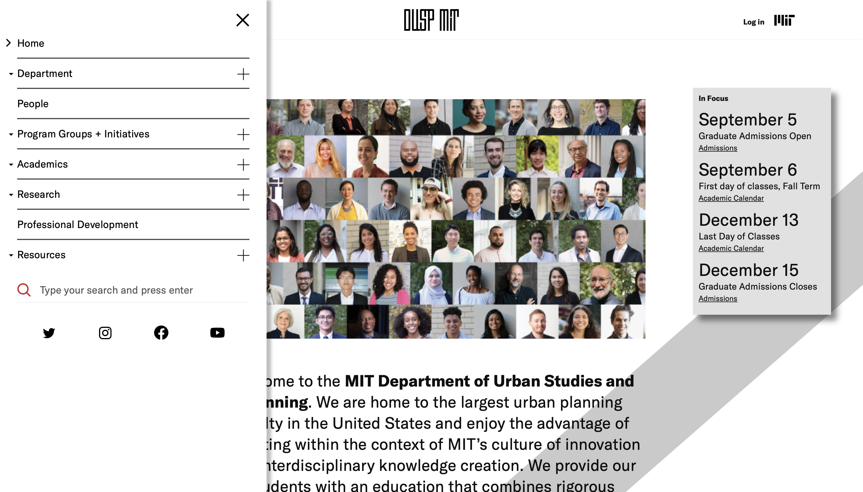
All in all, a much needed redesign!