UI Comparison: Apple Maps vs. Google Maps
In lecture on Wednesday, we discussed several criteria and heuristics for evaluating and improving the usability of user interfaces. Below, I sought to apply a few of them to an analysis of Apple Maps versus Google Maps.
Pleasantness
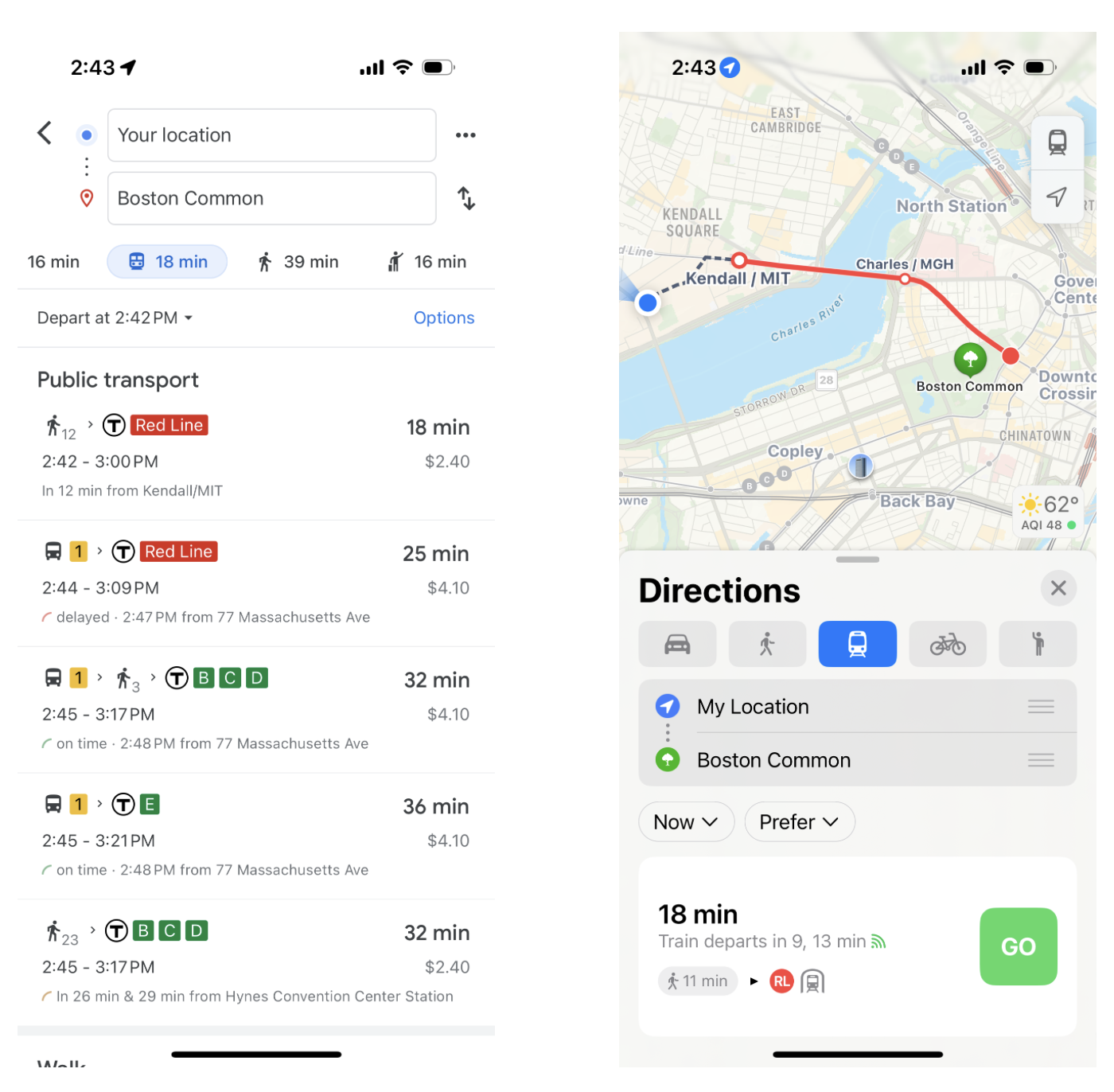
One of the most significant differences between the two apps is the overall simplicity of their UI, which contributes to the pleasantness of the user experience. Google Maps incorporates much more information into both the map view and navigational directions. Below is an example of the difference in transit directions (Google Maps on the left; Apple Maps on the right):

While Google Maps includes information like the ticket price and easily-viewable trip time comparison for other modes (in addition to many more bus and train options in the transit list, which is interesting...), the UI obscures the actual map and has the potential to be more overwhelming for users than Apple's simplified design.
Short paths
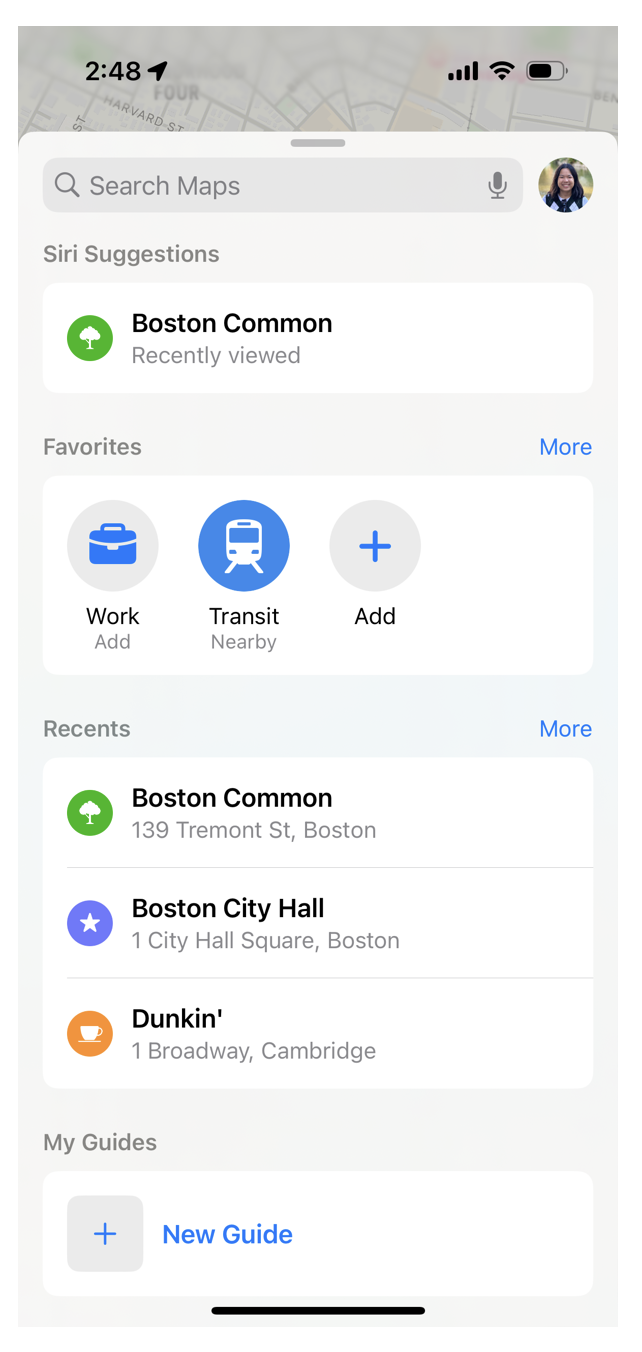
Unlike Google Maps, Apple Maps includes shortcuts to the user's most frequently visited destinations ("Favorites") within the main menu (shown below). Along with the Suggestions and Recents sections, this—as discussed in lecture—minimizes the number of steps that users have to take to reach commonly accessed functions within the app.

(In contrast, Google Maps opens to an explore page that assumes that the user is new to the area being viewed and only shows suggestions for tourist desinations and hotels.)
Accelerators
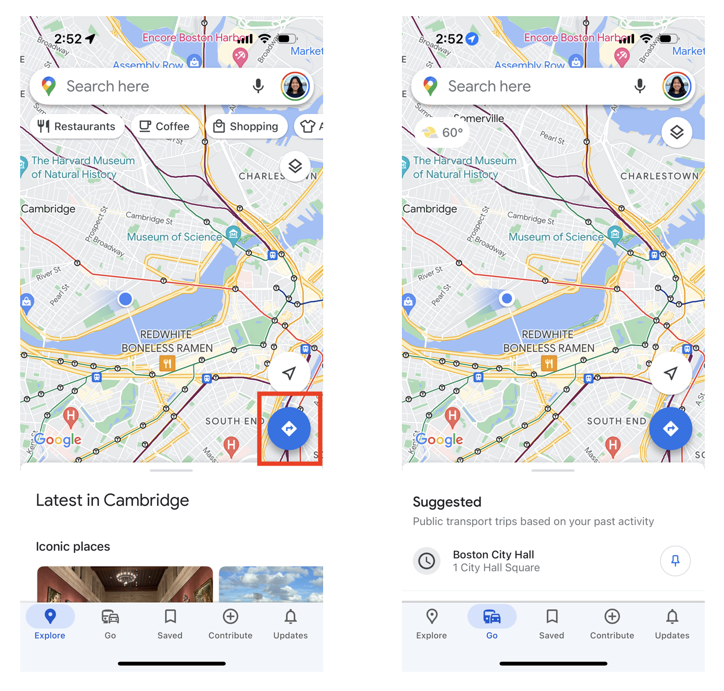
Finally, Google Maps offers an accelerator that Apple Maps lacks. Clicking the Navigation button (outlined in red in the left screenshot below) pulls up a menu in which entering a destination immediately returns directions to it, rather than more general information about it like using the search bar at the top of the screen would return instead.
However, one less successful attempt an accelerator is the "Go" page (the right screenshot below). Aside from the removal of the location categories at the top of the screen and the change in the menu at the bottom, all other elements of the pages retain the same behavior. As a user, I would have assumed that switching to the Go page would enable me to immediately access directions upon searching for a destination through the search bar. To me, the two pages seem redundant (which is something that Apple Maps appears to agree with, since it only contains a single page).

Overall, the two apps' UIs prioritize different elements of functionality, and it's interesting to see the diverging approaches that they take!