Instagram’s Questionable Sharing Buttons Redesign
In lecture yesterday, Professor Jackson’s example of Zoom reactions as an overloaded concept reminded me of Instagram’s recent redesign of two key buttons.
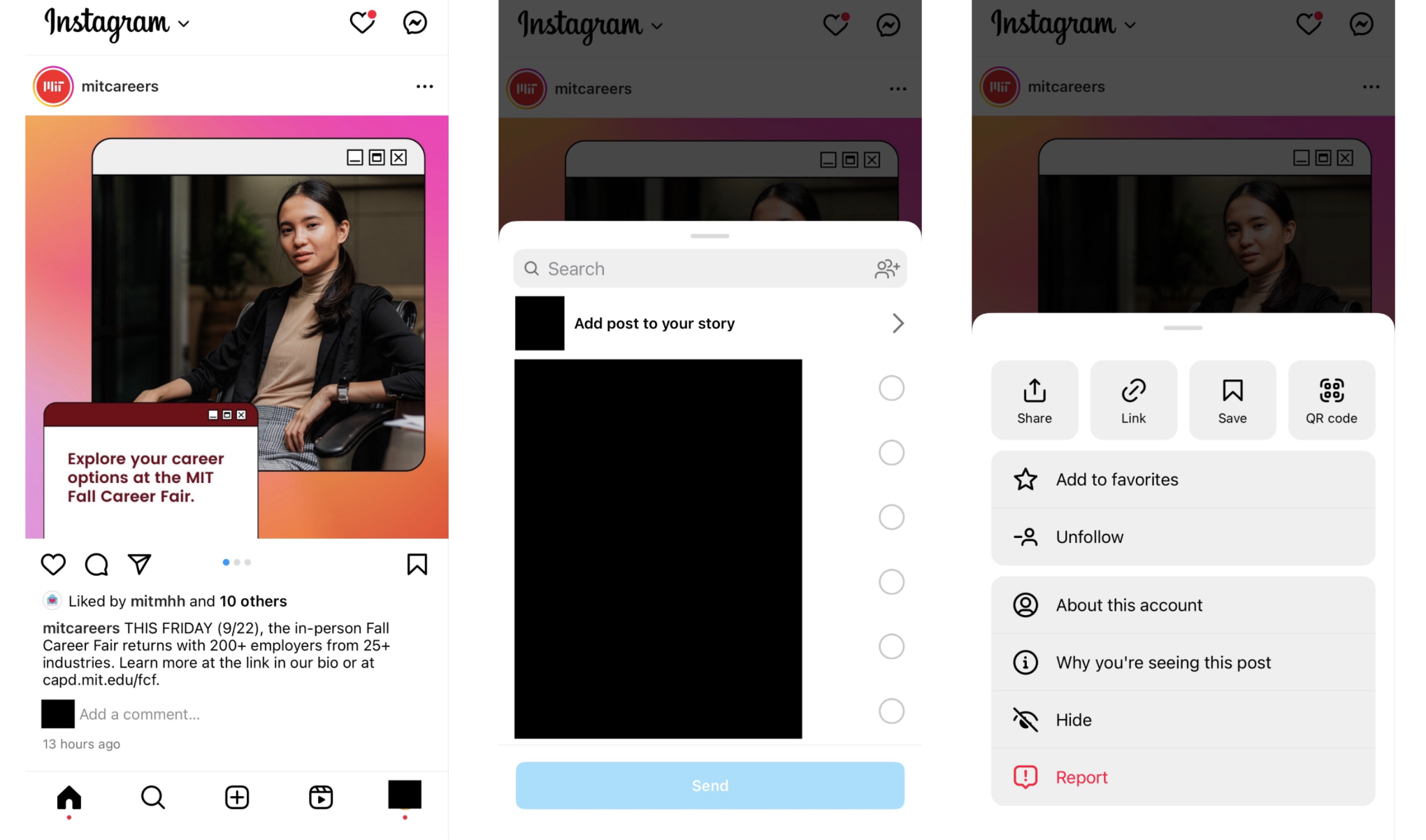
Here’s the old layout (accounts blocked out for privacy):

Clicking the paper airplane button below the post’s image brings up options for sending the post to others internally on Instagram: posting it on your story or DMing it to friends. The triple dots (more info) menu above the image, on the other hand, brings up a series of user actions related to the post and the account that posted it. I do think it was strange that the Save button was placed among the buttons related to external sharing—Share, Link, and QR code—but I at least knew that the user actions for external sharing were all contained within this triple dots menu.
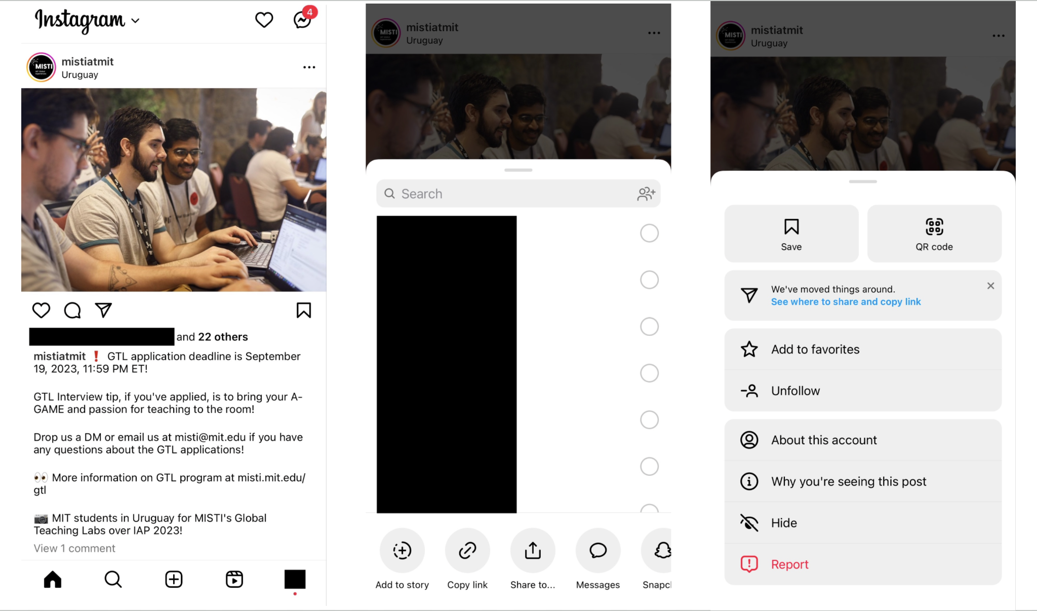
Now, here’s the new, redesigned layout:

In the new redesign, clicking the paper airplane icon leads to a menu that now contains options for sharing both internally on Instagram and outside Instagram. The “add to story” button has also been moved from a choice at the top of the list of friends to one of the options in the bottom menu, and the Send button for DMs has been removed. Clicking the triple dots in the upper right corner brings up the same menu as before, minus the sharing and copying link buttons—but interestingly, the QR code button has remained, even though it is a form of external sharing.
I’m intrigued by this choice to move the external sharing options and demote the importance of the Stories concept. Perhaps this is based on Instagram’s strategies to better facilitate and encourage the sharing of content from Instagram across other platforms.
However, this new layout is contradictory to my own mental model as a user. Instead, I think this design could potentially benefit from increased specialization, splitting it into more familiar, coherent concepts. Just like the Zoom reactions menu, I think the bottom menu in the second screenshot unnecessarily groups together features with very different purposes. To address this, one potential solution could be to create a separate button for external sharing options and place it next to the paper airplane button, which could instead be reserved solely for internal sharing (adding to story and DMing to friends).