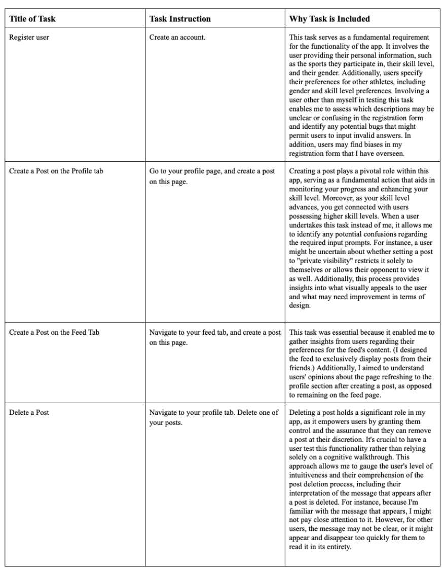
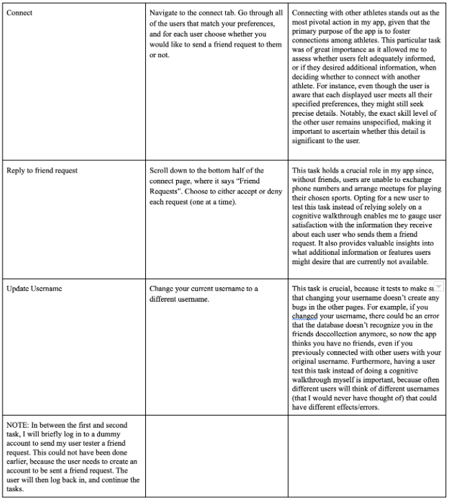
Task List


Study Reports
USER STUDY 1: Troy
For the initial task, Troy's first step was to log in. I observed that he attempted to click on the word "LOGIN" directly from the home page, instead of navigating to the login page through the navigation bar. This highlighted a potential usability issue with the current login setup, as it may not be intuitive for some users. To address this, it would be beneficial to include a direct link to the login page from the home page, given that it's the initial page users encounter.
Upon reaching the registration page, Troy expressed confusion regarding the term "gender preference." In my app, it refers to the gender of the athletes users wish to connect with. However, Troy initially interpreted it as referring to preferred pronouns, causing confusion when he encountered the "both" option. This emphasizes the need for clearer labeling and instructions. Troy appreciated the use of a dropdown for the skill score input but noted that he could also manually input an invalid value by hovering over the field. While manually inputting an invalid value is not in the user's best interest, it's important to prevent such input errors, especially since skill scores should typically fall within a specific valid range.
Moving on to creating a post, Troy expressed some frustration just before submitting it. He expressed the desire to specify the sport associated with the post, particularly since he had selected multiple sports during registration. This feedback suggests the need for a feature to associate each post with a specific sport and prompts consideration of whether users should have separate skill scores for each sport as well. Troy also mentioned that the success message after posting disappeared too quickly for him to read it entirely. Adjustments to the message display duration could enhance the user experience. When evaluating the connect task, Troy said that he appreciated being able to view each user's basic information but suggested including previous stats or a way to access the user's profile for a more comprehensive view. Notably, the connect task was Troy's favorite, primarily because he liked the one-user-at-a-time view, which made it easy to focus on deciding whether to connect with that particular user. However, Troy initially had difficulty finding friend requests, which are part of the connect page. To enhance user clarity, I will consider placing friend requests on a separate dedicated page.
Overall, Troy's feedback, while pointing out areas of improvement, also highlights the app's strengths, such as the user-centric "one-user-at-a-time" view, which he found particularly appealing. This feedback is a valuable resource for refining the app's usability and enhancing the overall user experience.
USER STUDY 2: Clara
Clara's experience with the app revealed several key insights. She exhibited a strong understanding of the registration form sections but suggested a critical addition to enhance inclusivity: the incorporation of a non-binary gender option. This demonstrates the importance of accommodating diverse user preferences. Clara also initially expressed some discomfort in inputting her phone number in the registration form, because she was unsure who this would be shared with. Thus, I think it would be beneficial if I added a disclaimer that your phone number will only be shared with other user’s once you guys have become friends.
Furthermore, after submitting her registration form, Clara wished to update her skill score preference range, a functionality not present in the app. This raised the need for an option that allows users to modify their preferences and profile information after initial registration.
When Clara created her post, she input just my name as the opponent username. Since my name was not a username in the database, it threw an error, but the error made no sense to her as a user. The error was “SkillScore not Found”. This was an error I had from the backend, but it was evident that I needed to change it to be something that the user could understand.
Moving on to the next task of connecting with other athletes, Clara voiced that it wasn’t clear that she was only being matched with people who had the same goal as her. Although it states that “this user matches all of your preferences”, she wasn’t sure what all of that meant since it didn’t explicitly state what their goal was. Thus, adding their goal to their description would benefit the user and make things more clear. Clara also said she really liked that she was able to see each user’s basic information, because it helped inform her decision of if she wanted to send a connect request to that user. Clara said the format of the connect feature reminded her of Tinder, which gave me the idea to look into how Tinder handles its connect functionality, and to get inspiration from them for enhancing the app’s visual appeal.
In the friend request task, Clara appreciated the ability to view the potential user's skill score, sports played, gender, and goal. She proposed incorporating distance information to assist users in assessing potential connections. Finally, while testing the post deletion task, Clara identified a minor bug that caused the app to reload incorrectly after deleting a post from the feed tab. This observation pointed to a usability issue, which could be resolved by allowing post deletion exclusively from the profile page.
In conclusion, Clara's feedback and experience offer valuable insights for enhancing the app's inclusivity, user-friendliness, and overall user experience. Her suggestions and observations provide a roadmap for refining the app's functionality and ensuring it meets the diverse needs of its users.
Design Flaws/Opportunities
Flaw: Deleting a post from the feed tab redirects you to your profile page, but the nav bar says that you are still on the feed page.
- Level: Physical (doesn't correctly make user's location/state in the app visible)
- How this flaw was found: Clara tried deleting her post from her feed page. The post did get deleted, but she was very confused when it redirected to the profile page, but said she was still in her feed page.
- Severity: Moderate- this doesn't make the app crash or ruin the functionality of any other actions, but it is confusing to the user, and unintuitive. Clara was able to move on to her next task only after refreshing the page.
- How to fix this flaw: Only allow users to create a post from their profile. Or, make a new page where the only action on the page is creating a picture. When the picture is created, redirect to the profile (and make sure the nav bar also shows that the user is now in their profile page).
Flaw: Updating the username makes it so your profile information is no longer displayed on your profile page.
- Level: Physical (the information is no longer grouped where it should be)
- How this flaw was found: One of the tasks was updating a username. When Troy updated his username, we noticed that his profile became empty when he changed his username. When he changed it back to his original username, his profile was filled with his information once again.
- Severity: Minor- I categorized this as minor, because you are the only one that can see your profile page, and you know your own information (gender, sports you play,goal for playing). However, it looks bad, because now the profile page just has those three categories, with no responses written in them.
- How to fix this flaw: Update the backend, so that it gets the profiles information based on a unique ID that doesn't change when the username changes. (Right now, profile information is obtained using a user's username)
Flaw: For inputting your skill score when you registered, a user can manually input an invalid number (outside of the range 0-5)
- Level: Physical (enables a way for users to type in any answer. Should only allow users to use the dropdown)
- How this bug was found: As a joke, Troy wanted to see if he could manually input his skill score as 1000. When he hovered over the number and typed it in instead of using the drop down, this worked.
- Severity: Major - I categorized this flaw as major, because having an invalid skill score makes it so you will not be matched with any other users (because you will never match all of their preferences). This makes the app useless, since the whole point is to find new athletes to play your sport with. In addition, being able to make your skill score 1000 now lowers the impressiveness of having a 5 skill score (the highest valid skill score).
- How to fix this flaw: Rather than using an input box that allows you to click the up button to get to 5, or the down button to get down to 0 (one number at a time), use a radio button setup, where the only buttons that you can click are 0,1,2,3,4,5.
Flaw: The gender preference section may be misinterpreted to mean your preferred pronouns rather than the gender of athletes that you would prefer to play with.
- Level: Linguistics (this section is not named in a way that is universally understandable) (technically also conceptual, because the way one perceives what this means is what affects how the user answers this section)
- How this flaw was found: Troy didn't understand what "both" meant for preferences, because he thought this section was asking what one's preferred pronouns were. Upon further discussion, he said he also thought this was what I meant by gender preference, beecause I put gender preference above inputting your own gender. Thus, it would have been easier to understand if gender preference was grouped with the rest of the preferences.
- Severity: Critical - If I was not there, Troy would not have known the correct interpretation of the gender preference section, and he wouldn't have known that he was choosing which gender he wanted to play his sport with.
- How to fix this flaw: First, group gender preferences and all other preferences together, and make them come after the user inputs their own background information. Also, update the name to be: Choose what gender you would prefer to play your sport with.
Flaw: There is no way to login from the home page. You must navigate to the login tab through the nav bar. However, the website starts on the home page.
- Level: Physical (where to put the link to get to the login page) and also linguistic (didn't provide adequate hints of where to navigate)
- How this flaw was found: Troy initially tried to login by clicking the word login that was on the home page. He figured out quickly and on his own that he needed to click the link through the nav bar. It makes sense that Troy tried to click the login word, because the word was larger than the nav bar link. The word was also one of the few words on the page, and it was bolded.
- Severity: Minor- While this design flaw made the login experience less intuitive, Troy was able to quickly figure out on his own how to navigate to the login page.
- How to fix this flaw: Add a button on the home page as well that redirects the user to the login page.