Heuristic Evaluation
Usability Criteria
Safety: how does the interface guard against people making mistakes?
- A user can only choose from options for everything (what sport they play, what visibility they want)
-Post: content is win or lose (and user presses button)
-Preferences: Chooses from only valid options
-profile info: chooses from only valid options TRADEOFF: the tradeoff here is if the user's go-to choice is not available in the checkbox, then the user cannot successfully register. making the scope of sports be a certain number of sports allows the app to be more specialized for each sport, but it cuts out some users whose sports might not be represented. - One thing that my wireframes didn't account for was adding a collaborator on post:
-Something that needed improvement was there needed to be a way to make sure that a user could only input another user that has an account as a collaborator- Fixed this by throwing an error if the collaborator inputted didn't have an account
TRADEOFF: Accounting for a collaborator helps prevent errors (accidentally inputting a username that doesn't exist), but it also makes it less user friendly in the way that a user must need an account to be able to be featured in a post. (similar to the zoom vs skype discussion we had in class)
- Fixed this by throwing an error if the collaborator inputted didn't have an account
- A user can only choose from options for everything (what sport they play, what visibility they want)
Error Tolerance:how easily can a user recover from making mistakes?
- One thing that I need to improve on is the fact that with my current app, the user doesn't really update their preferences/profile ever. Thus, they would have to make a new account if they wanted a different profile/preferences. This could be fixed by adding a way for a user to update their profile information and preferences. TRADEOFF: This makes it more safe from bugs in the one scenario (SCENARIO that could occur if updating was allowed) that a user matches another user's preferences so they send them a request, but then the if the user updates their profile an no longer matches the other user's preferences, they will still receive the request (even though they may not be compatible anymore)
- Another thing that may need improvement is the fact that if a user accidentally rejects a friend request, they cannot go back and accept it unless the user that sent the request resends another request. However, this is usually the case with most social media apps, and since the user can resend a request, it is not the end of the world.
Physical Heuristics
Fitt's Law:
- Actions that are a fundamental part of the app have larger buttons and fonts (ex:Create post)
- For most actions in my app, you must be logged in to use them. Thus, if you are not logged in, there is a message in huge font saying you must log in.
- Big idea actions/concepts are in a different font that stands out more and is larger
Situational context: how does the interface convey to a user their context (where they are, the app’s state, etc.), and how does it adapt to their context?
- There are four different "pages" a user can be on-- their connect page (where they find other athletes), their settings page(where they log in), their profile, and a feed (to see friend's posts)
- a user can access any of these pages at any time through the nav bar. When a user is on a given page, that word in the nav bar is underlined.
- one way I could improve on this in the future is also adding little pictures near the words on the nav bar, and the pictures would light up when the user is on that current page.
Linguistic Level
- Information scent: how does the interface provide hints for navigation to aid a user in “foraging” for information?
- As I was looking through my wireframes, one thing that I noticed that I plan on changing is that for posts, you have to add the post before you can specify what visibility you want (only you ,or your friends can see it too) (you have to add the post, press the three dots on the top, choose visibility).
- The place where most users would be able to go to for information is the connect tab, and since the app does the work for you in choosing which users you can connect with, all the user has to do is click to the connect page. Thus, the hint would be that "connect" as a word sounds like a place where you may be able to get more info about other users.
TRADEOFF: Since you can't choose which users you are allowed to match with, the work is done for you in terms of finding viable athletes to connect with. The tradeoff is that you aren't able to make your own decision in a way. However, this is important for safety reasons as well.
- Recognition vs. recall: does the interface force a user to remember operations?
- In the wireframes, while the icons suggest what action each button is, technically the user must remember/infer what the operation is based on the icon for some operations (like connecting with other athletes). To fix this, I want to do something where if the user is hovering over the icon it says what that icon represents. I also may fix this instead by changing it from icons to short words that represent the concept/action of what the user would be doing.
TRADEOFF: having the nav bar be short words instead of icons is easier to understand, but less visually appealing.
Visual Design Study
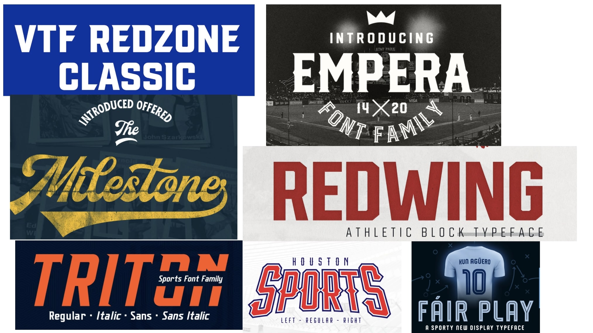
For my typography research, I looked into different types of fonts that were a part of the athletic font family. This slide includes fonts that have been used by professional sports teams (for their ads or jersey designs),fonts that have been used by food places that promote sports often (ex: Wingstop used one of these fonts in an add), and by famous sports brands. These fonts are all bold and communicate the message of grit. They are also all big and stand out. 
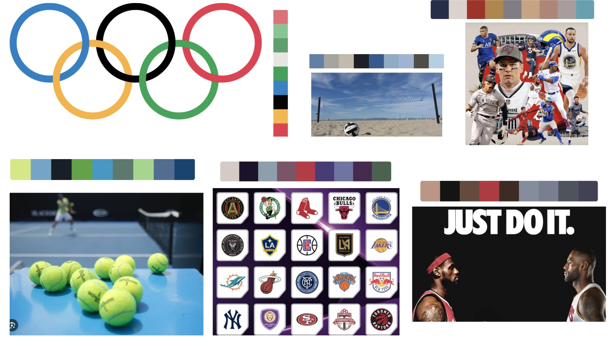
I wanted to get my color inspiration from pictures that represented going to play a sport (like the tennis court and volleyball court), and from professional sports teams and events. One thing that stood out to me was there was a lot of blue in many of the pictures I got my inspiration from. The black background of the just do it picture also really caught my attention, and made the picture seem serious and competitive. 
If you prefer to see this in slide format, here is the link to the slides: Visual Design Study