Assignment 5
Heuristic Evaluation
Usability Criteria - Learnability, Efficiency
- the icons may not be the most intuitive for learnability; for example, the pencil icon could also be confused as the icon for writing notes when it is actually the icon for editing your own post (one way to make this better in terms of learnability is to have the word "edit" or "notes" appear when you hover over an icon, but this is not the best method, and it would be better if I could either come up with better icons or change to less confusing names, possibly by calling "notes" something else instead)
- for efficiency, the interface does seem pretty straightforward to use; there are not that many functionalities to begin with, and the general layout for each page is similar enough that users can guess wehre to find similar features; individual features across pages also look and behave similarly
Physical Heuristics - Fitt's Law, Gestalt Principles
- for Fitt's Law, the elements on each page grouped in a way that most users should be able to point to interface elements; the navigation bar is easily accessible, tag buttons are easy to find, and the posts can be clicked on to view them individually; however, a point of improvement could be the icons for features related to individual posts; in the current wireframes, the icons to save, edit, and add notes are fairly small, and in places where these icons are right next to each other (especially for smaller sized posts), this may lead to users clicking on the wrong icon by accident
- in terms of Gestalt Principles, each page is pretty clearly partitioned into the navigation bar, some features on the left in the gray rectangle (usually related to tags or search), and general content on the right under the navigation bar; for most pages, the content ends up being posts to browse through (i.e. saved, all, featured) or the interface for creating a post; the alignment of posts in particular and smaller spacing also makes it clear that posts are associated with each other and separate from the left rectangle, and to enhance this effect, color or varying shapes could also be incorporated into the final design (like with the banner shape for the featured section of the home page)
Linguistic Level - Consistency, Information Scent
- wireframes are consistent in using the same symbols and icons for post-related features across all posts and pages (i.e. star always means save, pencil always means edit, double rectangle always means notes)
- posts are inconsistent in size when browsing, but this is a tradeoff I am willing to make for information scent (some posts are different lengths, and if there is an image, I would like to at least show that in the preview so users can find what posts they might be interested in) and aesthetic pleasantness (my personal preference is that posts can be different heights)
- in the current wireframes, the icons available on each post may vary depending on which page the user is on (ex: only the "My Posts" page has the pencil icon for editing); this lack of consistency is meant to limit how features are accessed (thus helping in efficiency, learnability, and robustness against errors, since users are less likely to find "incorrect" or unexpected ways to do certain actions), but it is a tradeoff in that it may also be confusing (ex: a user sees a post they created on the "Save Posts" page and wants to edit, but there is no option to do so unless they navigate to the "My Posts" page)
- the overall layout of each page is consistent; the navigation bar and user profile icon are always in the upper right, posts are usually present on the right side (to browse or to edit), and the left rectangle handles concepts that sort or search through posts
- for information scent, the icons provide hints on how to use certain interfaces; for example, the search icon hints at what the search bar is for, and the examples of top tags under the search bar suggest to the user that they can search for posts using tags
Visual Design Studies
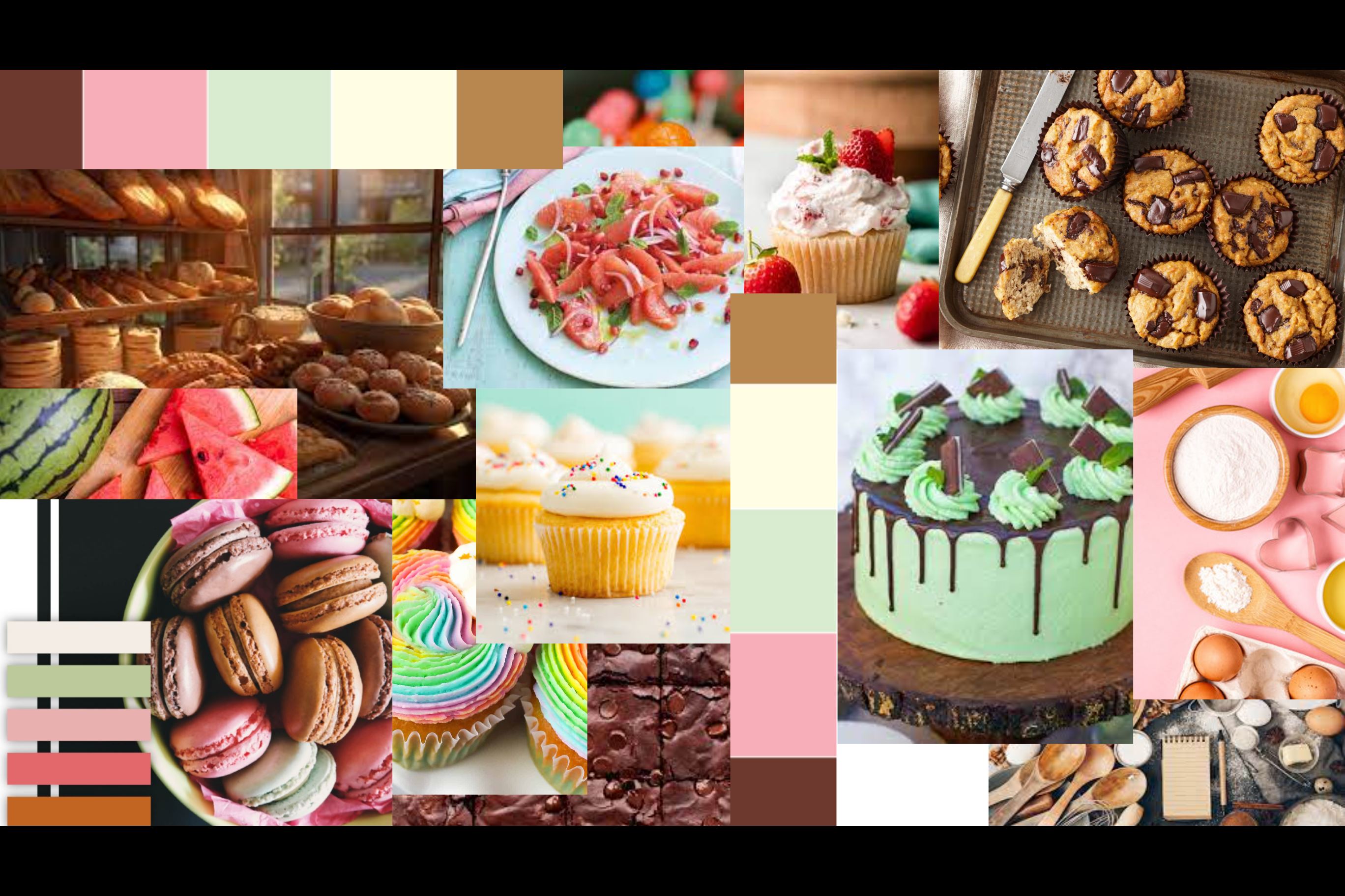
Baking and cooking inspired images
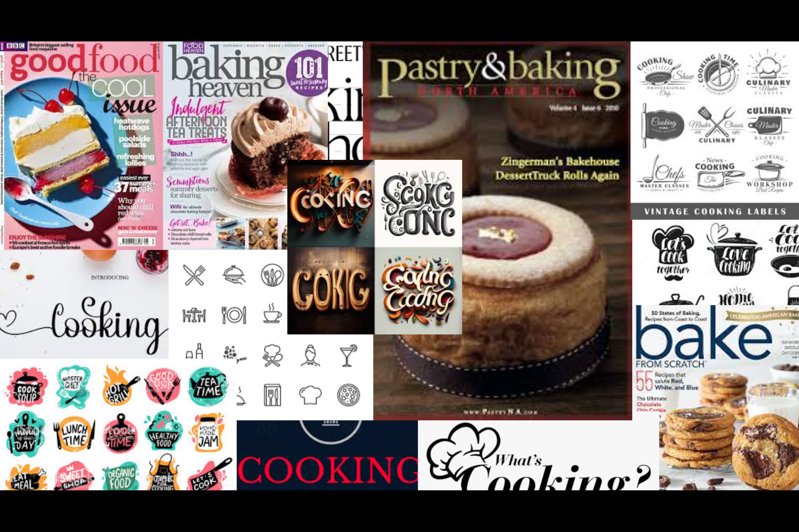
Baking and cooking inspired fonts
Demo Links
Frontend Repository
https://github.com/grace-j784/frontend-starter/
Vercel Deployment
NOTE: All of the functions worked when I tested them running locally, but for some reason, when I push to Git and deploy to Vercel, the buttons for adding and removing tags do not work properly. I apologize for not being able to resolve this, but I only just realized this today as I am submitting the assignment (late) even though I finished implementing my frontend components on Tuesday.
https://frontend-starter-murex.vercel.app/
Conclusion
When implementing the frontend, I realized there were some changes that would make things cleaner in both the frontend and backend. For example, I changed some of the inputs of the routed functions to be post IDs or tag IDs, which were more convenient to generate in the frontend (compared to the tagged IDs and save IDs I was using earlier).
I also found that there were some features that did not seem as coherent in the app, so I decided to remove the match ingredients feature and make all tags private, while still leaving the code organized enough that this may potentially be added in the future.
Lastly, I changed the design a little from my wireframes to make the application simpler and more intuitive. The current design also highlights the more important parts of the app, since it is not super necessary to know which tags already exist (because users can customize and add their own new ones), and seeing all of the tags might be messy or disorganized as many more tags are created.