Evaluating the Elements of UI Design in Spotify's Web Application
At the risk of exposing my music taste to the world, I wanted to evaluate the UI design of Spotify's web application in terms of the elements discussed in L11.
Layout
At a glance, Spotify's web application can be broken down into four main sections [pictured below] with left and right panels of equal sizes bordering a larger, center panel and a shorter full-width panel occupying the bottom of the screen.
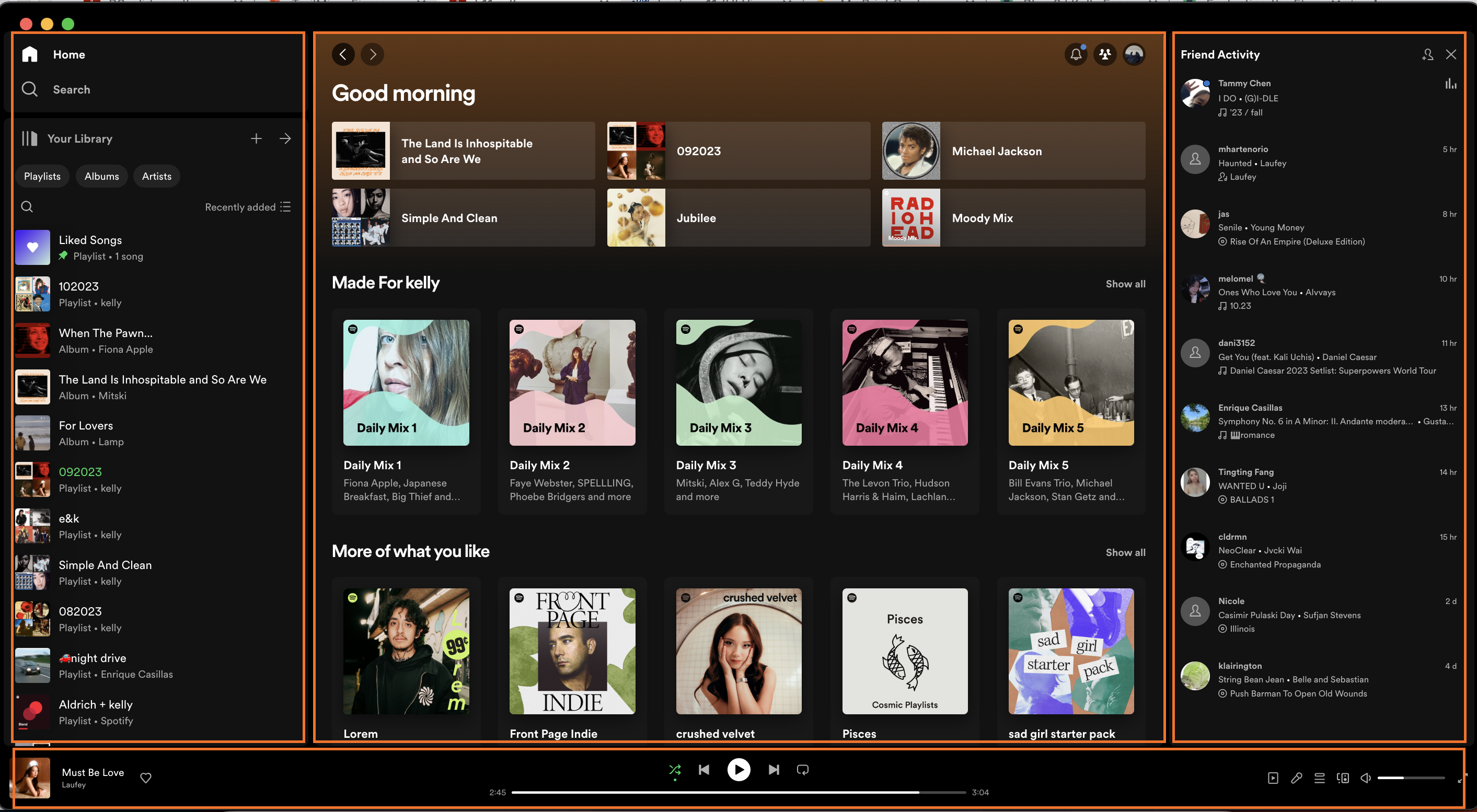
The various sizings, positions, and orientations of the different panels together form the information architecture. The right panel is clearly dedicated to displaying the user's friend activity while the left panel is dedicated to displaying the user's library (their playlists and saved albums). Their equivalent sizes suggest equivalent prioritization of information for the user. The large real-estate of the centered panel suggests that most of the user's activity and exploration will occur within it -- which is indeed true as that is where the user will find new playlists and view profiles. The grid structure is disrupted by the full width audio player occupying the bottom of the page, a common UI pattern for apps whose primary function is to stream or play audio. It allows the user to quickly locate and manage the controls of their music player (pause, skip, rewind, view the song, check the queue, check the lyrics), the primary purpose of the application.
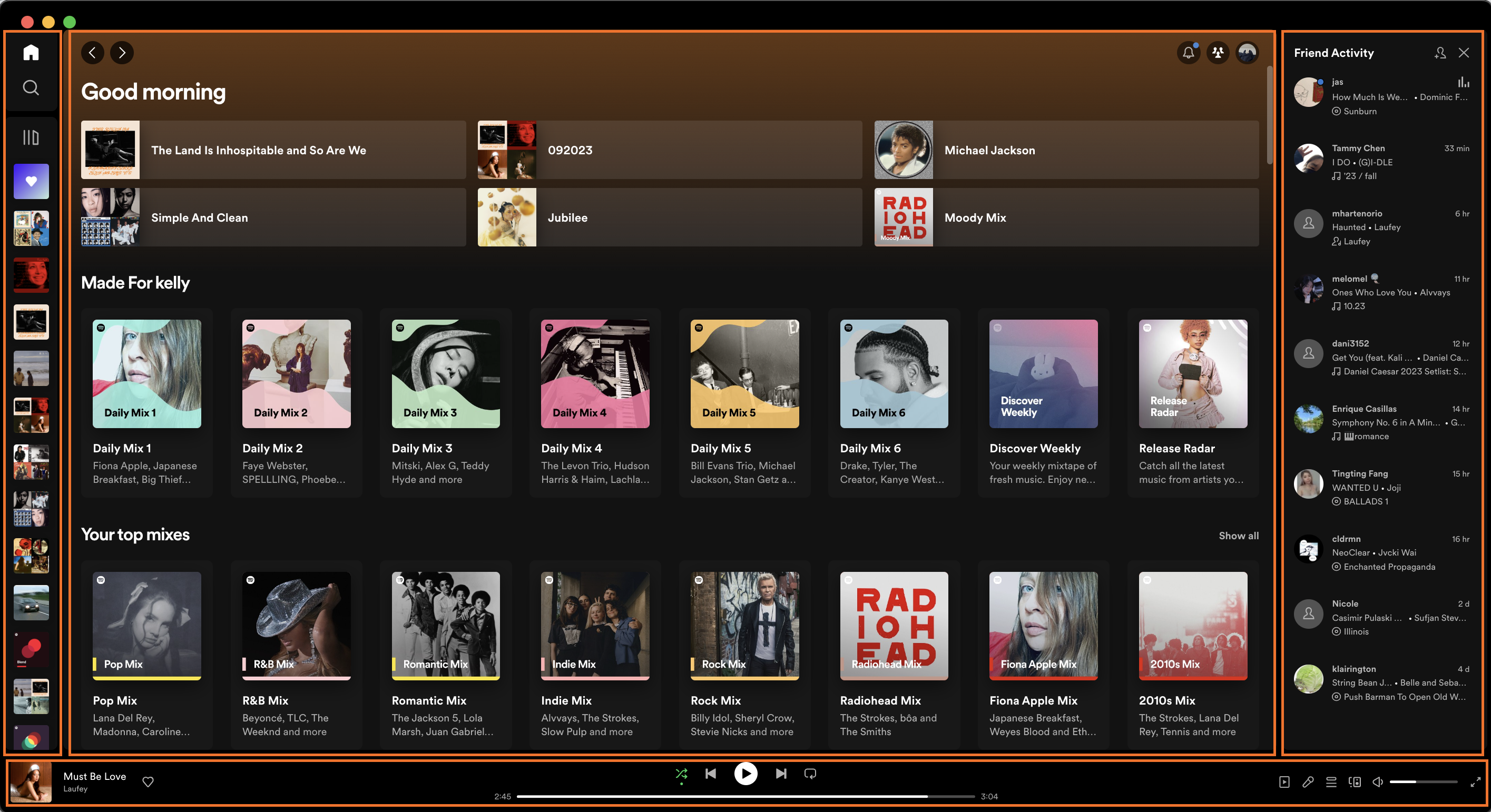
The spotify web application even lets you collapse your music library such that only the album and playlists covers are visible as well as shrink (but not completely) collapse the friend activity panel such that the information relevant for the functions of both panels are still visible.
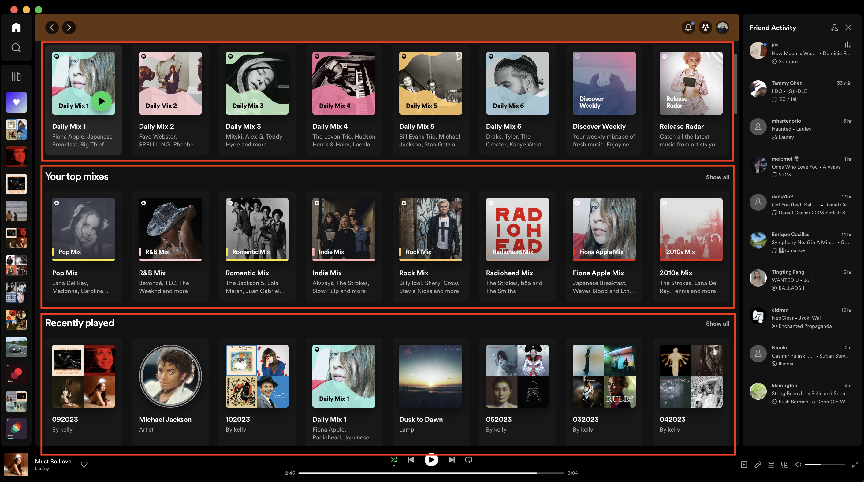
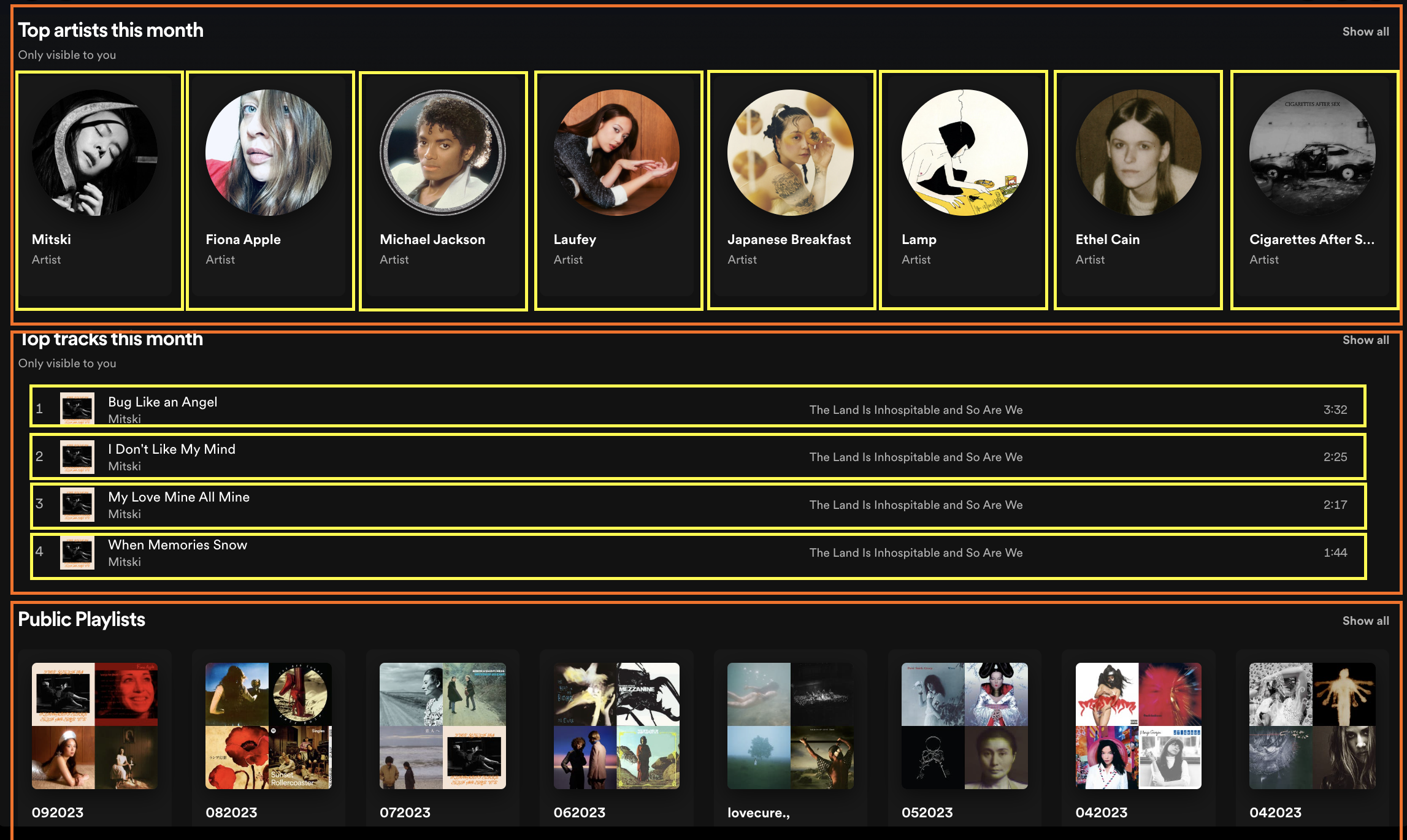
I also really like how Spotify organizes its different collections of playlists in its Home page and the different sections on a user's profile (top artists this month, top tracks this month, public playlists) by rows.
Then when a user wants to look at the tracks within a playlist they are itemized in a single column like a standard setlist/tracklist (for example, the top tracks this month section).
Typography
According to this website, Spotify uses a font called LL Circular. The lack of serifs make it easier to read and also creates a more informal tone for the application. The web app also uses varying font weights and sizes to create informational hierarchy.
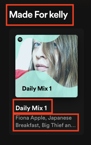
For example, in the home page, the title of a section has the largest font size and weight. Then the title of the playlist is slightly smaller and the artists featured within the playlists (secondary information) have a lighter font weight and smaller font size.
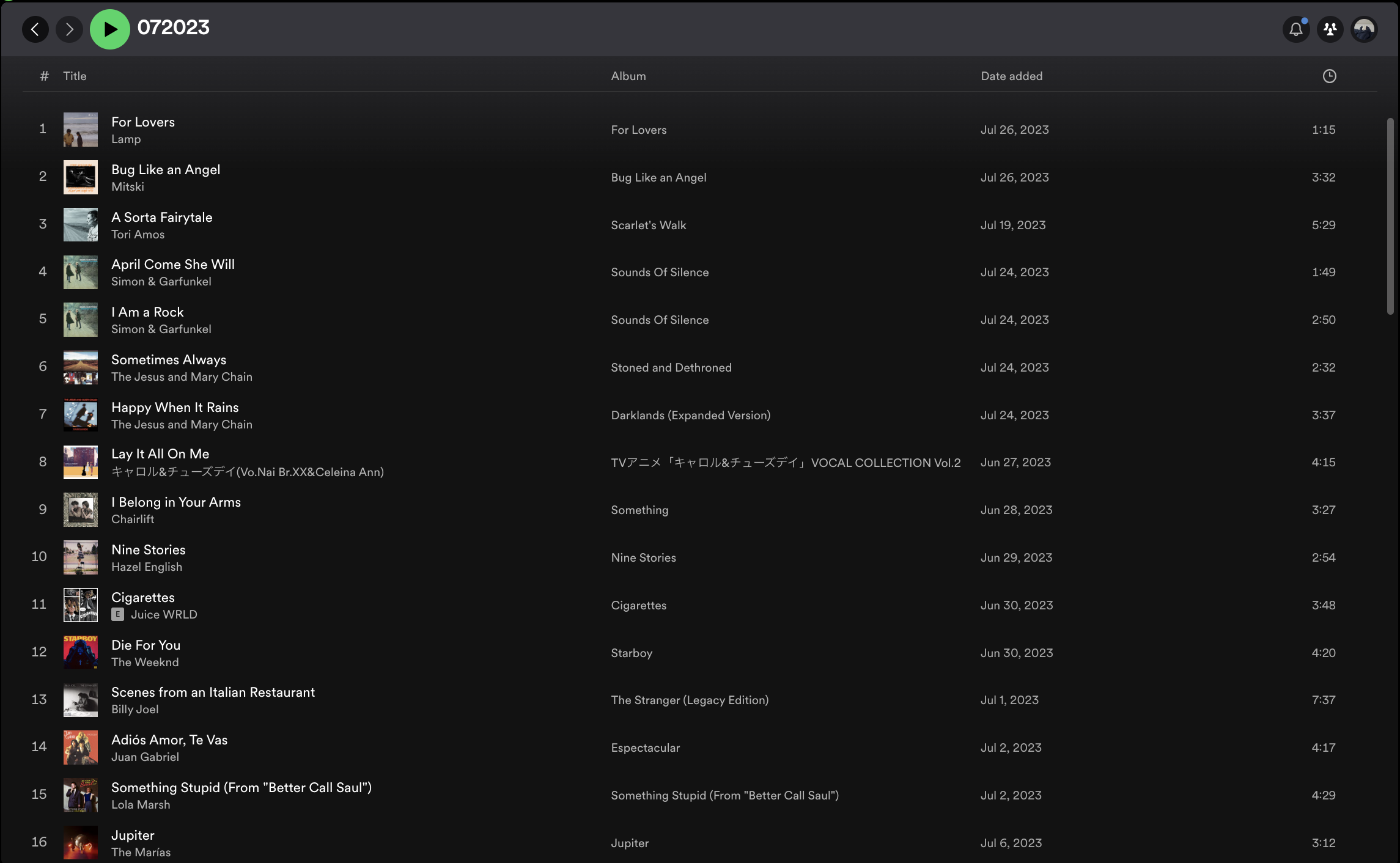
Similar to how in lecture we had to organize the many different information related to subject listings (subject name, subject number, instructors), the Spotify web app also has to organize different information related to an album or playlist (track title, artist, album, duration, date added). They bolded the track title (primary information) and put the artist name in a lighter font right under the title to bundle them together (highly prioritized secondary information) right next to the track cover. The rest of the information (album name, date added, duration), also in a lighter font, are displayed along the same row under the appropriate columns which are spread out. I noticed how they put the prioritized information besides the track images and put them on the left side as that is where the user's eyes will most likely be drawn to. The user can also guage all the tracks of the playlist by solely focusing their eyes on the left side of the playlist and choose to scan horizontally if they want to learn more about a track.
Color
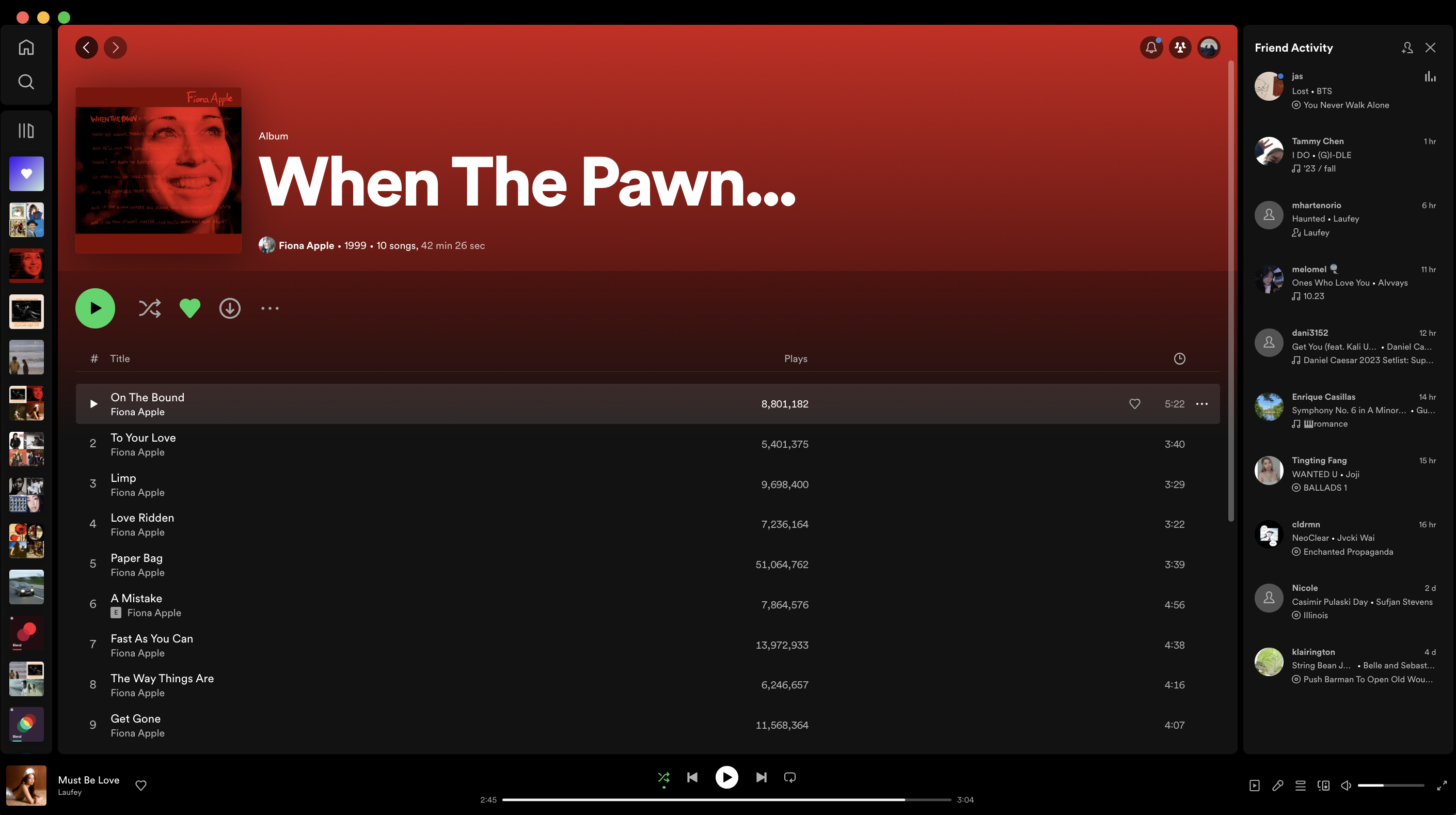
Spotify's minimal color palette feels modern, sleek, and sexy with its dark background and white/grey text. The splash of iconic green peppered throughout the UI adds a touch of fun and color to the user's experience. I also really love how they use a "glassy" effect to highlight things (such as a track being hovered over [see below]) as it feels soft and less harsh to the eyes.
