A4. Frontend Design & Implementation (Beta)
Heuristic Evaluation
Usability Criteria
Efficiency
I find that my wireframes do not support the Efficiency heuristic as strongly as it could. By the nature of the purpose of the app, the user may want to find events or posts related to specific natural destinations or hiking trails of interest. However, because the feed is formatted in a typical “infinite scroll” manner, the user won’t be able to efficiently do so.
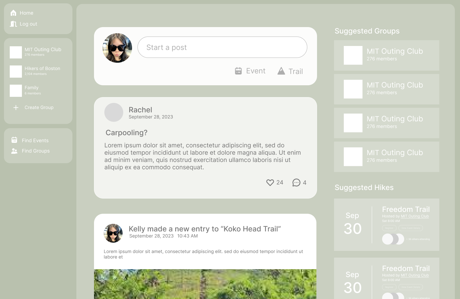
This violation of the heuristic suggests a design improvement of the feed by adding the ability for the user to toggle between a “map” and “infinite scroll” view of their feed. In this way the user can easily look for posts related to their area of interests and even create posts easily by dropping a pin (supporting the Accelerators heuristic).
Accessibility
My wireframes violate the accessibility heuristic. The background color I chose is light green and some of the components are a transparent white paired with white text. The lack of contrast may make it difficult for those with visual disabilities to read the text. This violation of the accessibility heuristic suggests that either a darker color should be chosen for the background or a text. However, the tradeoff for this correction would be a reduction in perceived “color harmony” since the current selection of colors are similar in hue, they feel more cohesive. Choosing a darker font text or background may disturb that cohesion.
Physical Heuristics
Mapping
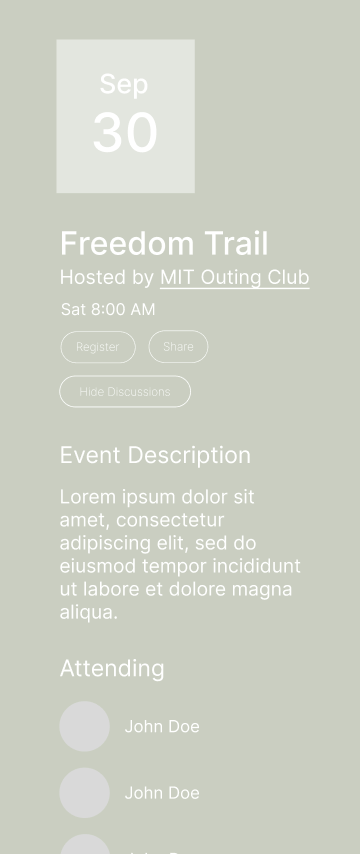
In particular, the Mapping heuristic is violated when looking at the design of tags and buttons. Because they are both designed as pill shaped with white outlines, white text, and no fill, the user might assume that they both have the same functions. However, this is not true as a button would usually perform an action or event while a tag is presenting information. This is especially confusing in the event details page [see image]. This violation of the heuristic suggests that the tags should be redesigned so they do not look like general-use buttons, perhaps by color coding them based on the categories they represent. 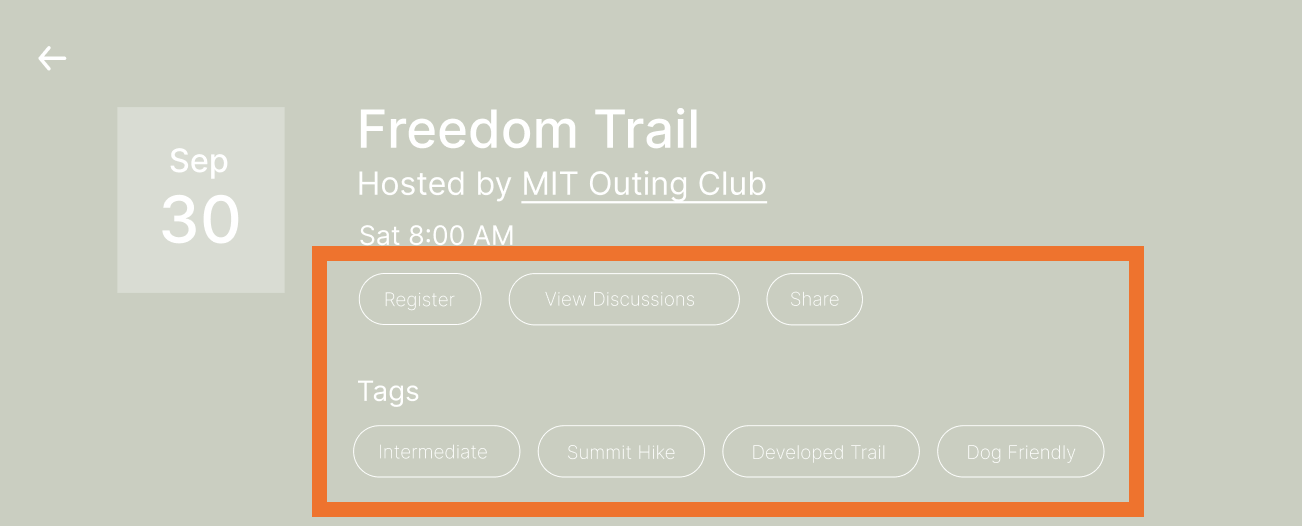
Accelerators
Shortcuts can be added to the interface to speed up expert users. We mention one possible accelerator in the Efficiency heuristic of allowing a user to automatically start a place-specific trail, event, or post by clicking on the map. Another accelerator would be to allow users to copy trails from other events, their own previous trails or others’ profiles to their own profile so that a user does not have to input the points for the trail every time.
Linguistic Level
Consistency
The Consistency heuristic is supported by the design choices of the interface. For example, the component design for the event concept is consistent across all its forms (as a preview and event description page [see below]). The hierarchy of information is preserved through consistent hierarchy in typography and the formatting of the event date with the abbreviated month resting on the enlarged date number is consistent [see image] across both forms of the event. Additionally, in the event preview, attending members are displayed with circular avatars and in the event details page, they are listed with circular avatars.
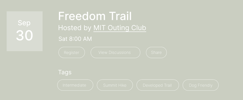

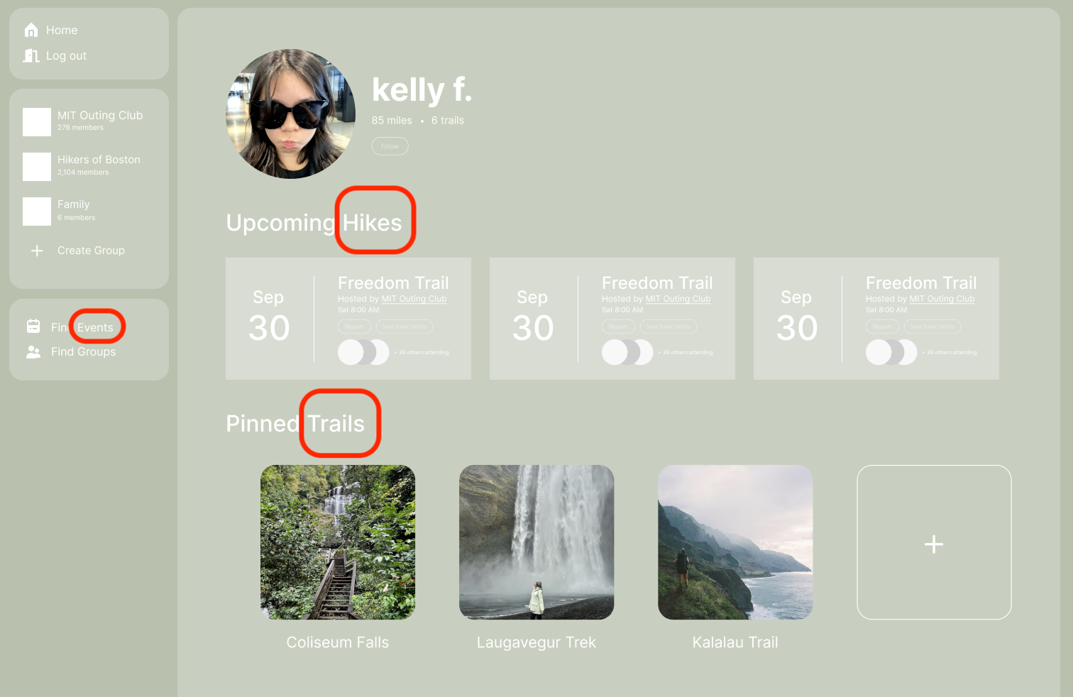
However, one violation of this heuristic is the inconsistent language employed to represent the “Trail” concept. Vocabulary such as “Hike,” “Trail,” and “Event” are all used to describe the same concept. This violation suggests a design improvement to only pick one word and use it throughout. “Hike” may be too specific as one may use the app to document trails and experiences that aren’t necessarily hikes and “Event” seems too broad as it does not imply the spatial/geographic dimension that Trail does.
Information Scent
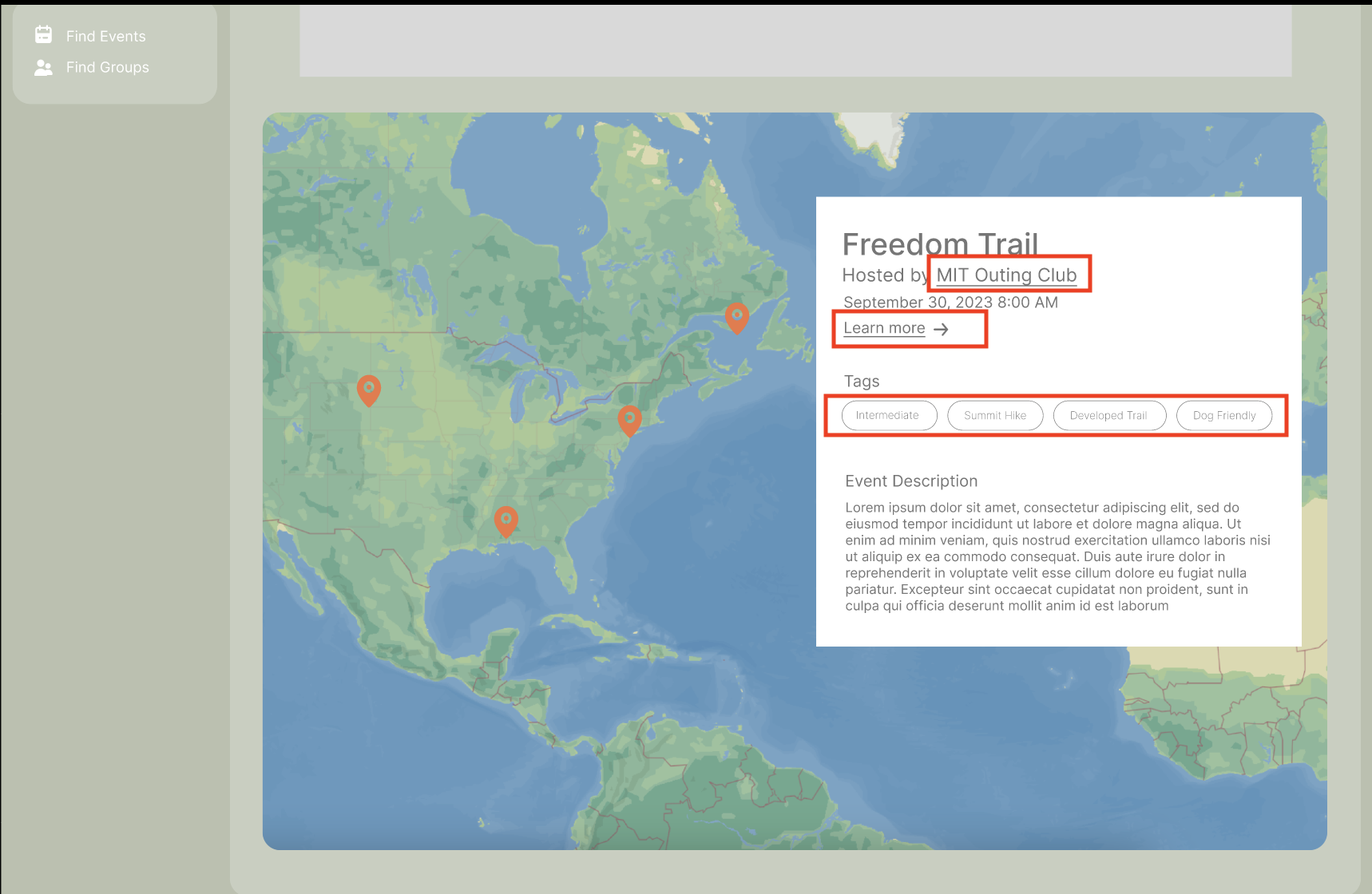
The wireframes include design choices that support the Information Scent heuristic. When looking for events in the map view, a user may click on a marker representing an event, and then a preview popup with a “learn more” button will take the user to the designated page for the event. Once the user lands on the event details page, they can navigate to other profiles by clicking on the avatars of those listed in the “attending” section or click on the “Hosted by [x]”. The underlined nature implies a function similar to the “hyperlink” – that clicking on it will navigate them to another page.
Additionally on the event details page, there is a “View Discussions” button located right under the date and time information and next to the “Register” button for increased visibility. This button would redirect the user to the event-specific forum where they may find more information or ask any questions regarding the event.
[Not pictured, to be implemented in wireframe update] To further aid users in the foraging for information, specifically with respect to their search for more events, we can design the interface such that the user may click on the various tags in the event preview or event page to look for other events with the same tag.
[Not pictured, to be implemented in wireframe udpate] We can also add another layer of informational scent such that when a user views the profile of another user and looks at a trail associated with an event, they can navigate to the event page from there and learn more.
Link to Deployed App
https://61040-frontend-ashen.vercel.app/
Link to App Repo
https://github.com/fangkelly/61040-frontend
Visual Design Study
Color
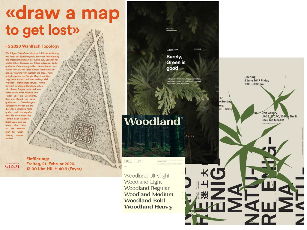
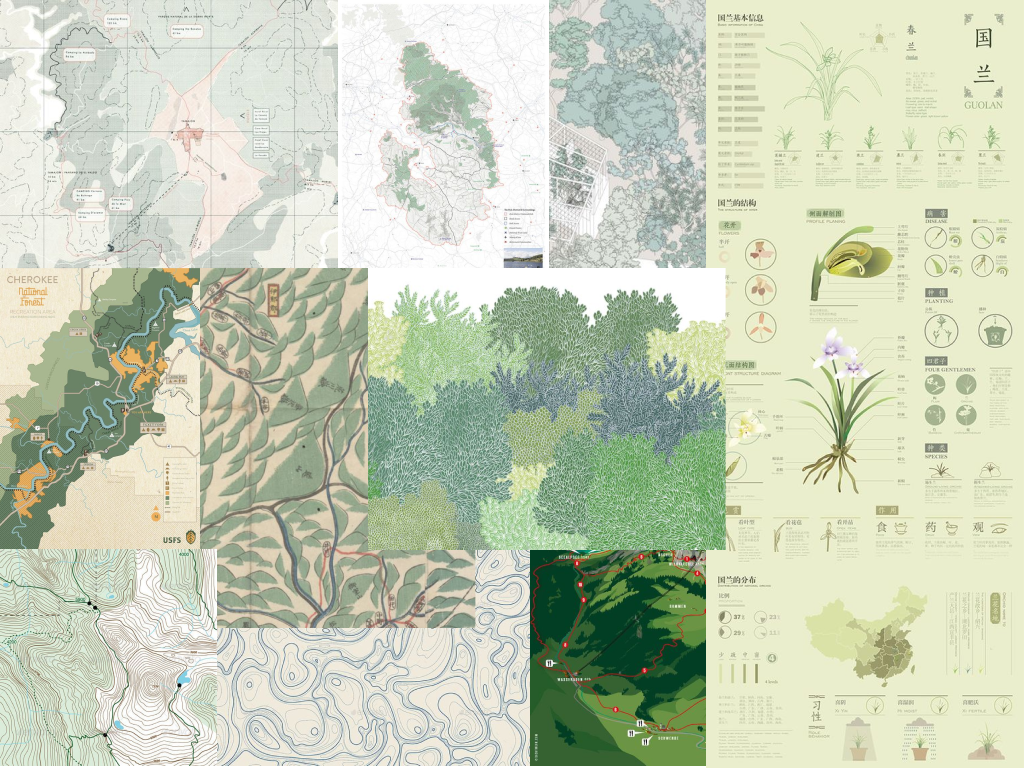 Exploring vintage feel of outdoor maps and scientific diagrams, aesthetic blends of greens, contrasting lines and contours
Typography
