User Testing and Analysis
First Report
This participant when looked at the site immediately commented on the appearance of the website, saying that it was very cute and they liked it. This participant had alot of trouble with understanding various components of the website when used. One key moment was when they were uploading an image to the site. They did immediately understand to navigate to the Profile section of the website however, was very confused on how to get an image url or what an image URL even was. She spent several minutes trying to upload only to be met with a frustrating grey loading image instead of the picture she was trying to select, her brows furrowing in frustration as she repeated her actions. She said that it wasn't working and I noted that she was clicking on "Get Url Link" on the site instead of "Get Image Address". She was happy when she got it to work, noting she liked the green success button that appeared whenever she successfully completed a task. Design
- (critical) (conceptual) She was very confused about how to upload a picture as described above. I could have a tooltip appear with instructions or a help ? option to describe how to get an image url.
- (minor) (physical) She really disliked the constantly loading grey pictures from her failed upload attempts. She said it was visually disturbing and made her not like using the upload feature, especially because of the eternal loading circle. To improve I could replace the forever loading with a not found image, also make medias deletable.
- (major) (linguistic) When asked to upload an image, she said "oh I must use the + icon right" and was very confused about the wording of the Media section. Should change to "upload images"
Second Report:
This participant also really liked the appearance of the website as "this reminds me of Pinterest but less basic because of the Myspace/Y2K aesthetic". She found it much easier to navigate the website, and needed no extra help for uploading an image. When she realized she could add any picture on the internet to the website she looked gleeful and stated "I'm going to upload my whole Pinterest board". She stated she actually prefers the adding with an image url as it greatly expands her post options, as she finds downloading images to post tedious. She had frustrations with favoriting a post to a collage, stating she expected favorites to be a section on her profile, not a prompt to add to one of her collages.
Design: Design
- (minor) (linguistic) disliked that media was a seperate tab in the app and how settings wasn't in profile. I should condense my pages.
- (major) (physical) She really disliked how the profile showed other peoples posts when searched. I should fix that bug.
- (major) physical When asked to save a post to a collage, she completely missed the favorite option on the post and said it was unnnoticeable. She went to the collage page instead and was trying to find a save post thing. I think I could relabel the favorite option as "save to collage" or something clearer and make the color more bright and noticeable.
DEPLOY LINK https://frontend-starter-eight.vercel.app/
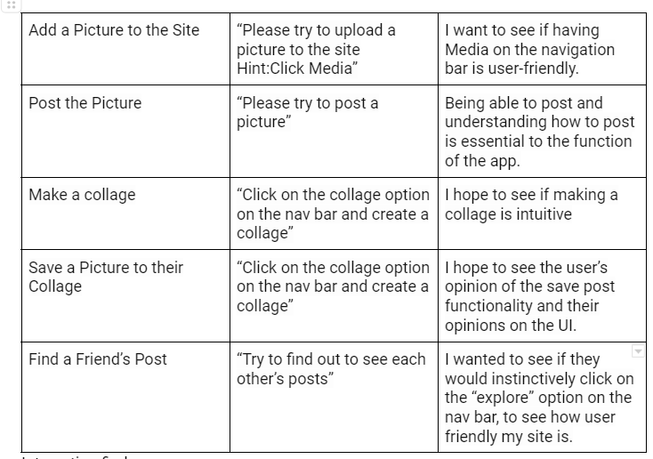
Task List
