Assignment 5: Frontend Design & Implementation
Heuristic Evaluation
Usability Criteria
Learnability
The interfaces I have should be very similar to users who have spent any time on any social media platform. The ideas of articles, comments, etc... are all presented in a very familiar way. However, I will still add many directions throughout the app to direct the user to the correct pages for each action.
Error tolerance
A core idea in my idea was that any posts made would be permanent and immutable. Right now, there is no indicator in the frontend that tells the user that's the case. A good thing to implement would be a short disclaimer every time the user posts something. It is a bit annoying, but in my opinion very important.
Physical heuristics
Fitt's Law
All the buttons for actions are very close to the context they relate to, so that should not be a problem. However, when we have nested comments, the comments deeper into the nesting get smaller and smaller, and so do the related buttons, making it worse according to Fitt's Law. In the implementation, I will fix this with an interface that allows users to only see two layers at a time, and they can go up or down the layers with the click of a button. This is very convenient to use, but not a very common solution. So I will make the buttons very descriptive to make it easier to learn.
Gestalt principles
I will make use of colors to display conceptual structure. The app will have two main colors, and when the context switches, so will the colors. This might look very noisy if using bright and contrasting colors, but my app has cold colors that work with each other very well, so I think it will look very aesthetic.
Linguistic level
Consistency
Users can make two different types of comments: to the article and to other comments. They are displayed to be pretty much similar in the frontend, although they are implemented slightly differently in the backend. Overall though, here I think abstracting the backend from the user is a good choice, as the two are identical in the ways they interact with the user, and this provides a lot of consistency.
Information scent
I want to make the app minimalistic, so I want to avoid bombarding the user with unnecessary information in one page. However, I will add the information relating to links users can click when they are important for the context: The numbers of comments on an article when managing articles, whether users are verified or not when listing them, etc...
Visual Design Study
Color

For the color palette of the website, I wanted to do something that would really stand out from other websites with similar purposes. It seemed to me that those websites usually were either trying to make themselves as professional as possible (lots of blacks, whites, and greys) or were trying to capture the attention of the audience (lots of bright colors).
I wanted to do something that would instead soothe the audience as they are looking through some news articles at the end of what might have been a rough day. So, I took inspiration from nature and decided to use lots of turquoise, teal, blues, and grays. I feel like this is also a very rare combination to see on websites, so it really has a unique, calming look.
Typography

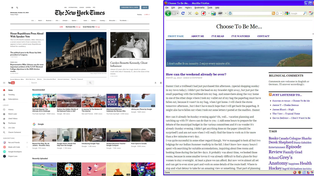
I really liked the New York Times' way of displaying their content. Their fonts are easy to read and look classy. Therefore, in the app, for the articles, I used a font specially designed for articles to be easily legible, and for the logo, I used a font similar to that of the New York Times.
However, for the other sections of the app, like the social parts (commenting) and the settings, I wanted to have something more familiar to make the users feel more comfortable, so I decided on Roboto, which is very popular as it is used on Youtube, Android, Google Maps, and many other apps.
However, although my main inspirations for typography were those, for overall layout and feel, I wanted to have something that resembled older, simpler blog sites. I feel like most websites today try to blast you with information, while you could digest information much easier if it was displayed one at a time.
Links
Frontend code: https://github.com/egekabas/frontend-assignment Deployment Link: https://vercel.com/eges-projects/frontend-assignment
Notes
AI Usage
I used Github Copilot while implementing the frontend, but used it almost exclusively for smart autocompletion and not much else.
Notes About Implementation
There are two actions in the app that should not be available to the user: looking at and approving/rejecting validation requests. These actions should only be taken on the server side by the app maintainer.
To implement this, these actions are hidden in the frontend, by choice. You need to log in as "root" with password "123" and go to "/admin" to see all the requests and approve/reject them. Also, there are no styling/usability concerns in this part: It is not supposed to be an actual part of the frontend, it is just there for convenience in testing.