Lecture 11: Critiqueing YouTube's Visual Design
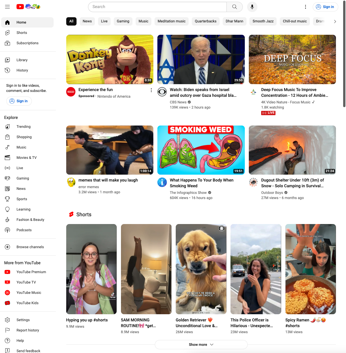
As an avid YouTube user, I thought it would be interesting to critique it's UI in terms of the 3 categories that we discussed in lecture. I will specifically be analysing the homepage of YouTube

Layout
The most notable part of the homepage's layout is its grid-like structure. In the screenshot above, the user's attention is caught by the Shorts in that the pattern of the grid abruptly changes. One qualm I have is that the layout after the Shorts section is rather bland. It shares the same layout of 3 videos in a horizontal row. YouTube could surely come up with a layout that is more exciting.
Gestalt Principle's are generally followed in the UI of YouTube's homepage. The title, author, and view count of a video is placed very closely to the video preview. Each row of videos is separated with a significant amount of whitespace. One slight tweak I would make is to increase the amount of whitespace between videos in an individual row. They are placed so closely together that one may assume there is some sort of relation between the videos in a row. This is particularly confusing in that at times, the videos in a row are related under some genre. At others, it is simply a collection of trending / random videos. One last observation is that the homepage seems to follow the "F" principle as discussed in class with the sidebar placed on the left-hand side of the screen.
Typography
I personally appreciate the typography choices made by YouTube homepage. It is a minimalist's dream -- the font choices are simple and consistent across the entire page. Further, the importance of text is clearly highlighted by the weighting of the font. For instance, the title of a video is bolded whereas the channel that posted the video is smaller and lighter in weight. I like their choice of a sans font type as it showcases the informal nature of the YouTube community.
Color
I have mixed feelings about the color palette decided for the homepage. In some ways, I think that there monotone choice of whites / grays makes a lot of sense. For instance, the background and text colors of the page make sense in that the video thumbnail pictures bring the page alive. If there was a variety in background / text colors, it would likely be overwhelming for users.
However, I think there are opportunities to give a more vibrant color. For instance, I would appreciate something like a light blue color highlight color. This would emphasize the highlight functionality to the user more, and make the UI a bit more pleasant/exciting.