Assignment 5: Frontend Design and Implementation
a. Hueristic Evaluation
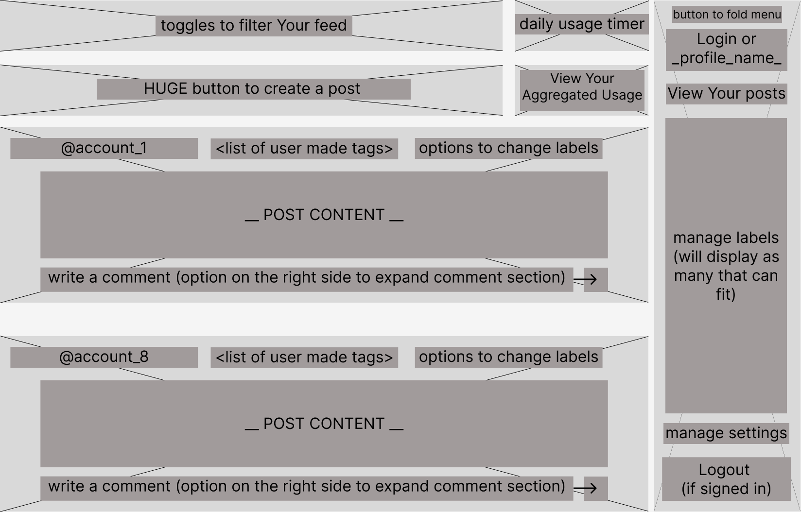
Wireframe from A3
NOTE: After submitting and recieveing feedback on A3, I am aware that my wireframe should be simpler and more interactive. Nonetheless, I will be using my previous wireframe to evaluate the hueristics of my front end.

Usability Criteria
Efficiency I feel that the UI of "Ounce" is very efficient once users become comfortable with the interface. There are not many embedded features, so all major interactions are directly reachable from the home page. Particularly important features, like filtering content based on labels and viewing personal usage are both intentionally placed at the top of one's page. Once fully implemented, these elements will be "frozen" at the top of their UI --> still visible even when scrolling. Compared to my wireframes, I think I should make the "personal usage tracker" larger and be on the leftmost side of a user's display.
Pleasantness As of right now, the UI is not pleasant whatsoever. From my wireframs, the buttons are clunky and do not have much of a flow to them. This is functionally sounds; however, I would not consider this pleasant or calming. Creating a more aestheically pleasing UI will be a major point of emphasis when creating my full frontend implementation.
Physical Hueristics
Fitt's Law From my wireframes, all of the interactive buttons are quite large (i.e Post button, Filtering feed), eluding to an easy experience for user's in terms of Fitt's Law. I think this stems from the relative simplicity of the concepts behind "Ounce". The heart of the app is for simple, yet powerful interactions with the app. This has allowed me to focus more on tying together relatively simple concepts to create a meaningful synergy between them, and thus focus on quality versus quantity in terms of functionality. In my final implementation, I will certainly keep this notion of very large buttons for users to interact with.
Gestalt Principles My wireframes violate Gesalt principles as discussed in lecture. For example, the "daily usage tracker" is currently equidistant between the "label filtering" and "View Aggregated Usage" buttons. According to Gesalt principles, the usage tracker and viewing one's usage should have less separation between themselves / more separation from other elements to allude to the fact that they are related. In my final implementation, I will likely have these buttons connected to assert this relation.
Linguistic Level
Speak a user's language Based off of my wireframes, the UI does not use simple messages. However, this is due to my lack of understanding of wireframes. I wrote these to convey the functionality of certain buttons, not that these would be the actual UI for a user. Now after the fact, I will certainly make the labels of these buttons / interactions much more concise. Overall, the functionalities should be clear for user's as they should all be somewhat familiar with the various features of my app.
Consistency No, my wireframes do not show consistent symbols / icons across similar actions. This will be another point of emphasis in my creation of the final UI design. Many of my features share similarities (i.e adding, removing, pop-ups/downs) and all have commonly used symbols to indicate such (i.e "add" = "+", "remove" = "-" or "x", "pop-ups/downs=" = triangle facing either up or down). Thus, this should be a very important design decision that will be simple to implement for my front-end.
b. Visual Design Inspirations
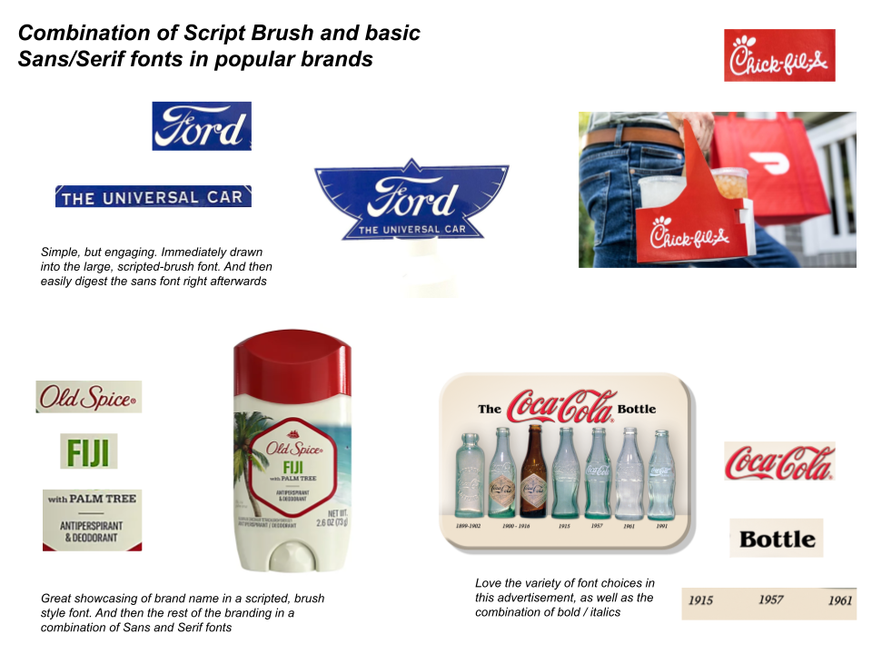
1. Typography

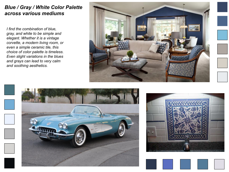
2. Color
