Canvas: A Study of Visual Design
MIT's Canvas dashboard is one of my most frequented websites. Most classes I've taken utilize the platform to manage assignments, share resources, and facilitate communication between students, staff, and faculty. Canvas has proved itself to be a user-friendly, efficient, and productive experience, driven in part by its visual design.
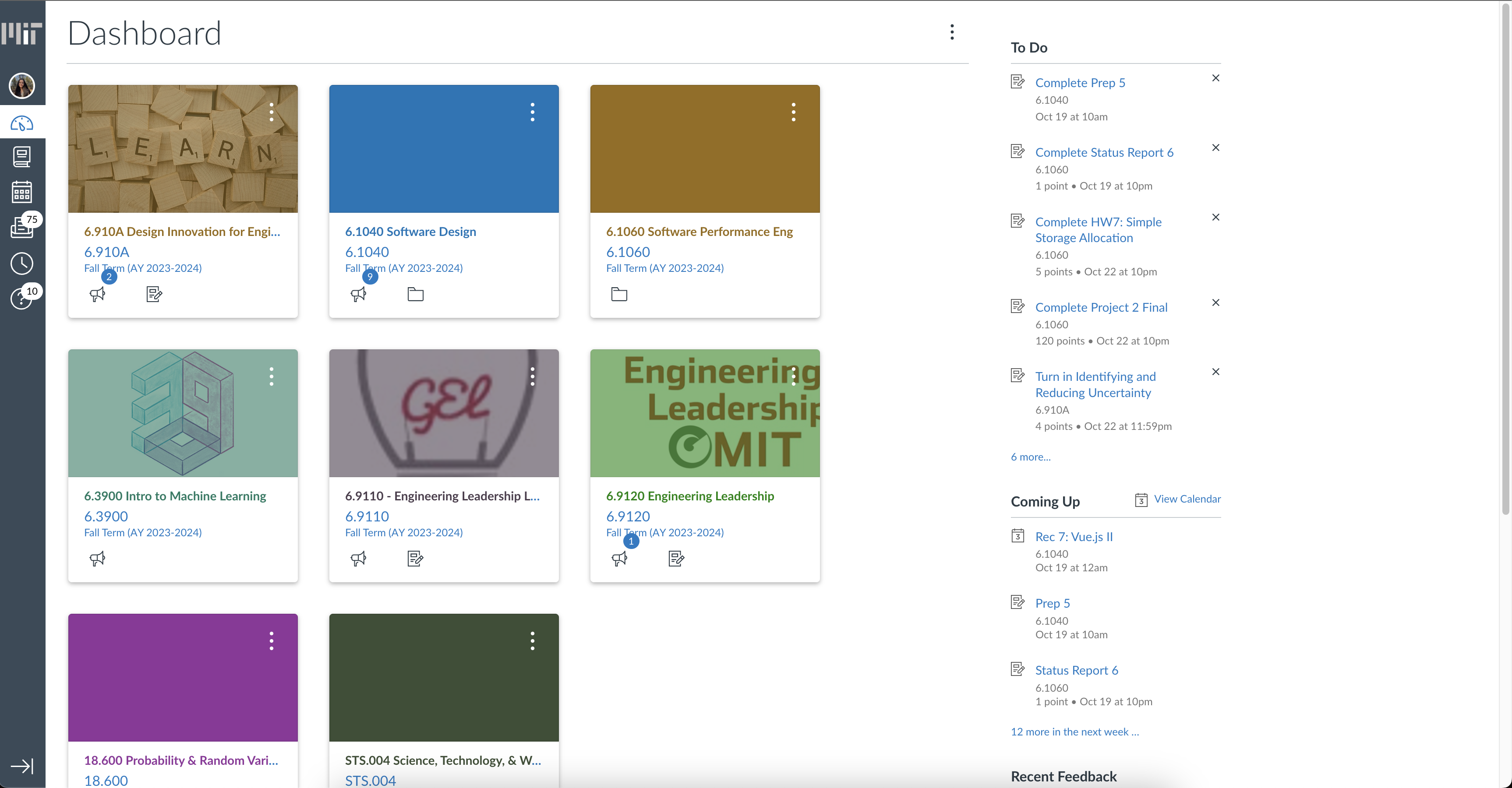
Dashboard
The landing page contains a grid of classes, as well as a navigation bar and list of links. These elements are nicely organized and separated either by a contrasting background or by white space. The class cards are left-adjusted, so the reader's eyes are drawn to them immediately upon loading the page. Each class contains a colored image, either an opaque color block or transparent color overlayed on a class image. The text of the class name matches these colors, making each easily distinguishable by the user. An expert user might be able to navigate to their class much faster by quickly recognizing its color. The text in the right column as well as the captions of the class blocks are colored blue, indicating that they are hyperlinks and will direct user to the specified content. The To Do, Coming Up, and Recent Feedback lists are separated by horizontal dividers and organized chronologically so the user can see the most relevant details.

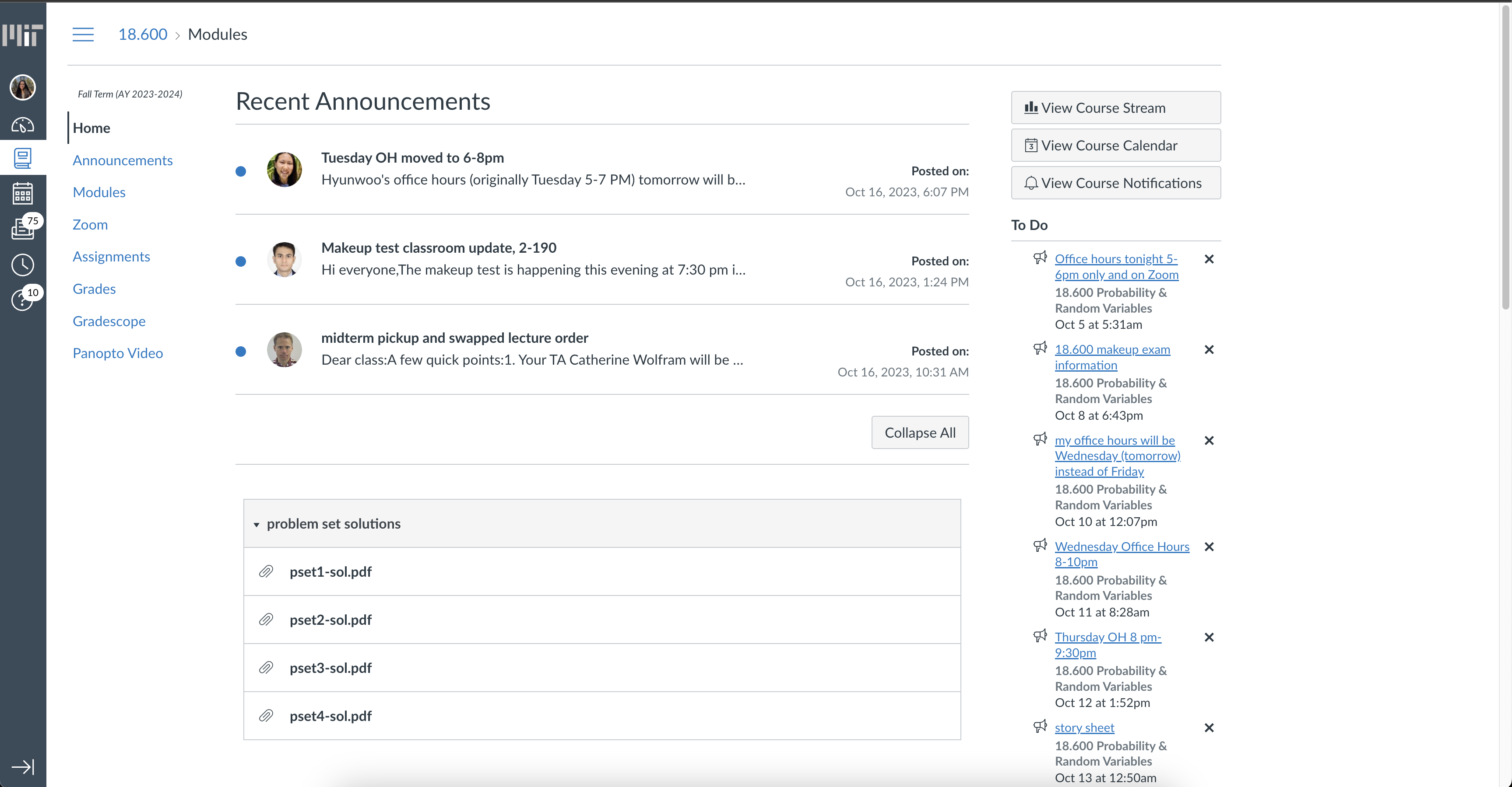
Class Page
Each class page shares a layout: a Recent Announcements section at the center of the page, a list modules below that, a navigation pane, and a To Do list. A blue dot to the left of the announcer's profile picture indicates that an announcement is unread. By displaying a maximum of three recent announcements, Canvas prevents overwhelming users with excessive information and keeps the focus on what's most current. An ordered, expanded list of the modules is displayed, hinting at the user's ability to scroll down to see more. The To Do list and navigation bars are consistent with the dashboard which makes it easy for the user to recall where to look for these features. The expanded navigation pane, a staple feature of Canvas's design, adds to the platform's user-friendliness as the user can quickly navigate between different sections of the course.
