Assignment 5: Frontend Design & Implementation (Beta)
October 27th, 2023
Links
If you'd like to login as an established user: username=bob, pw=123
Heuristic Evaluation
My Figma wireframes can be found in Assignment 3.
Usability Criteria
Learnability
- On the Edit circles page, there is a space to Manage Circles, which contains a dropdown with an Add or Delete option. It's not intuitive that you can add or delete circles using the same input box. Therefore, separating the "Add Circle" function into its own component improves learnability.
- A user must initially create a group to publish posts to. The user may not pick up on this at first glance, so when a new user is created, they instead see a message "please create your first group!".
- It's not obvious that by default, selecting no groups when creating a post publishes the post to all groups. To remedy this, I added an "(optional)" indicator which gives the user the sense that choosing groups manages the visibility of the post.
- Adding a "Link" hyperlink on the posts made it easy for the user to understand that they would be redirected to another site when they click it. I decided to trade off this aspect of learnability and link the hyperlink to the title name to improve the overall aesthetics of the post list and reduce the complexity of the post display.
Efficiency
- On the New post page, there is an input for the source of an article. I decided to remove this input altogether and extract the source behind the scenes based on the url string, to reduce the friction to create a post. This not only reduces keystrokes but also removes a potential source of user error.
- In my current design, the user has a New Post button on the home page which redirects them to a separate page to create a post. This navigation in between actions could be reduced by embedding the new post feature at the top of the home page. The user then has less friction in between scrolling through their feed and publishing a post.
- In the Edit Circles page, the user has to manually enter the circle name to add/delete it. Instead, each option could be laid out in a more desirable format with each option and group displayed in a flattened layout. This way, the user can see all their options clearly and navigate right away to select them.
- On the New Post page, the +Sources and +Notes sections both have an "Add!" button. Adding these sections individually takes time and serves no real purpose, as the "Post" button takes care of this already. Removing these buttons will therefore improve the efficiency of creating a post.
- In my New Post wireframe, the user selects "yes" or "no" for the paywall option. Instead of selecting "no", I changed the input to a checkbox so the user does not have to take an action if the link does not have a paywall.
Physical Heuristics
Fitt's Law
- On the Edit Circles page, there are multiple ways that circles are represented: a list with the members visible, as well as a dropdown. If the user wanted to perform multiple actions on a group, they would have to navigate to multiple areas of the page. Creating a central list of circles with options within that would reduce the time it takes for a user to reach for multiple circle interface elements. This might reduce learnability if there are less clear buttons with descriptive actions, but will likely improve overall efficiency and usability.
- The dropdown menu is also inefficient for the user as they have to click multiple times to select a specific option. In addition, if the list of circles is long enough, the user will have to spend time scrolling to find their desired circle.
Mapping
- The layout of the Home page consists of the posts as well as a sidebar which contains buttons for creating a new post and editing circles. Grouping these two buttons on the navigation bar might confuse the user, since their functionalities are not related. Instead of this, embedding the New Post form into the home page would make sense as the two concepts are more cohesive. Moving the Edit Circles button to the top navigation bar would also make more sense as it would be closer to the Settings/Login button which deals with users and accounts.
Linguistic Level
Recognition vs Recall
- I decided to trade off consistency in my buttons to improve the users' ability to recognize different operations. In my wireframes, the New Post and Edit Circles buttons are the same, even though they have very different functions. I decided to change "edit circles" to "groups" to add simplicity and improve recognition, as well as move it physically to the top navigation bar so the user only has to look in one place to navigate to a different page. As mentioned in my Efficiency heuristic analysis, the New Post page is now embedded in the home page.
Speak a user's language
- Having "Insert Title" and "Insert Hyperlink" on the New Post page is not very instructive. Instead, having both a heading and placeholder will help the user understand the necessary actions they must take. Insead, I ask the question "what are you reading?" to narrow down the user's focus to online articles/webpages, and add placeholders with more clear instructions like "paste the title here...".
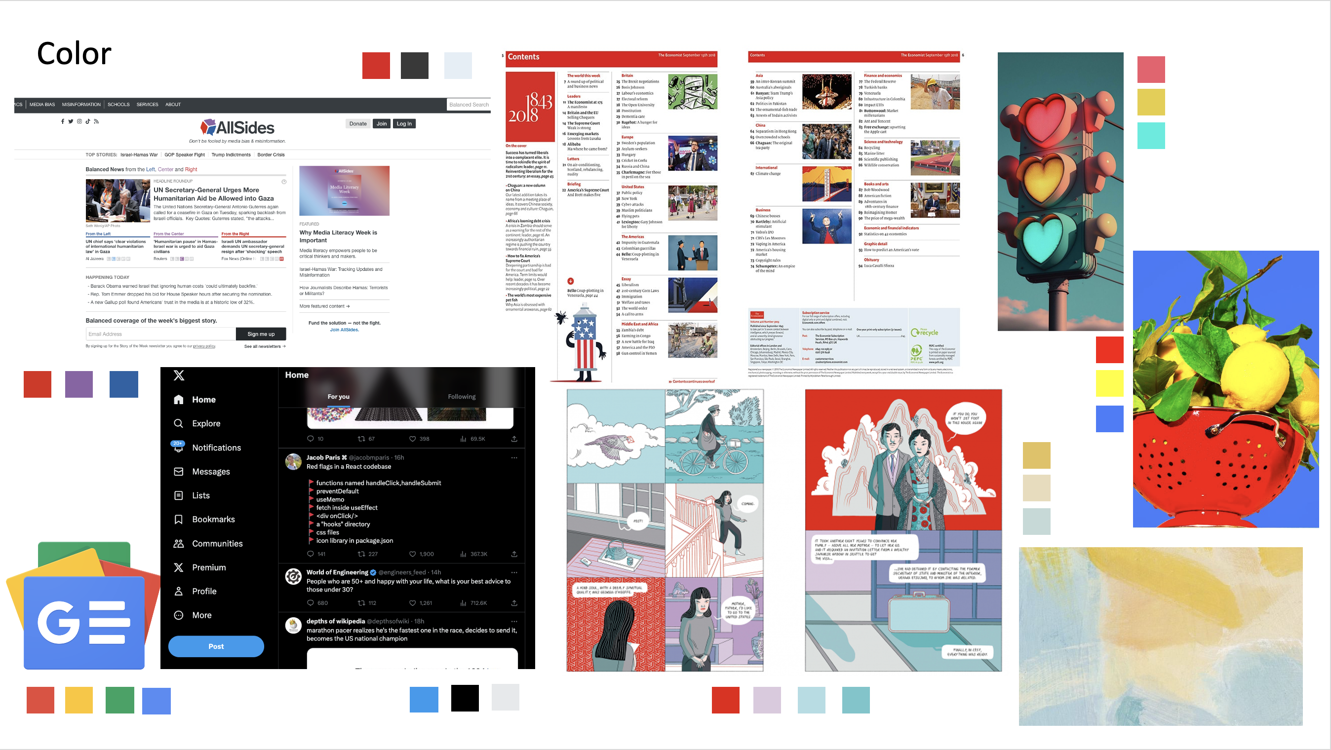
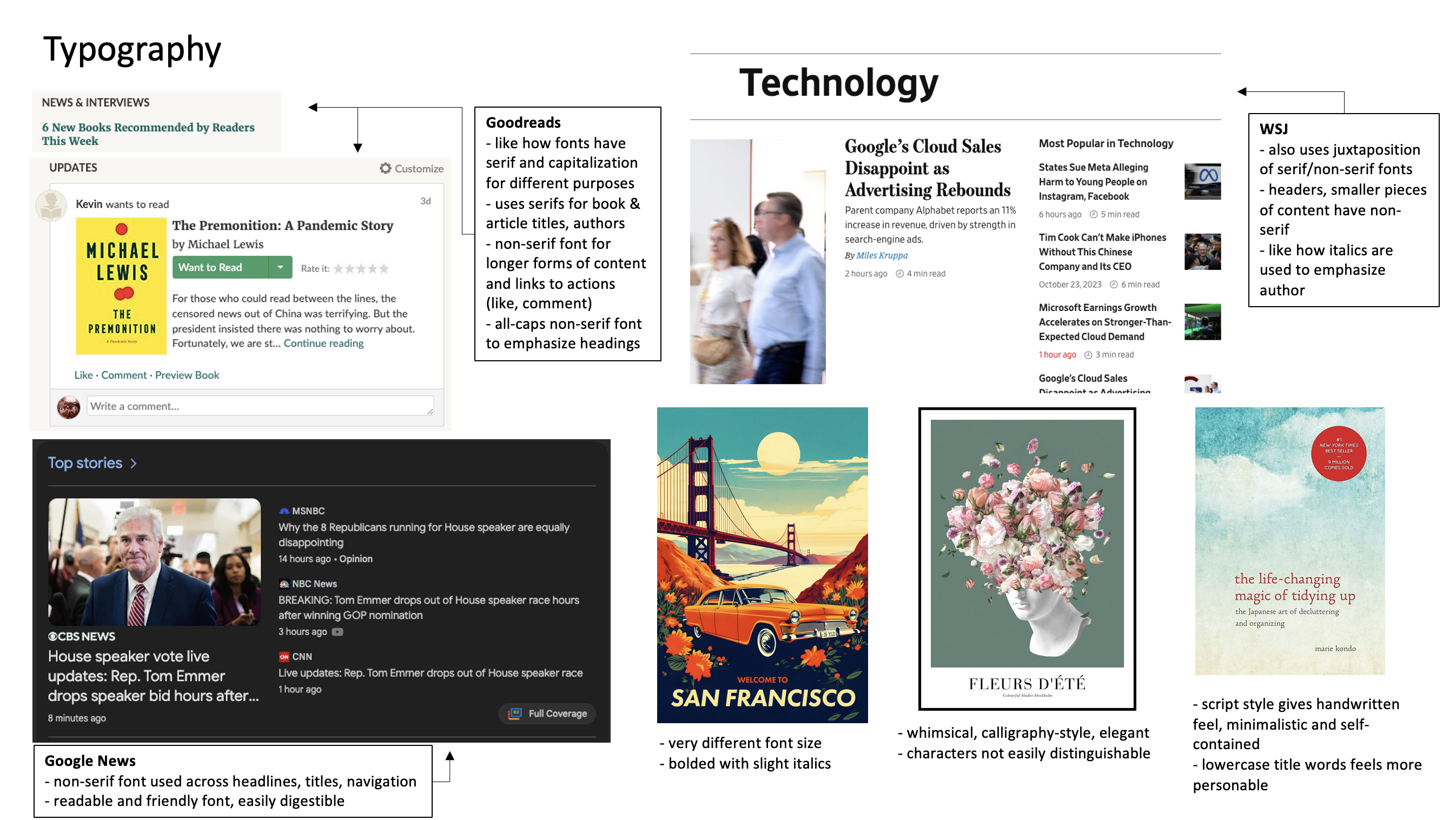
Visual Design Study

