Tasks
| Task | Instruction | Purpose |
|---|---|---|
| Getting started | Make an account and login into your account | The goal is to see how smoothly a user can get started to use the app. |
| Flow of the app | Try to comment on a post | If someone has forgotten to post their daily journal, they do not have enough points to comment or send request. I wanted to know whether they would be able to figure this out. For example, the error message that they get is informitive. Additionally, when they are propmted to post first, I wanted to know if they can navigate easily to the journaling tab easily. |
| Point concept | Spend all your points | The goal is to know where they would check first to know their points. How they would spend their points. How they would navigate between posts and users. |
| Settings | Change you username or password, logout and login again | Testing how users would navigate to the setting page. |
| User's power | Edit your previous post, create a new post with a different topic. Find your tags | Testing how a user modify their post, how they find their tags. I wanted to know their reactions when they see their tags. |
| Interaction with other users | Send a friend request to someone who has similar tags to you | Testing if they know how friend suggestion is being generated, and to see how they find the friend tab. |
| Friendship | Remove a friend that has posted something that you do not like | Testing how a user navigate to find their friends' pages and unfriending them |
study report
Peyton Worthington
An MIT undergraduate student majoring in course 2-A
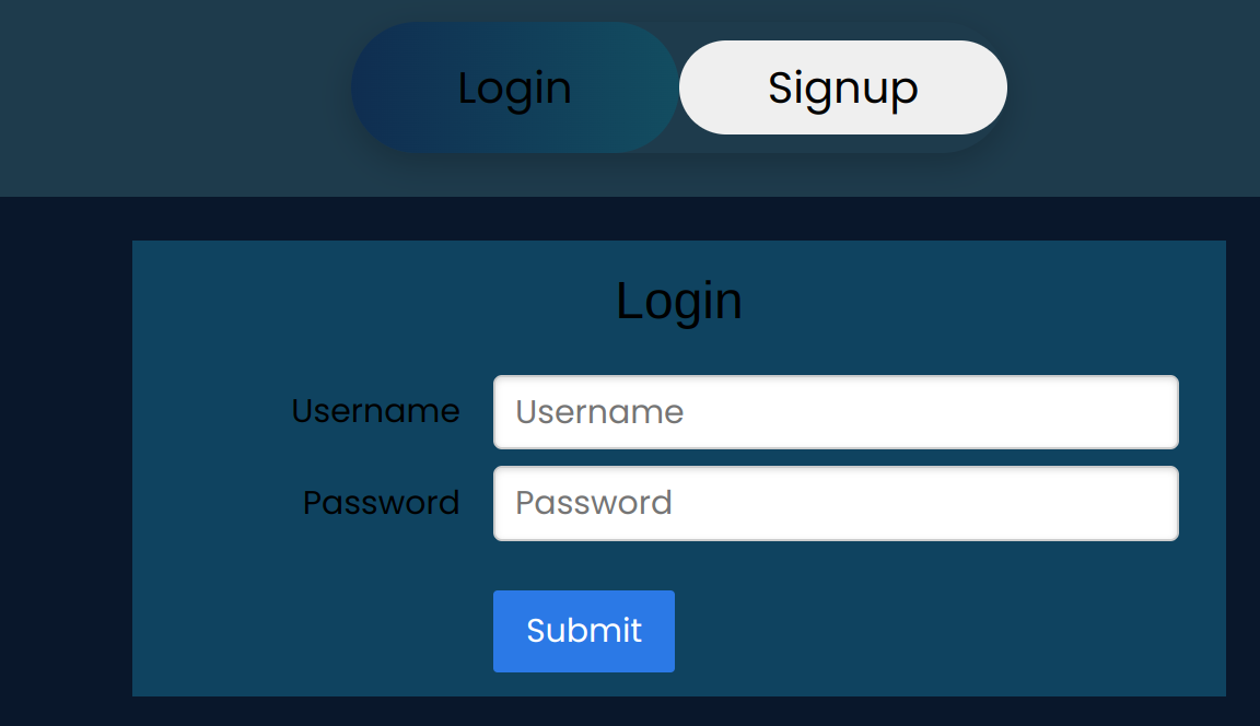
He was very excited that even before me asking him to create an account, he made one and started to explore the app. I believe that although the color harmony of the login page is not elegant, the design and style are entertaining, and that made him excited. Having a slider to choose between login or sign-up is a simple action that excites the user to engage with the web. The moment he logged in he started scrolling down the homepage. When he saw posts from some people that he knew, he started reading them. The first task that I asked him after he logged in was to comment on an arbitrary post. He couldn’t submit his comment because he did not have enough points, and he received the error message that he does not have enough points. Then, he tried to find a way to post something. First, he checked the button for the profile account. He did not find anything there. Afterward, he checked the button with the book icon and posted something. In common apps, like FaceBook or Instagram, a user can post from their profile page. My guess is that he checked his profile tab because of that reason. After that, I asked him to spend all his points. First, he said that ‘probably my point count is on my profile page.’ He checked his profile page, and then, he started commenting until he ran out of points. The next task was to send a friend request to someone who had posted similar content to him. For looking up his tags, he immediately went to his profile page. He was surprised that his tags were related to his post (GPT!). Easily he navigated to the friend page and found the friend suggestion tab. However, for checking their page, he first typed in their name in the box for sending friend request. Then, he wandered a little bit, and based on what he was saying at the same time, it seemed to me he didn’t know how to find his way to someone else’s account. Finally, he figured out that by clicking on their names on the home page he redirected to other users. I asked him to try to find the name of a user that is into sport without going through all the posts on the home page. He simply posted something new about sport to modify his tags and friend suggestions. During our debrief, I got some interesting feedback. For example, he mentioned that he did not like the buttons that I have for commenting or deleting something! Additionally, he said that the background color of posts was bothering him!!
Lucas Young
An MIT student majoring n course 6-9
The initial task in my user test was to create an account, where I observed an interesting user experience. Initially, Lucas inadvertently remained on the login page instead of sliding the switch to the sign-up option. Consequently, his attempt to sign up was unsuccessful, and he was left without the expected error message indicating that the account did not exist, which did not appear on his laptop screen. After a brief moment of confusion, moving the mouse around the login page, Lucas said 'Ahhhhh' and correctly clicked on the signup option. I noticed that it was not really obvious for a user which option, login or signup, is active. The next task was to leave a comment on a random post by his choice. As anticipated, an error message appeared, indicating that he needed to make a post first to gain points. He was surprised and said ‘interesting, ok let’s post something.’ Lucas navigated to the post section, posted content, and subsequently left a comment as instructed. Then, I asked him how many points he has and what his tags are. He checked a few different tabs until he found the profile tab. After that he quickly found the points and the tags on his profile page, as those two things appeared next to his name on top of the page. The following task was changing the username, which he confidently looked at the top of the page and clicked on the gear icon immediately. He changed his username, and I asked him now to log out and log in again. He said, “It should be easy-peasy!” Then, I asked him to send a friend request to a user who had shared similar contents as you. He said ‘hmmmmmm, let’s check the friend tab.’ He moved the mouse around the friend’s suggestion. Then, he said ‘they might have posted similar contents, let’s check their profiles’. He clicked on their names and prompted to their profile page. He was like ‘Oh yeah, they have similar tags as I do.’ He immediately sent a friend request to them. Then, I accepted his request from my end. The final task was to remove a friend. Lucas without any hesitation navigated to the friend tab and clicked on the remove button. In our debrief, his first opinion was very interesting, “even though this app is missing lots of functionality, it is very simple and enjoyable to use, to see your friends’ diaries.” In his opinion, the overall color of the app gives the vibe of an old notebook, which is a calm experience. He said that the logos were self-explanatory to help the user to find their ways around the app.
Design Flaws and opportunities
1-Post/Comment arrangment
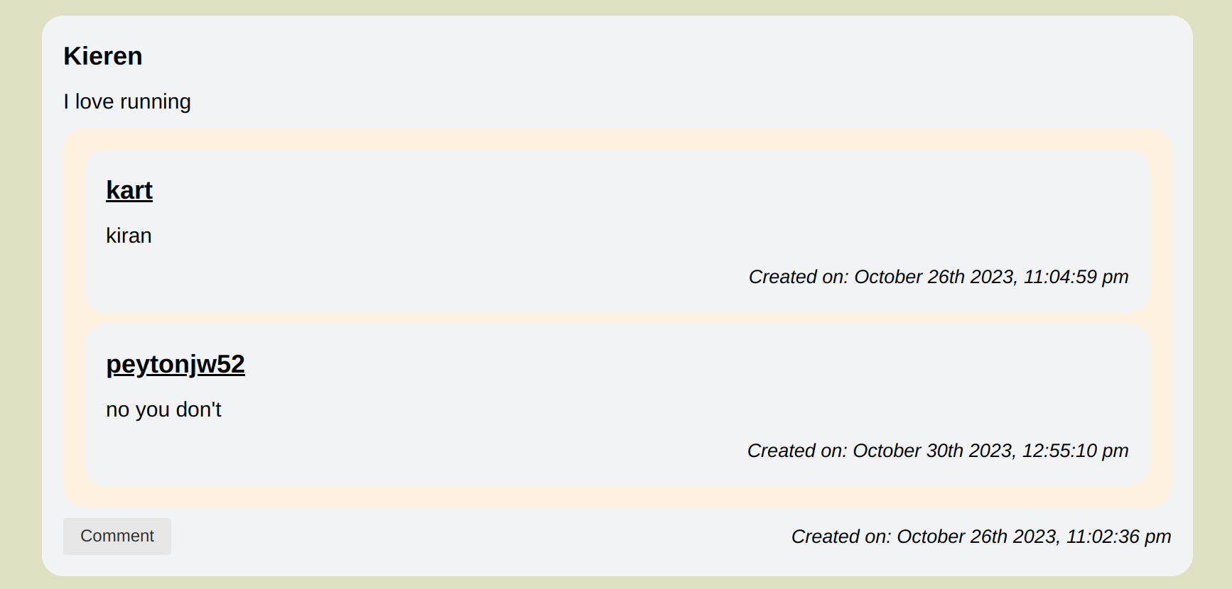
This is a moderate physical issue. Using a different box for comments was helpful to distinguish comments from the posts. However, Peyton in his feedback said that it is not really pleasant to look at the way it is styled currently.

2-Clarity about point
This is a major linguistic issue. Other than a few error message, there is no way a user would discover that they are spending their points when they are sending friend requests or commenting on other posts. Potentially, I could add a page that once a user register it describes how the concept of the point play a rule in this app. However, I should keep the messages as a user might forget and keep track of their points.
3-Clarity about tags
This is a moderate conceptual issue. Tags are generated and accumulated everytime that a user posts a diary. Therefore, if a user writes a diary about sport only one time, they will see users who posts diaries about sport everyday. 'Sport' should not be that user's tag forever. It is not clear to the users how tags are generated and being updated, which is linguistic problem. I got the question 'what is the algorithm' to generate friend suggestion from both users who tested my app. Additionally, as they posted more, the list of friend suggestion got longer since my app currently accumulate the tags.

4-Consistency in using diary word
This is a minor linguistic issue. I have been using the post and diary interchangably on my app and in my user testing. I have seen moments of confusion, but the users figured it out quickly. I should use the word diary everywhere that it says 'post'.
5-Navigation between users
This is a mild physical issue. In both user testings, the users had problem how to navigate to a user's page. It wasn't obvious that by clicking in their names, their profiles will be shown. A potential solution would be to change the color of the usernames when they hover the mouse over the usernames. Also, it is possible to havea search tab to find users' profile pags.
6-Login/Signup
This is a mild physical issue. Lucas didn't notice which box (login or sign up) was activated the first time. The colors do not have really a meaning on the login page.
