Github
https://github.com/amirika20/frontend
https://frontend-theta-beryl.vercel.app/
Visual Study
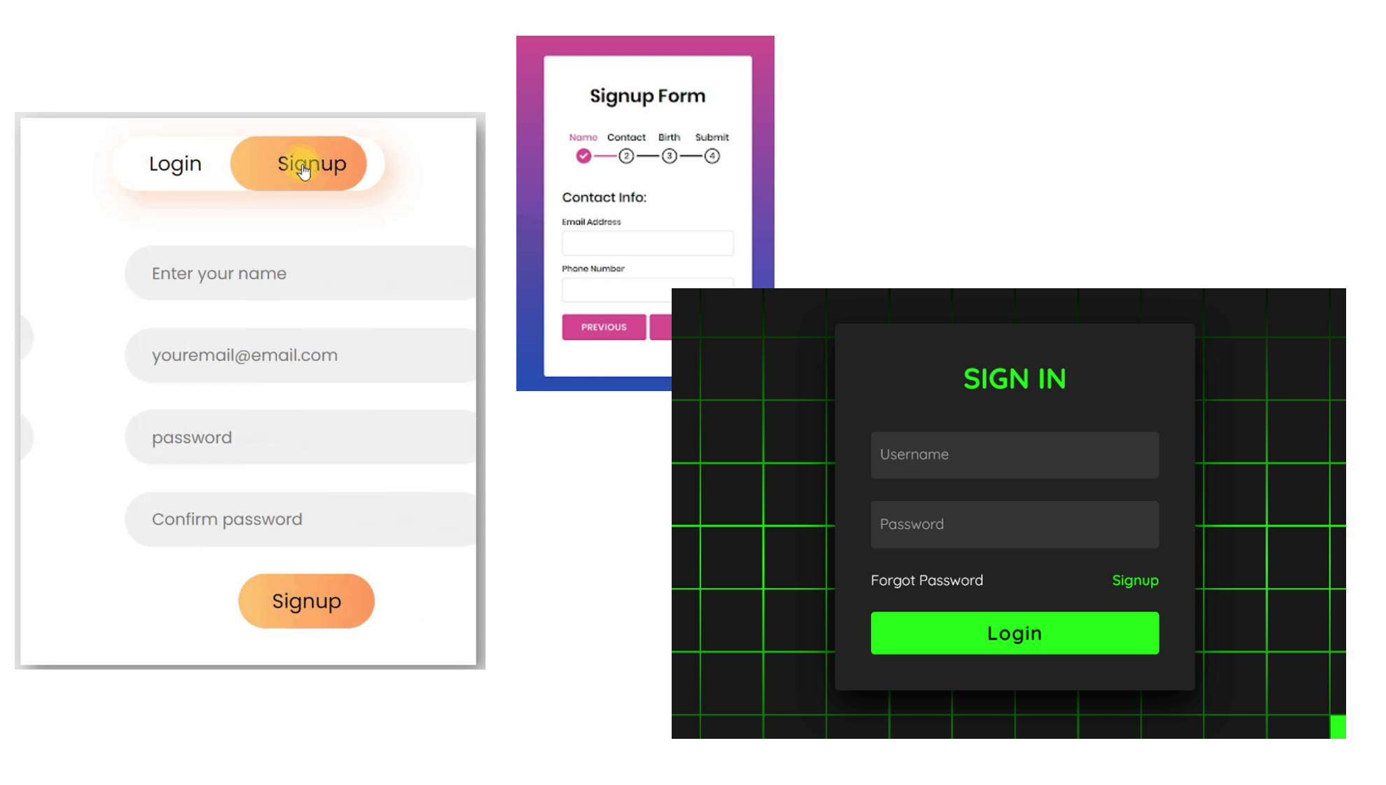
Login page designs 
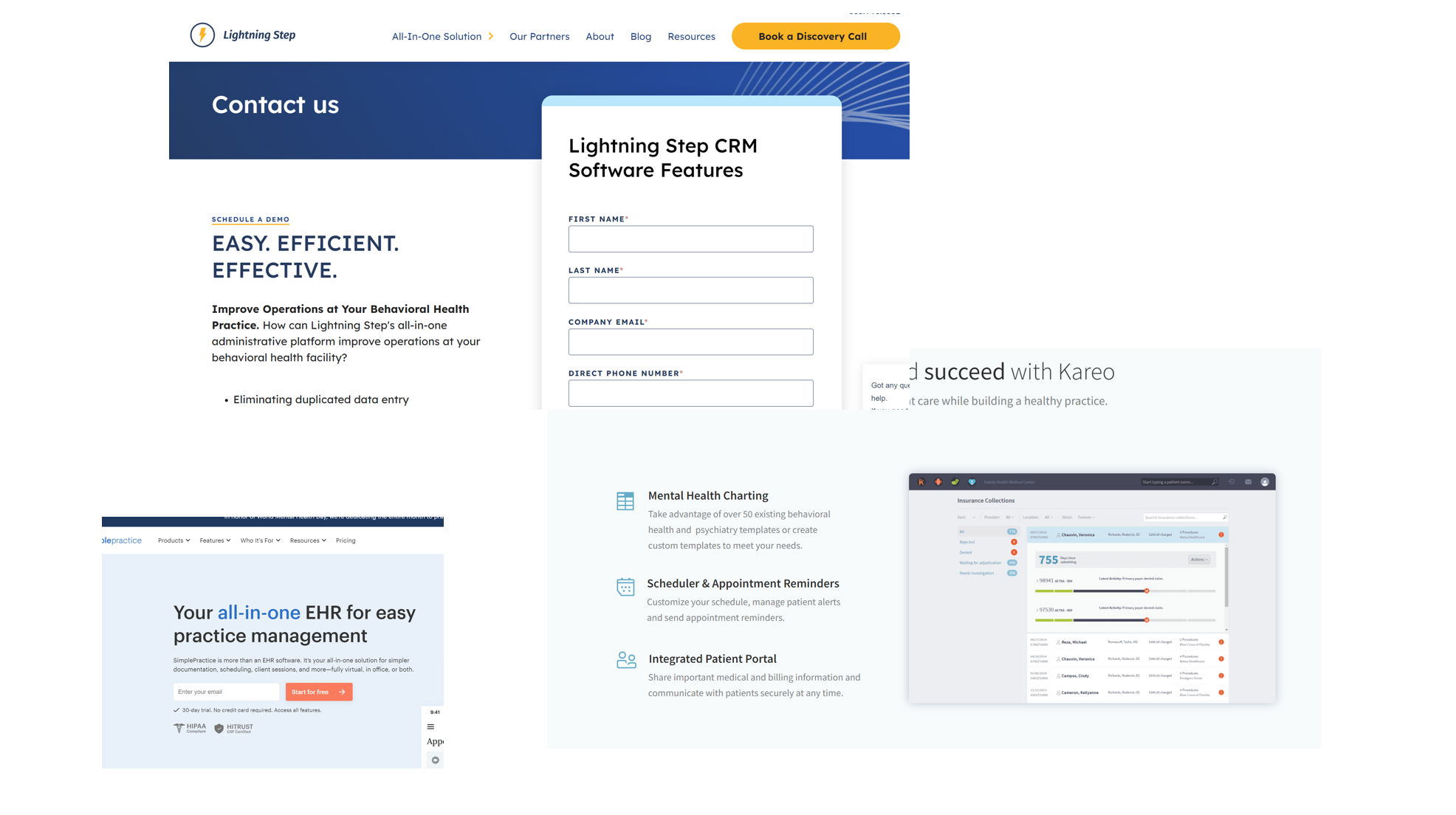
Colors for apps that are related to healthcare systems 
Wireframes
Usability criteria
Learnability: I beleive that it is intuitive to navigate through the app to find the page to write a diary or find the homepage to check others' diaries. For any action, there exists a distinct bottun for a user to revognize and use.
Accessibility: My wireframe is not well designed for people with disabilities. For example, If someone is color-blind, the colors were not well-chosen for them. If someone cannot type, they cannot type in their diaries. Therefore, the solution to this problem would be to add a transcriptor.
Physical heuristics
Fitt's law: The navigation bar is at the bottom, so someone simple needs to to move the curser to bottom of the page to reach the icons. Additionally, I used some circular icon which a user does not need to be worried about the sharp edge ofa square. They simple need to get into the area of an icone.
Situational context: In my app, when a user post a diary, they get some points. Then, they can use their points to send friend requests or comment on other posts. However, with my current wireframe, if a user does not have enough points, there is no way that they would notice that they do not have points when trying to comment or send a friend request. The solution would be different coloring to convey that a comment option or follow request is enable or disable.
Linguistic level
Speak a user's language: I tried to avoid text as much as possible, and instead, using icone images. However, I did not explain well how tags work. Tags are topics of a user's recent post, and it is generated by an LLM. Additioanlly, friend suggestion is based on tags. Definitely, an explaination is needed for this.
Consistency The navigation bar does not change on different pages.