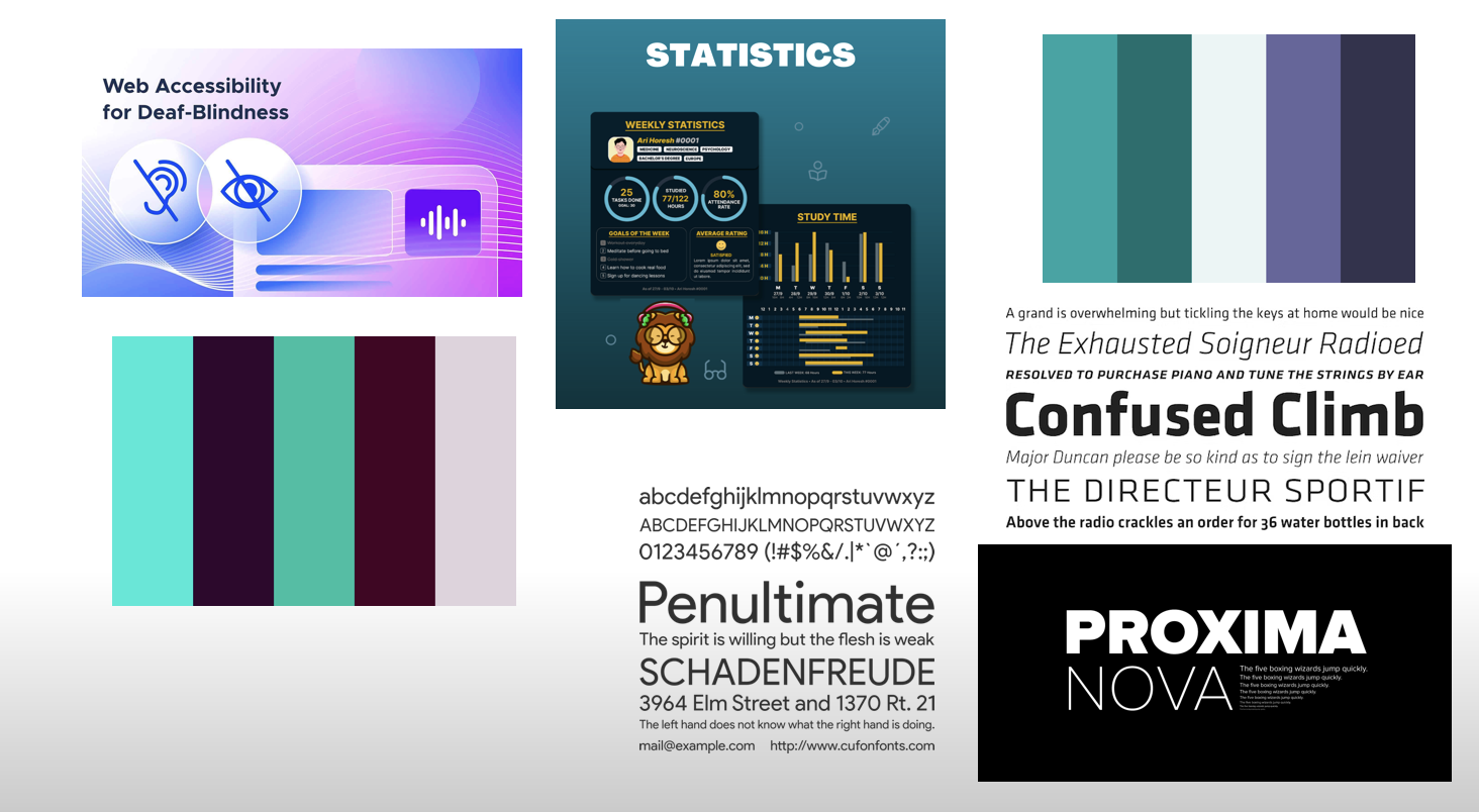
Frontend Design
Figma Wireframes
Heuristic Evaluation
Usability Criteria
- Accessibility All buttons and other components are verified to be able to be read via a screen reader. However, some functionalities such as speech generation rely heavily on APIs that were not able to be obtained for free.
- Error Tolerance Actions provide error messages with information if an error was raised (for example, already-logged-in). However, all information not in stores will vanish upon refreshing the page, such as being in the middle of editing a post or text.
Physical Heuristics
- Fitt's Law Buttons are in close proximity of each other, navbar is on top, and other visual needs are met. However, not all functions are accessible from all pages.
- Situational Context Most functions make sense situationally, but for example in the signup modal, the feature selection may be confusing.
Linguistics Level
- Consistency The colors are not very consistent across the board, especially comparing to the original wireframes. However, important buttons, etc are all marked with accented colors, leading to a useful view.
- Speak a User's Language In the literal sense, the speech detection API is currently not working due to costs that I was not able to fund. The wireframe could do better with a lot of the language, but text length restrictions prevent some of these improvements.
Visual Design Study
