Heuristic Evaluation of the Wireframes
Usability Criteria
Veil's visual and interaction design of the prototype wireframes are generally tailored to ease the user's learning curve and to provide a smooth and intuitive user experience. However, there are still some usability issues that need to be addressed.
prototype I: noraml view & grid view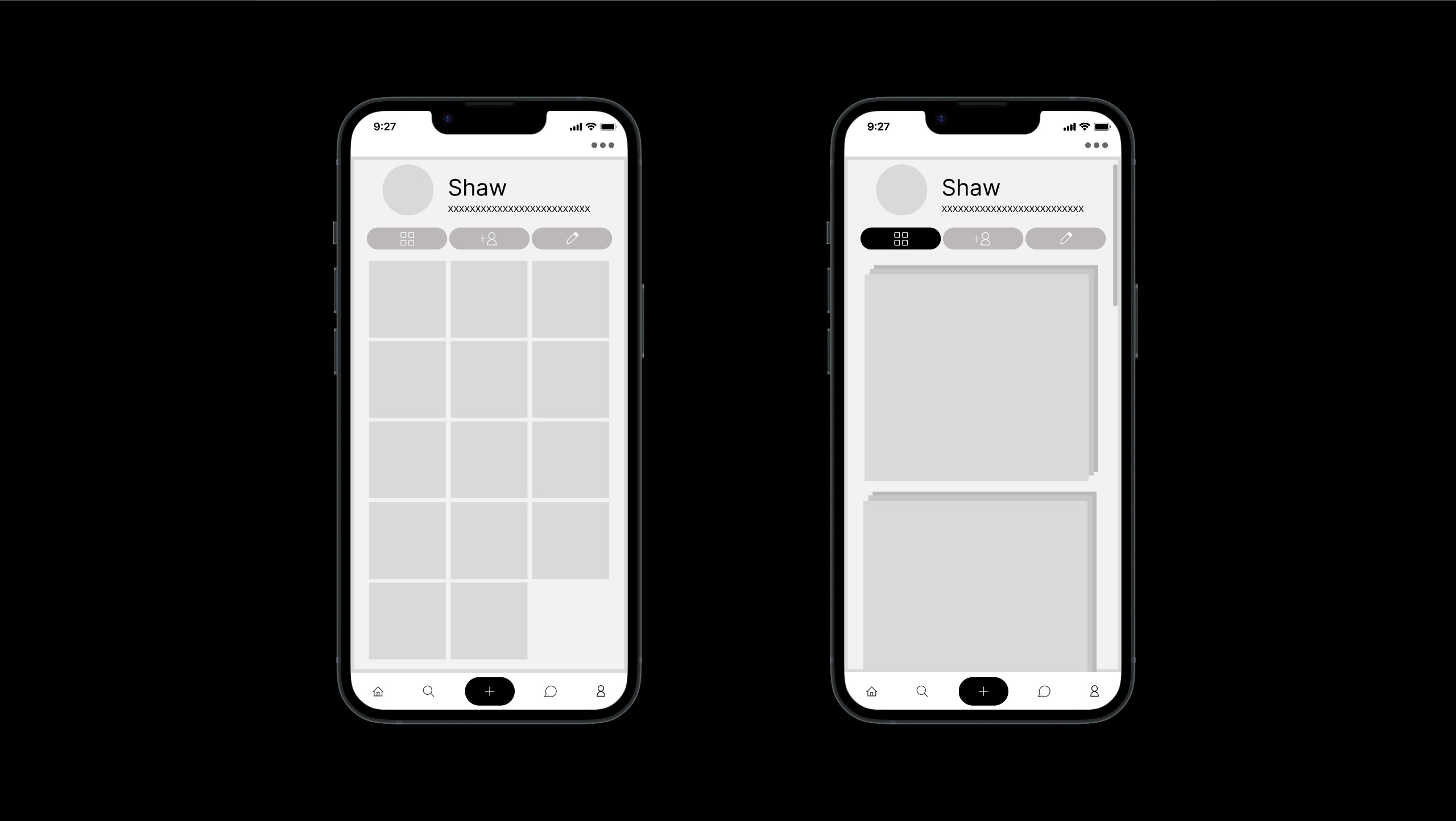
- Learnability:
An important idea of Veil is to give users the freedom to "veil" and "unveil" the contents they curated in their own content cabinet. However, the current design does not show an intuitive way for the user to do so. A possible solution might be adding a "veil" button on the top right corner of the content card, which will be shown when the user hovers over the card. This will allow the user to easily "veil" and "unveil" the content without having to go to the content detail page.
The grid view button of the contents in the content cabinet is not very necessary, since it's sort of a default view for the content cabinet. It might be helpful to have sub-views of the contents based on the tags, such that the user can easily find the content he/she is looking for. However, this is may, in turn, add to the complexity of the learning curve.
- Efficiency:
- Once the user has learned how to use the app, the user should be able to use it efficiently. The "veil" and "unveil" functionality can be improved by allowing the user to "veil" and "unveil" multiple contents at once. This can be done by adding an extra option in the more menu on the top right corner of the content cabinet page. Or like iphoneOS, the user can tap and hold on a content card to select multiple contents and then "veil" and "unveil" them.
Physical Heuristics
Veil's user interface is designed to be clean and simple. However, there are still some physical heuristics that need to be improved.
prototype II: the discovery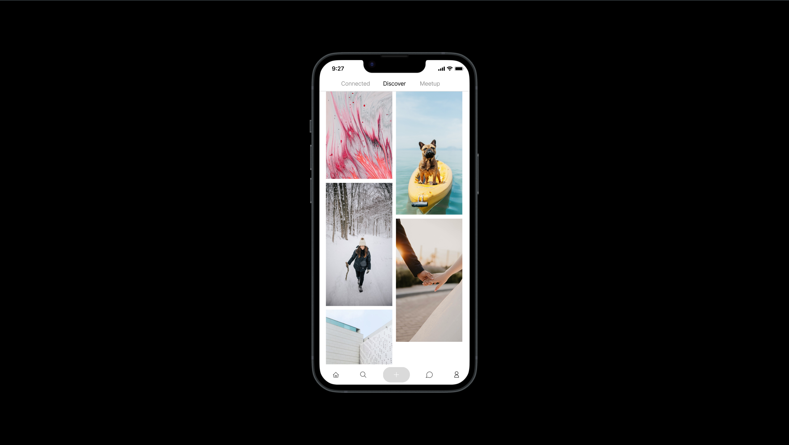
- Situational Context:
- The current home page of Veil is composed of three main blocks: Connected, Discovery and Meetup. The three blocks correspond to the three main concepts of the app: Friend, Discovery and Meetup, each having its own contents and functionalities. Considering adding a page for the user's own content cabinet, which is the main concept of the app, might be a good idea. This will allow the user to easily access his/her own content cabinet, but may be a bit redundant, since the user can always access his/her own content cabinet through the profile button.
- Accelerators:
- Users can now easily navigate through different pages of the app by clicking on the header buttons on the top of the homepage. Also, at the buttom lies the navigation bar, which allows the user to navigate through the app with ease. However, the current design does not allow the user to navigate back to the previous page. This can be done by adding a back button on the top left corner of the header, which will be shown when the user is not on the homepage.
Linguisitic Level:
Even though Veil introduces some new concepts, the user interface is designed to be intuitive and easy to understand. It is important to keep the user interface simple and concise, but also demonstrate the app's unique features.
- Speak the User's Language:
- The choice of using "Connected" might be a bit confusing at first glance. After all, the connected page shows the contents of the user's friends. A better choice might be "Friends", which is more intuitive and easier to understand.
- Information Scent:
Considering highlighting some of the friends' contents in the connected page might be a good idea. This will allow the user to easily find the contents of his/her friends, which is the main purpose of the connected page.
The login page could be improved by reducing repetitive information. For example, the placeholder can indicate the format of the input, and the "submit" button can be replaced by the "login" button.
Better Login page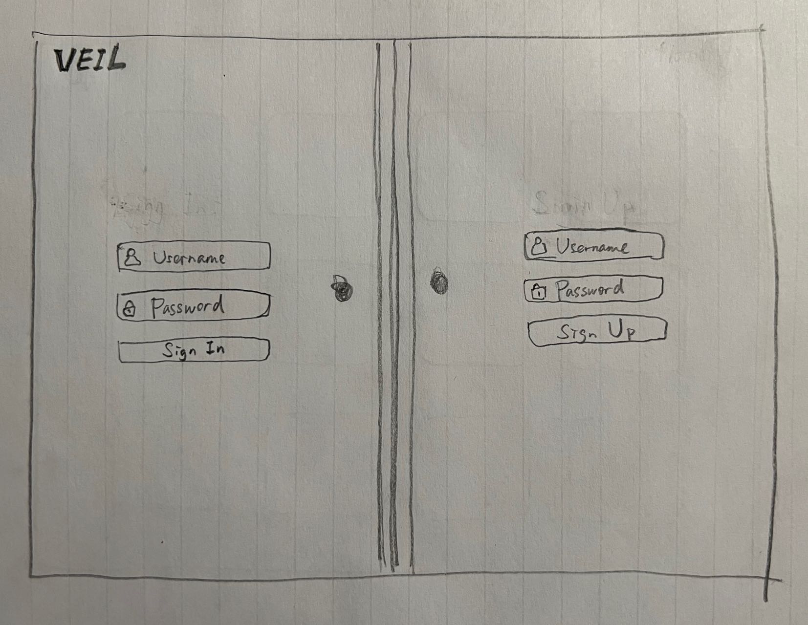
Visual Design Study
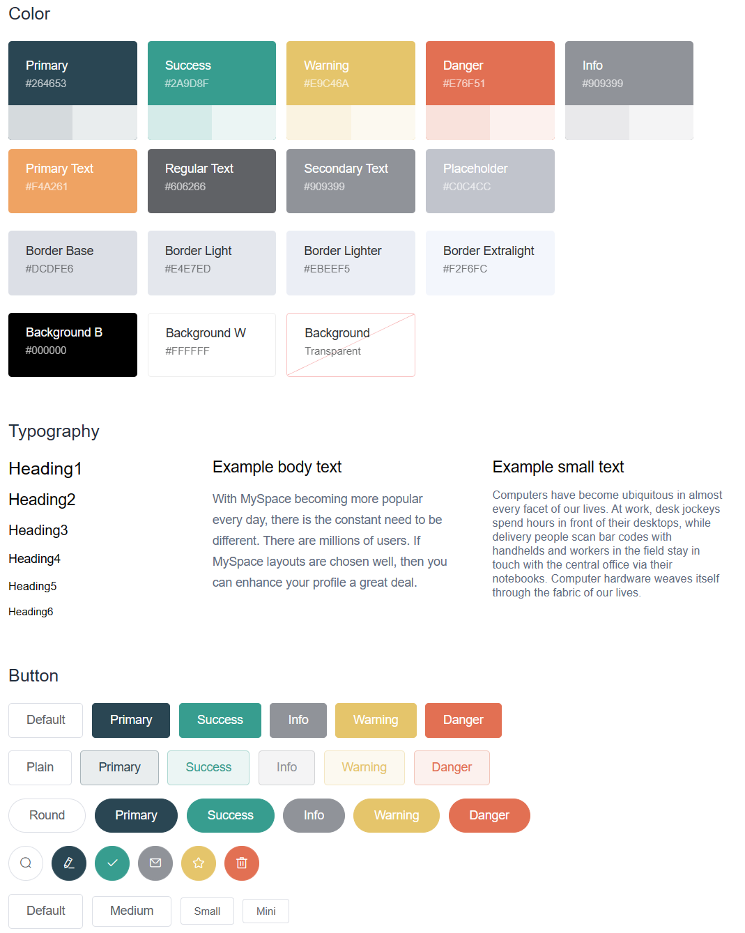
The color scheme and typography of Veil are designed to be simple, clean and giving a nostalgic vibe. I want to create a smooth and relaxing user experience, and the color scheme is an important part of it. The color scheme is inspired by the movie "Asteroid City", which has a siganiture color scheme of light, warm and nostolgic. I tuned the color scheme a bit to make it more calm and suitable for the app.
Asteroid City, Wes Anderson
Veil's Color Scheme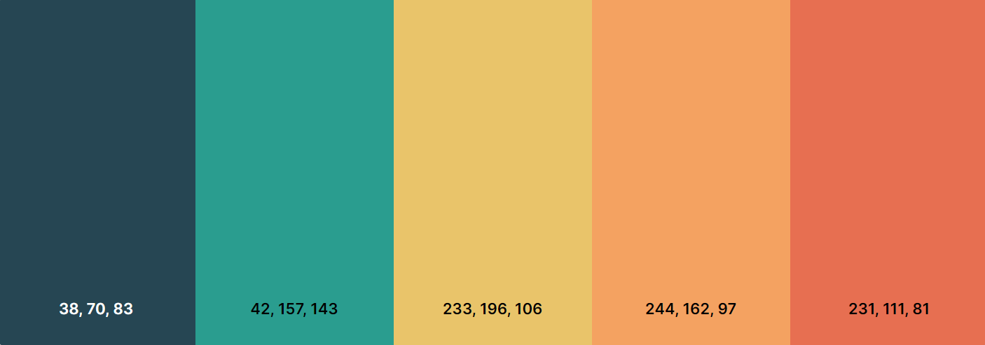
Veil's Theme