User Testing & Final Release
@Shaw Chen @Ethan @Maggie @Yinghou Wang
Final Release: ALWAYS & Demo Video
User Testing
Test 1:
Report on Patient Version:
The patient user's experience with our app was a mix of positive and negative reactions. The user found the registration process easy and intuitive but questioned the limited user settings, suggesting the inclusion of more personalized options such as religion or after-death preferences. The mood-setting feature was appreciated, but the user desired a more comprehensive pattern-tracking functionality to see mood trends more clearly while incorporating AI suggestions for negative mood trends.
The forum feature was straightforward for creating posts, but the reply functionality needed to be clearer. The user also suggested the addition of a feature to display the number of likes and who liked their post. Also, the bottom navigation menu icons could have been more intuitive, with the world and time capsule icons needing clarification about what they would lead to.
The diary feature was easy to use, but creating a topic was unnecessary. The user also questioned the option to add diary entries to the time capsule, as diaries are typically private. On some pages, the user needed to realize the home icon was a button and also expected to be able to click on their profile image on the home page.
The time machine feature was well received, but the user suggested it looked too much like an exciting present, which was conceptually odd for a concept of releasing content after death. The user also wished to add other media types to the time machine. But in general, the settings were intuitive and familiar.
Report on Non-Patient Version:
The user found the non-patient registration process easy and familiar but raised the issue of access for healthcare professionals without a patient passcode. The user found the home page icons in the mood block easy to miss but could figure out all basic functionality.
The user suggested that non-patients should also be able to add their memories of the person to the time capsule. This suggests that the app could benefit from more inclusive features that allow all users, regardless of their relationship to the patient, to contribute to the patient's time capsule.
In conclusion, the user found the app's features generally easy to use but suggested improvements for more personalization, intuitive icons, and inclusive features.
Test 2:
Report on Patient Version:
Overall, the user had a nice experience with the Patient Views. As this was the majority of our focus during implementation, they all were very polished. Across the board, there were small UI bugs that gave the user a bit of friction. For instance, the user must provide a 4-digit passcode on registration. Once a digit was entered, the cursor did not automatically move to the next digit input. Furthermore, the user had a few conceptual qualms. First and foremost, there needed to be more explanation of the various features across the app. For instance, upon registration, the user has to specify if they need "Visual Aid." Although he did not select yes, he was unsure what features this would specifically modify. Another initial paint point was that the nav bar only utilizes visuals for the various pages. He worked around this by hovering and deciphering the path of the next page; however, for someone who is not tech-savvy, this would not have been feasible. In real practice, this should not be an issue in that I would expect the users to naturally explore the various pages and gain an understanding of the app's structure.
Once on the forum page, the user had no qualms with the interface. He easily navigated through various topics and saw the posts of others. One small note was that he did not naturally click on any usernames within the topics (which routes to a profile page of the associated username). If this app were to be used in a real-world setting, we would want to clarify this functionality to the users.
Next, the user went through the Diary and Wish functionalities. They are very similar so that I will discuss his points with both now. He really liked the layout and UX of the page, specifically noting that the various pages for creating / editing were nice (rather than pop-ups). He did have a few negative observations, though. Once again, he thought that our app could have done a better way of explaining a feature. He did not know what "private" specifically represented within our app. Going off of his mental model of Instagram, he thought that "Private" meant that "linked family/friends" were the only ones who could see it. However, in our app, "Private" means only the user can view it. This alludes to the fact that we should either make this a more intuitive name (i.e., "Hidden") or have an explanation on the diary page.
Lastly, the user navigated to the Time Machine views. He thought this page's concept was awesome and loved the Time Machine layout. He easily navigated through the pages and could add and delete things to his Time Machine. A highlight of the entire User Testing Session was when he tried to edit the content of a diary within the capsule. He hesitantly clicked on the component within the capsule, and it routed him directly to the "Edit Diary" page. He thought it was a subtle feature yet extremely convenient.
Report on Non-Patient Version:
The user easily created and linked their Family/Friends' account to the Patient account they had just created. He liked the concept of being able to link the two. The user was super impressed when his Home Page loaded and showed the content he had just created in his Patient Account. Conceptually, one qualm he had was that the Diary / Wish pages were blank when the Patient had no public entries. He validly pointed out that this needed to be clarified in that he was not sure if the page was still loading or if there was no content.
Overall, the user had difficulty navigating through our Family/Friends view. The fulfilling Wishes functionality needed to be incorporated, but the nav bar needed to be present to do things such as navigate to the forum, and there were other minor UX bugs that he pointed out. This highlights our focus on the patient version of the app. We had all of the backend to incorporate the missing features on the Non-Patient views; however, we couldn't complete it due to time constraints. Nonetheless, I am super pleased with our app, as implementing it all was extremely ambitious.
Test 3:
Report on Patient Version:
Throughout the whole test, the user experience was smooth and pleasant. An extra explanation was put in to help her understand the TimeMachine concept. With this understanding, she thought having such a feature was super cool and useful. Although she liked the feature, she wished there could be more notifications for clarity. "It would be much clearer if it said 'add to the time machine, and it will be deleted after 100 days since your account stayed inactive," she pointed out when trying to add the newly created wish to the time machine.
For our other three core concepts, Diary, Wish, and Letter. Starting with the diary, she successfully created a new diary and made it public. As in the above user test, she also thinks adding a public diary to the forum is unnecessary. "People can just read the patients' public diaries in the diary section," she said. Some functionalities, such as adding a picture or a location, were mentioned while creating the wish to help better identify the information. She appreciated allowing the user to create a wishlist and involve their loved ones in fulfilling it. A major problem with creating a letter appeared to be the place for adding the desired contacts located on the home page. She thought finding this on the home page next to the settings was very unintuitive. Another confusion was about adding the delay behavior to the letter. She understood the scheduling idea but was unsure about the difference between delaying the sending here versus in the TimeMachie.
The user went smoothly with all the tasks for the forum and mood feature. She likes how we can navigate to a user's profile through their topic. Overall, she thinks the app's interface is clean and pleasant. She also likes the layout of different contents in each module.
Report on Non-Patient Version:
For creating a non-patient user and connecting to the patient-user she created before, she applauded the 4-digit verification idea. However, she mentioned that it is highly possible that she won't know the patient's username in advance, so a dynamic verification system generating temporary passcodes would be better in practice. A tiny problem here, though, was she pointed out that having to jump to the next code slot manually was a bit inconvenient.
After connecting with the patient-user and logging in to the home page, she likes that all the connected patients are displayed on the front. Moreover, "I would also love to be able to access the forum as the patient's family or friends. The forum was meant to be a public space, right?" she asked. It is an interesting question and also worth careful consideration. Should we open the forum to everyone or keep it only to the patients?
With all that, she naturally navigates to the patient's Wish, Letter, and Diary section. And this is due to the same icon she has seen as a patient user already. Ultimately, she expressed her affection for this app's idea and catering to the palliative care and life-death process. She thinks it is a very meaningful and useful trial.
Design Flaws/Opportunities
- Enhanced Personalization (Conceptual, Moderate)
- Current Issue: Limited personalization options in patient and non-patient versions, particularly regarding religious or after-death preferences and non-patients adding memories to the time capsule.
- Opportunity: Introduce more user-specific settings and preferences to cater to each individual's unique needs and desires, enhancing the user experience and emotional connection to the app.
- Intuitive Iconography (Physical, Major)
- Current Issue: Confusion caused by non-intuitive icons, such as the world and time capsule symbols.
- Opportunity: Employ universally recognized icons or integrate tooltips to clearly convey each icon's function, thereby reducing confusion and enhancing user navigation.
- Advanced Mood Tracking (Conceptual, Moderate)
- Current Issue: The existing mood tracking system lacks depth in recognizing patterns and providing AI-driven suggestions for negative mood trends.
- Opportunity: Implement an AI-powered mood analysis feature to offer personalized suggestions and alerts and an expanded tracking calendar for a more insightful view of mood patterns over time.
- User Onboarding and Feature Explanation (Conceptual, Moderate)
- Current Issue: Some of the app's features are not immediately intuitive or well-explained to new users.
- Opportunity: Develop comprehensive tutorials or "Help" sections throughout the app to facilitate a smoother onboarding experience and reduce the learning curve for new users.
- Healthcare Professional Access (Linguistic, Critical)
- Current Issue: Healthcare professionals require a patient passcode to access the app, limiting its utility for professional monitoring and support.
- Opportunity: Create a dedicated registration pathway for healthcare professionals, allowing them secure and appropriate access without patient passcodes. This would enhance the app's utility in a clinical setting and improve patient care coordination.
- Open Forum (Conceptual, Major)
- Current Issue: The current design of the forum is unclear regarding its accessibility - whether it's exclusive to patients and their immediate circles or open to a broader audience.
- Opportunity: Clarify the forum's purpose and access policies. Consider creating separate sections within the forum for patient-exclusive and open discussions where a wider community can participate, including interested parties, healthcare professionals, and the general public. This approach would not only respect patients' privacy and specific needs but also foster a broader community engagement and support network.
Design Revision
Note: For our final release, we mainly followed the revisions from the beta release and refined the functionalities for each feature.
1. Defining Non-Patient and Patient User Relationships
Our approach to connecting non-patient and patient users has evolved through several stages to better align with our design principles:
Initial Approach
- Friend Request System: Initially, we implemented a standard friend request system. This allowed non-patient users to send requests to connect with patient users.
First Revision
- Registration with Passcode: We modified the connection process to adhere to our 'patient-centered' design principle from P1: Impact Case. During registration, non-patient users require a passcode from the patient user. This establishes an initial connection and allows them to sign into our app.
Second Revision
- Connection via Forum Posts: We introduced a new connection method in response to our post forum's 'public social circle' feature. Non-patient users can now view patient profiles through forum posts and request to join their contact list, enabling connections with multiple patient users.
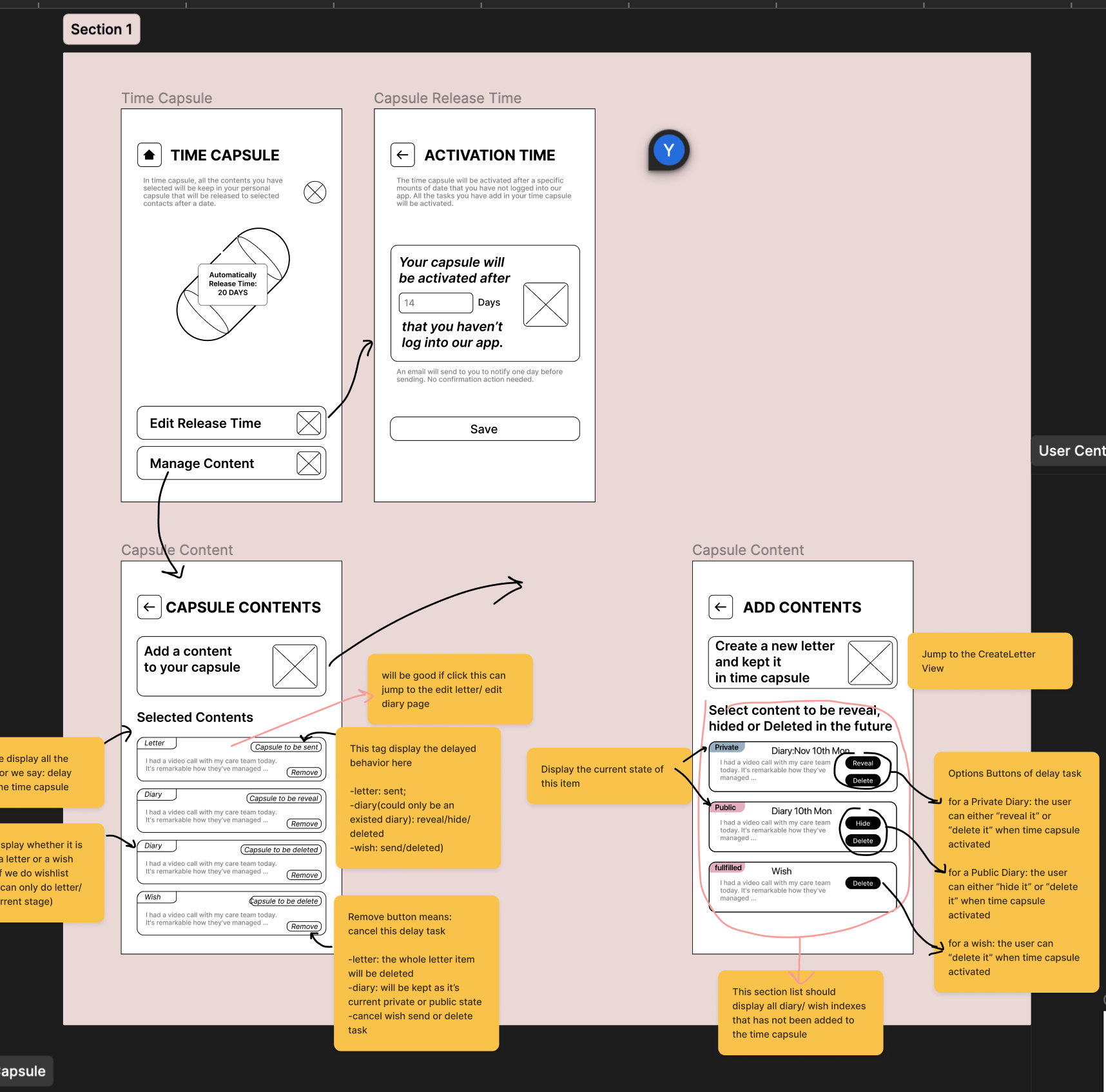
2. Delay for TimeCapsule
Our concept of 'Delay' has undergone a significant transformation:
Initial Concept
- Generic Delay Functionality: We initially planned for the Delay feature to be a generic concept applicable to elements like Letters, Diaries, and Wishes.
First Revision
- Specific to TimeCapsule: After careful consideration and during the implementation process, we decided to make the Delay feature exclusive to the TimeCapsule. This decision was based on the realization that Delay is most coherent and meaningful when applied specifically to the TimeCapsule in our app.
- Extend Time Capsule as an option for users in "diary," "letter," and "wishboard." To make Time Capsule functionality more useful in our app, we make accessible options for users when they create new diary, letter, and wish.
Second Revision
- Changing the name to Time Machine: Considering the mental model of a Time Capsule, we decided to change the name to Time Machine. This is because people generally associate a Time Capsule with revealing content, not deleting it. We still believed that "deleting" specific data was important, so we think the new name is much clearer.
- Adding delays to Letters: after further thought, we added back the classic delay functionality for the Letter concept and the Time Machine. It seemed like a direct message to a family member or friend should have the ability to be delayed and not necessarily be in the time capsule.
- After adding this functionality for Letter, we also decided to have a component to show the upcoming delay of Letters. Thus, the home page now has a slide bar showing the next three letters to be sent.
- Bug Fix: there was an error in getting a "Delay" by using the content (i.e., Diary, Wish, or Letter) by its id. This was cascading across multiple functionalities. It has since been fixed.
3. Preference Setting
The design of our Preference Setting also underwent modifications driven by practical considerations and project constraints.
Initial Concept
- Periodically check users' using habits and refresh their default settings
First Revision
- Specify the "preference": Due to the time limitation of this project, we specified the preference into two main functionalities: Vision Assistance and Time Capsule activation date. The first function is designed to serve the special visual needs of our users, and the second preference function addresses and assists our main innovative concept, "delay."
Second Revision
- After implementing our Beta and conducting some tests, users had difficulty remembering their previous "Preferences." Thus, we used "v-model" to link the previously stored values with each input. This was a simple and subtle change but a major improvement.
4. Topic Instead of Forum
Initial Concept
- an environment conducive to discussion and collaboration among users
First Revision
- Collection of Topics: What was previously categorized under Forum is now organized as a collection of individual Topics. This allows for more streamlined and topic-centric discussions.
- Diary to Topic Translation: A significant feature of this revision is the ability for patients to convert their diary entries into Topics. Should they choose to do so, their diary entries can be shared in the forum, transforming private reflections into public discussions.
Second Revision
- Response and Like: Now, the other user can enter one topic, create a response, and hit the like button to give thumbs up to the author!
5. Introduction of New Concept: Contact
We created a new concept to manage different types of users better
Revised Implementation
- Handling Diverse User Types: Contact is akin to the classic Friend concept but is tailored to handle different user categories, including 'patient,' 'non-patient,' 'in-app user,' and 'email (non-app) user.'
- Flexibility in Connections: This system allows for seamless interactions between users regardless of their status or mode of app usage, ensuring that all users can connect and communicate effectively.
6. Restructure wireframe
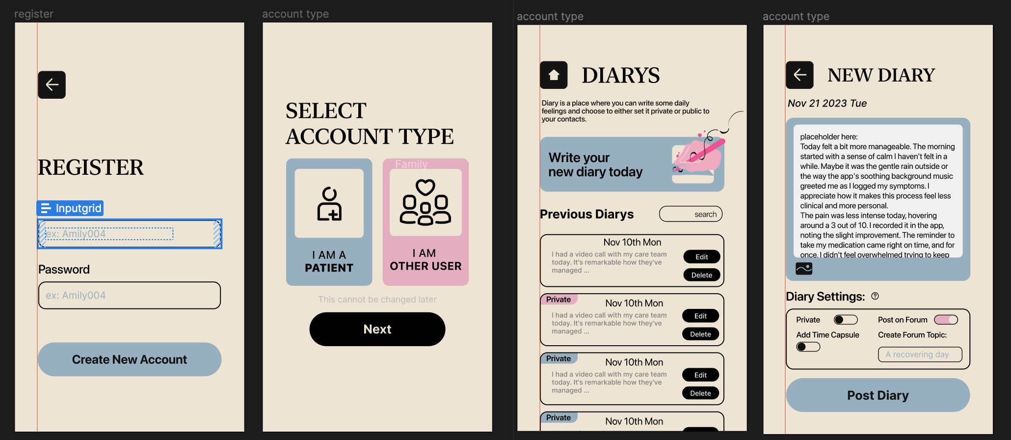
We re-draw the Figma wireframe into a high-fidelity one and use an industrial standard frame to enhance the modularity of our front-end design and styling.
Revised Implementation
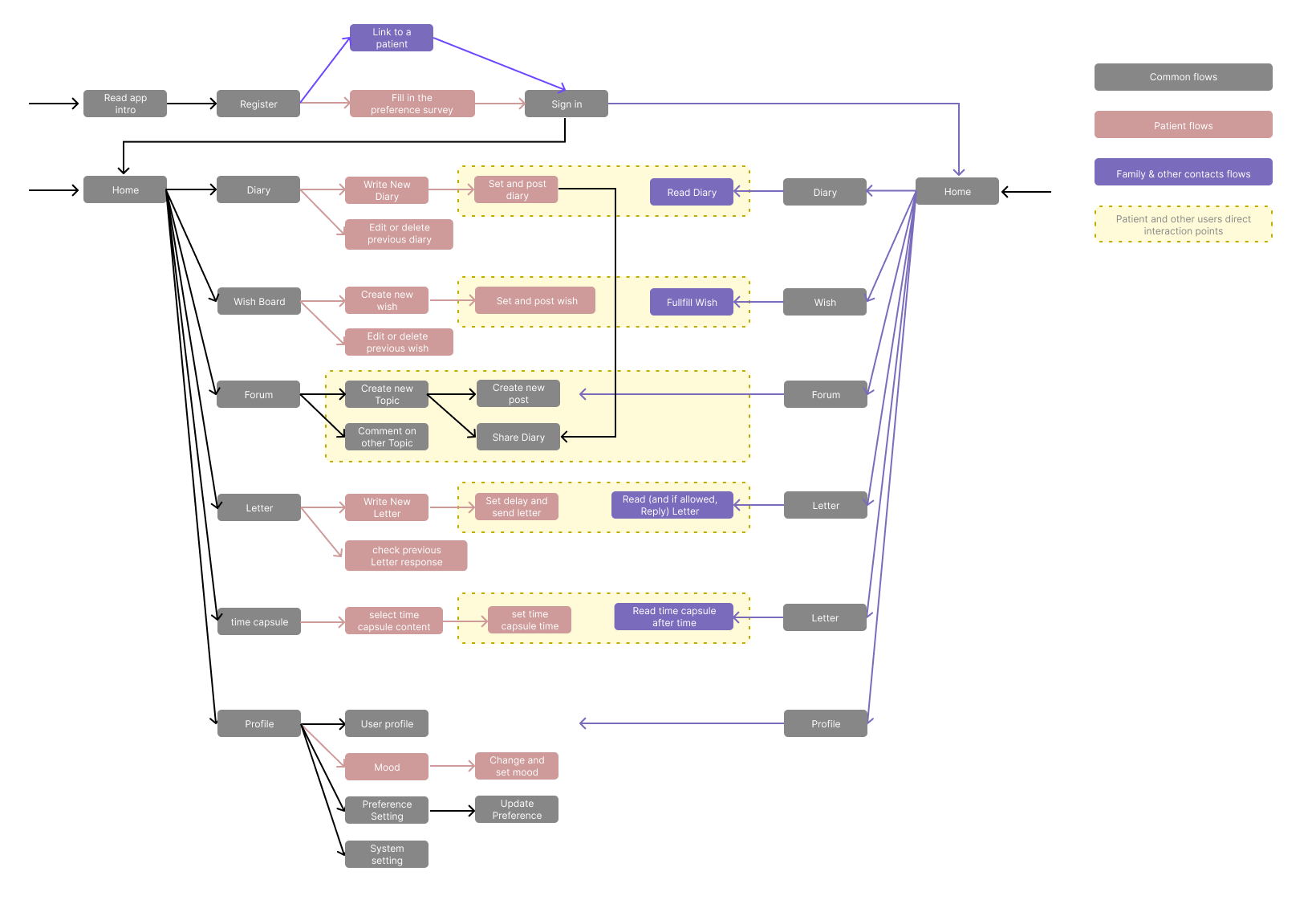
A clearer user flow

Reframe our interfaces based on revised concepts:

Hi-fi version frame with standardized layout and components
